Category: pcomp

work for introduction to physical computation.

  • Cheer an ITPer, initial concept

    For my final Physical Computing project, I decided to make a lofi-morale raising device for all the overworked cool people here in ITP, utilizing the lofi magic that is a thermal printer.

    photo 3

    Users can interact with it in two ways: physically to print an anecdote, a quote, or a rad piece of ASCII art, and virtually through submitting pieces of said anecdotes, quotes, and rad pieces of ASCII art through an email address or a public blog.

    I am in love with it already.

  • Arduino Diaries IV: Sensor-controlled Dot

    Arduino Diaries IV: Sensor-controlled Dot

    Building up on the serial communications capability of the Arduino board, I used an accelerometer to control a dot in a Processing sketch. The x-value and the y-value captured from the accelerometer were mapped to the equivalent values of the screen.

  • Arduino Diaries III: Sensing Visualized

    Arduino Diaries III: Sensing Visualized

    Serial sensor data can be sent through an Arduino board to a computer, where it can be further processed by Arduino’s own Wiring programming environment, or alternative software environments such as Processing.

    Below are the results of such process for two different sensors. In both cases, the binary data received from the sensor was mapped to an appropriate range in Processing (0 to height of window), and graphed as a time-series.

    The first sensor is a force sensor whose returned values had a nice, expansive range due to its nuanced responsiveness to applied force.

    669436.44

    816304.75323532.03611160.7562932.44443994.03


    Compare this to the x-axis readings of an accelerometer, below.
     

    251795.34242564.2221143.979215.1166277.38232491.4146


    The results are not as varied as those of the force sensor mainly because of the inclination of the accelerometer’s reading to be of a broad set of ranges that are difficult to map appropriately to the Processing’s sketch screen.
     

  • Observation Study: Office Chair

    Observation Study: Office Chair

    What is it?
    The standard, stock office chair with a cushion-endowed sitting surface, wheels at the bottom (usually), a low-height backrest, and conveniently-placed hand-rests.

    Prior assumptions
    It is hardly interacted with. The user can interact with it through a single operation only: sitting.

    What is the context in which it is typically used?
    Typical context in which it is used: working on a computer, working with non-fixed tools (e.g. notebooks, hand tools) on an adjacent table or desk. Having a meal, or in a communal setting in which people interact (meetings, meals, etc).

    How do people actually use it?
    The following are typical operations done to a chair: Move the chair towards a general direction. Rotate the seating surface towards another person, a desk, etc. Hang sweater, jacket, or other clothing material on back. Adjust height. Hang a bag on sides or armrests.

    How is it being used differently by different people?
    Some people use it as a simple seating “device,” others as a surface to place things, hang stuff, or hide luggage underneath. When it is wheel-less, some people use it as a step to reach higher parts of the room, to pick up things from shelves. (In, er, rare cases, they use it recreationally for play.)

    What appears to be the most difficult?
    Getting things that have fallen on the ground; it is a challenge attempting to steer a moving chair properly to get a pencil or so from underneath. Getting it in the right orientation and height. Trying to move the seating surface all the while  the wheels move about by themselves.

    What appears to be the easiest?
    Siting on it, unsurprisingly. Leaning forward and backwards.

    What takes the most time?
    Finding the right position and/or orientation. If the chair is wheel-less, then this is even more difficult. Hanging stuff takes more than it should.

    What takes the least time?
    Again, leaning backwards and forwards.

    How long does the whole transaction take?
    To sit: 1 to 2 seconds. Hanging and placing stuff: 2 seconds. Adjusting position and orientation: 1 to 5 seconds. Leaning forward or back: less than 1 second. Standing up: less than 1 second.

    Critique, following Crawford and Norman
    Norman’s main thesis is that the design should show the answers to the problem it is attempting to resolve, and a chair that is conventionally-designed certainly does that for the main problem of sitting: the seating surface visibly affords to have a person sit on it. However, it does not afford that exclusively, nor do the other parts of the chair (its backrest, for instance, affords the placement of clothing materials). This is not a bad thing, but it calls for a revision in its essential design philosophy: emergent usage patterns requires that proper mapping is established between the new interaction operations with their controls and outcome. For instance, the backrest should no longer accommodate the process of leaning backwards exclusively, and should also be visibly mapped to the process of placing suspended materials.


    Photo credit: http://www.toddusa.com/products.aspx?id=54

  • How to make human-friendly everyday things, a very short introduction

    How to make human-friendly everyday things, a very short introduction

    [In response to Donald Norman’s The Design of Everyday Things]

    Say you were asked to make or remake a piece of furniture, cutlery,  an appliance, or an electronic apparatus.

    You are perhaps a visual designer: you start aesthetically, exploring the palettes, textures, and patterns that interact with the visual systems of the users (viewers, to you).

    Or maybe you are an engineer, so you naturally concern yourself with the completeness of the physical and logical systems that comprise the product in question. You ensure, as a result, that the components run effectively and efficiently, as a whole and in individuality.

    Or, if you are a marketer, you have a business plan to follow, a portfolio of products to maintain to maximise profits and minimise the costs. Those pretty fancy tactile patterns that will take up the whole budget and then some? They’ll have to go. And so does the super fast, deathly quiet gears system that an engineer laboured to make with complete disregard to the budget at hand.

    All of the above are ways to make things; things that are profitable, efficient, pretty. Those are not mutually exclusive parameters. And they are not the only ones; they disregard usability, the manifestation of the user’s point of view, whether explicit or implicit, as opposed to that of the aesthete, engineer, and merchant. This does not mean that the user is not interested in the other three: a user might and will look for things that are pretty, reliable, and cheap. But not only that.

    ****

    So if we go back to you and your desire to make the aforementioned product, tool, etc. You want to do it differently from the aesthete, techie, and marketer above, in that you want your design to be of maximum usability and human-centricity How do you go about it?

    1. You start with the intent of having your design speak of the problem it is solving, without the need for instructions, symbols, etc. How can you do that?

    2. You do that by designing for and with affordance. Affordance is the actual and perceived properties of an object that allows it to perform specific tasks and none other than those. For instance, a table affords placement of things on its surface, but does not afford, say, to be used as a moving object.

    3. Some affordance properties are inherent to the physical reality of an object, e.g. the material it was made from. Soft and straight plywood affords carrying things of a specific weight range. Paper’s porousness affords words to be written on it.

    4. Other affordance properties are created by the designer: a slot in the design affords insertion, whereas a handle affords being pulled in a specific direction.

    5. Affordance is not the end of the story. The next step is to design with visibility in mind.

    6. Visibility of all the possible interactions with the object.

    7. Visibility of the outcome of said interactions i.e. the object should provide proper feedback to all possible operations by the user.

    8. Incorrect feedback mechanisms results in false causality that breeds superstition. For instance, a system failing right after a click of a button results in the user believing that said operation is the cause of the failure, even if that is incorrect.

    9. Affordance and visibility combine to provide mapping, i.e. the relationship between what can be seen and what can be done. Or, more concretely, the relationship between the controls, the operations, and their outcomes.

    10. The best possible mapping is natural mapping, which relies on the conventions (e.g. an arrow indicates direction) and the physical properties of things.

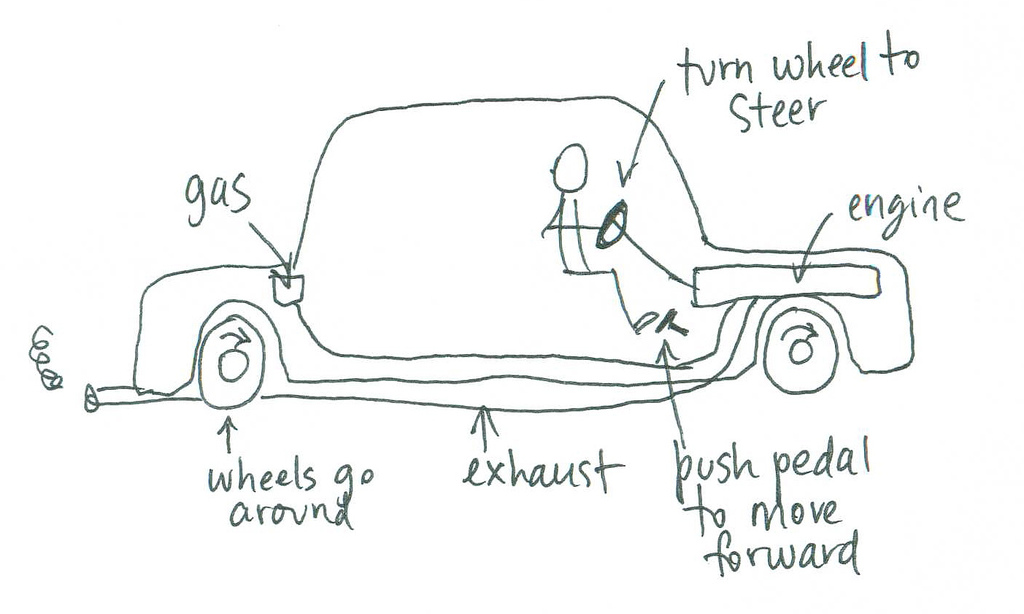
    11. If you keep the above in mind, you should be able to ease the user into a proper conceptual model of the product, where the user can predict the outcomes of his actions towards the object.

    12. A good user conceptual model is achieved when the designer’s own model is communicated simply and properly through  the physical model of the object itself.

    All of the above is a gross simplification, but what isn’t?  But it is a starting point.

    [photo credit: Mental model of how a car works, by davegray [http://www.flickr.com/photos/davegray/236316672/]

  • Arduino diaries II

    The Arduino microcontroller receives a digital input from a switch, and accordingly outputs a digital signal that lights up an LED depending on the state of the switch. 

  • Music that listens: What is interactivity?

    Music that listens: What is interactivity?

    Click here to view the above image in proper scale. 

    1. Defining Interactivity

    Chris Crawford argues that many of the mediums that traditionally can be thought of as interactive are in fact not; the opposing actors within them, though they might listen and speak, do not possess the capability to reach the appropriate level of thinking about, or processing, what is being listened to, to provide rich enough responses to be considered interactive. For instance, a dancer dances to a piece of music, but, Crawford argues, they are merely reacting to it; the music, if it is to be considered an actor, is static and does not respond to the dancer. In fact, music merely speaks, it does not think nor listens.

    A performance to an audience is typically low in interactivity as the audience cannot influence how the performance is being performed. Similarly, a book does not listen, it just tells.

    If I am to add to Crawford’s definition of interaction as a listen-think-speak cycle, I would argue that such a cycle should incorporate the concept of empathy to the model of interaction-as-conversation. This is a loaded statement as empathy entails a more thorough listening and thinking capabilities.

    To begin with, an empathic listener is one that retains an accurate, evolving model of the listenee. This entails a working implementation of memory. In addition, to maintain the accuracy of said model, the listener should be able to detect as much information simultaneously about the listenee as possible. This leads to the need for the listener to maintain multi-sensory channels. Finally, being an empathic listener calls for the listen-think-speak cycle to be less asynchronous, and more driven by micro-feedback and immediate, affirming responses.

    In a way, this definition is in line with the way Bret Victor argues that the future of interaction design should be modelled around the human capabilities, as manifested in the human hand.

    2. What makes a good physical interaction?

    A good physical interaction is intuitive. The action perform should be completely and exclusively afforded by the object; it should also be an extension to the actor’s capabilities (as Bret Victor would argue).

    3. Examples of works that are good, but not interactive

    Most graphic design work, while brilliant and necessary, is poorly interactive. For instance, logos are conventionally static. But why so? One of my all time favorite projects is Stefan Sagmeister’s dynamic identity project for Casa de Musica, where the colors and shape of the logo are a reflection of its current cultural offering.

    Another interactively-lacking digital medium is most wayfinding systems. Signage is rarely interactive or accommodating to the state of the viewer.