Category: itp

itp work and progress

  • Lyrical Particles, a music visualization project

    Lyrical Particles, a music visualization project

    Lyrical Particles is a music-lyrics visualisation system that accepts two pieces of input: a music file, and a timed representation of the lyrics in the form of a CSV file.

    Both the waveform and the beat information are extracted from the music file and are mapped into aspects of the main particle systems in display.


    [sr_video][/sr_video]

    The size of the particles in the main particle system corresponds to the amplitude of a sample of the waveform at that instance. The size of the particles in the distant, background particle system is controlled by the beat of the song, while the rate of their movement (once they do start moving) also corresponds to the waveform of the song.

    The main particle system serves another function: it is a visualizer of the lyrics of the song. According to the provided CSV file in which the lyrics and their timestamps are specified, the particles in said particle system self-arrange to display portion of the lyrics at that instant of time.

    To expand the system’s capabilities further, I plan to add, if time allows, the functionality of identifying the song based on its basic characteristics, connecting to the internet to grab its lyrics, and determining the timing of each portion of the lyrics based on voice recognition algorithms. This effectively eliminates the need for the secondary CSV lyrics file in the current implementation.

    Another direction I wish to explore is adding an interactive layer by recognizing the speech of the viewer and consequently visualizing it through the main particle system in display.

  • Redesigning the ITP Logo

    Redesigning the ITP Logo

    1. Redesigning the ITP logo

    I opted to redesign, or more appropriately, re appropriate the ITP logo into a dynamic, generative design.

    logo9 logo8 logo7 logo6 logo5 logo4 logo3 logo2 logo1


    I created a Processing sketch that manipulates two particle systems to form the name and the emblem of the logo. The sketch cycles through different type and color choices to hopefully aid the user in finding an appropriate color and type combination for the logo.

    The following is a video of the design in action.

    [sr_video][/sr_video]


    2. A favorite logo design
    dubai
    I’ve always been partial to the logo design of Dubai airports. It is effectively a template for the various entities under the umbrella of Dubai airports; designed to be reusable and expandable as more such entities are established. The beauty of it, to me, is its kaleidoscopic form that evokes a sense of disparate elements coming together to become one. The type choice, however, is not ideal, and the arrangement of the words could definitely use some improvement.

  • Rubicon: A Typographic Exploration

    Rubicon: A Typographic Exploration

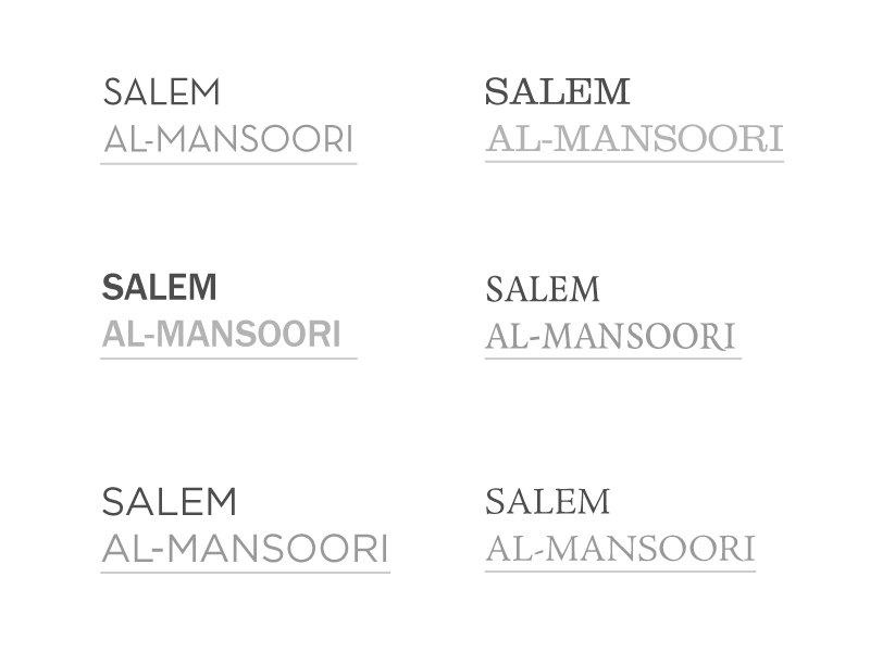
    This week, I explored typography through setting my name in different serif and sans serif typefaces. The criteria through which I made the type selection is whether the typeface does a good job in conveying the statement I personally like to bring across: lightness, (subdued) character, and aesthetic order.

    1. Sans Serif 

    salem-in-neutraface

    Neutraface is a modern (2002) typeface that was designed by House Industries with an inspiration from architectural lettering in the 1940s. The typeface has an intriguing contrast between the x-height of the letters to the cap height, resulting in playful A’s, E’s, and R’s. There is also an interesting play in symmetry: the characters are mostly symmetrical around the y-axis, but not so around the x-axis, which gives it a personality of geometric order without being too predictable.

    salem-in-franklin-gothic
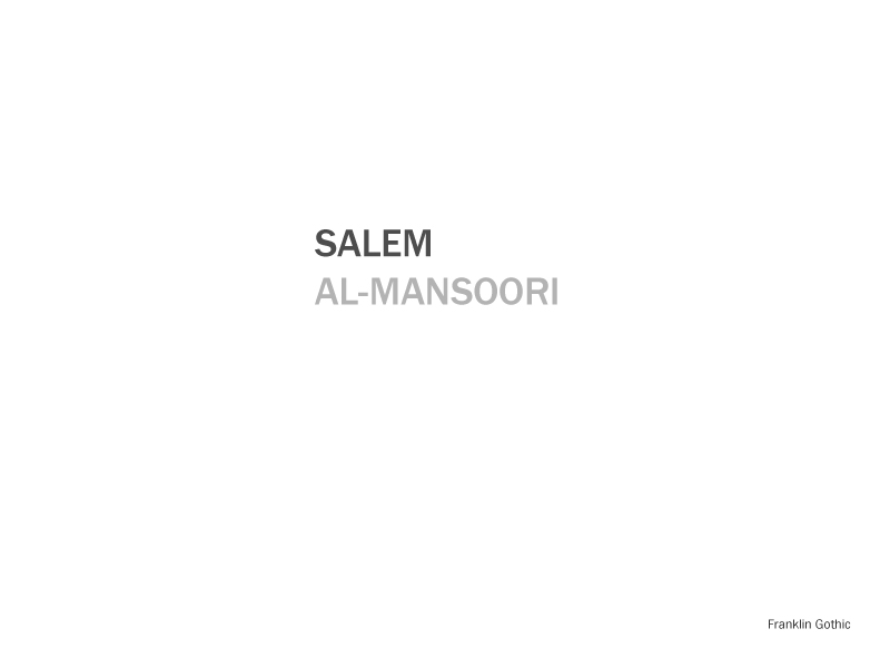
Franklin Gothic, designed in 1904, gives a formal yet personable impression; the condensed character width with the thick, contrast-lacking strokes give it a hint of quirkiness without losing its formality.

    salem-in-gotham
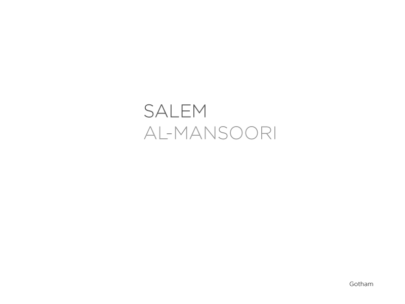
My last sans-serif choice is my all-time favorite typeface, Gotham. Designed by Tobias Frere-Jones in 2000, it, too, was inspired by architectural and signage type forms the mid 20th century. While it does have a strong geometric sense (see the perfect bowls in the prominent O’s), it avoids monotony by achieving a perfect stroke contrast and symmetry. I’m particularly partial to the light variation of it due to its attainable airy feel.

    2. Serif 

    salem-in-clarendon

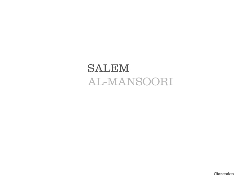
    My first serif choice is Clarendon, an English slab-serif from the mid-19th century. While it can get overbearing when used extensively due to the thick stems and serif, I do find it a strong, statement-making typeface to its rational (upright) axis and playful character aesthetics (see the R’s lower stem).

    salem-in-quadraat

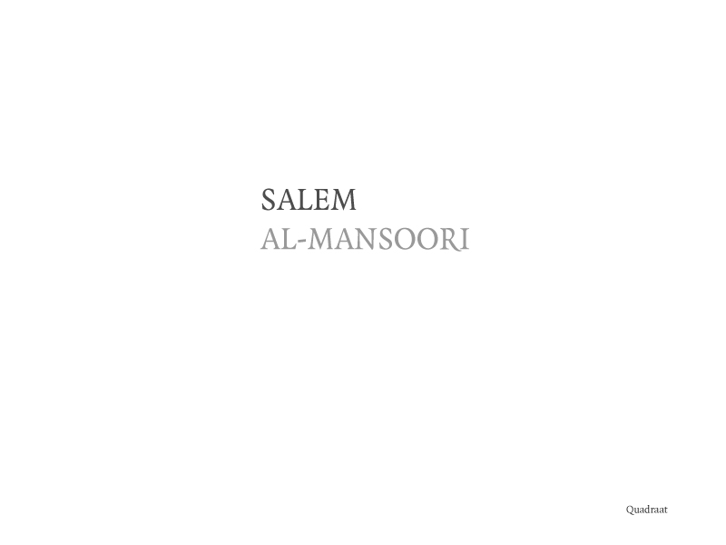
    Quadraat is a more humanist serif than Clarendon, with a condensed character width which gives it an approachable quality. Each letter has clear stroke contrast; see the left stem of the A versus its right stem. The M stands prominently with the dramatic descent of the middle stems towards the baseline.

    salem-in-jenson

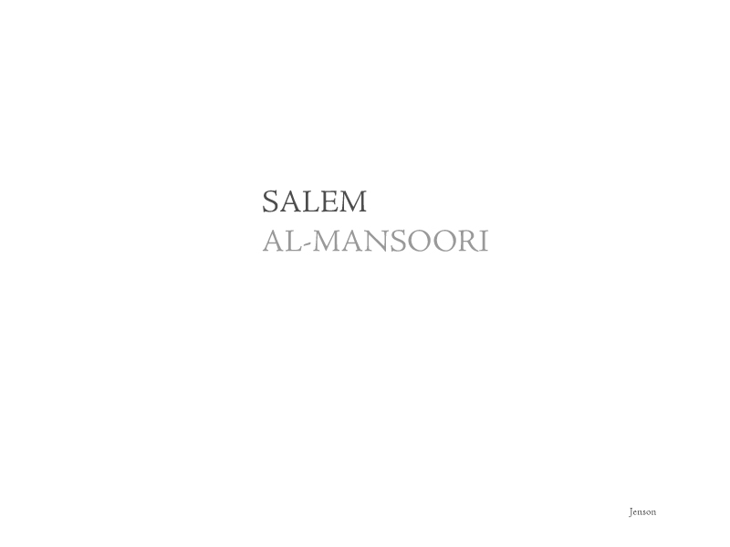
    Jenson, to me, is the perfect serif. The wide letters, along with the humanist axis and the delicate stroke contrast, gives it a wholly balanced and amiable feel. Letters that are meant to be prominent look prominent (see the M’s, O’s, and the R’s), others that are there to reliably hold their loud brethren do so effortlessly (see the L’s, E’s, and A’s above).

    fonts


    And my name in Arabic, in Adobe Naskh, for the fun of it. salem-in-arabic

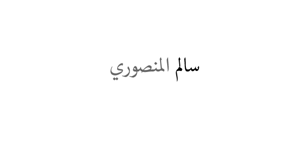
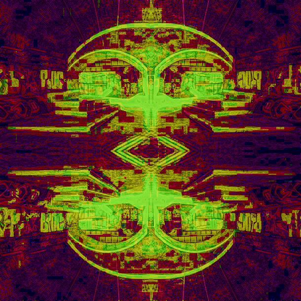
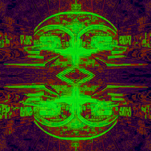
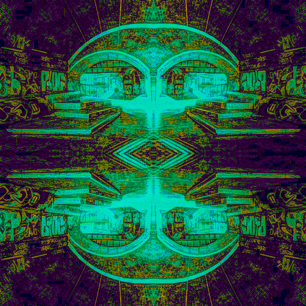
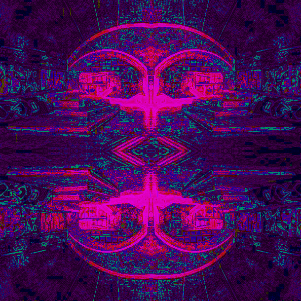
    3. Expressive Typography, Rubicon 

    rubicon-definitionMy word of choice is a favorite, significantly personal word: rubicon is my Twitter username, and my design and alter ego/sort of brand back home in Dubai. I find it extremely intriguing because it has multiple aspects: idiomatically, when someone is said to have crossed the rubicon, it is meant to signify that they have crossed into a dimension of complete commitment, a point of no return. It is also the name of (currently-extremely-polluted) river in Italy. In ancient time, when Caesar would cross said river, it was considered an act of certain war.

    In my typographical exploration, I opted to play around both the synonymous point of return meaning of it, as well as the river for which it is eponymous.

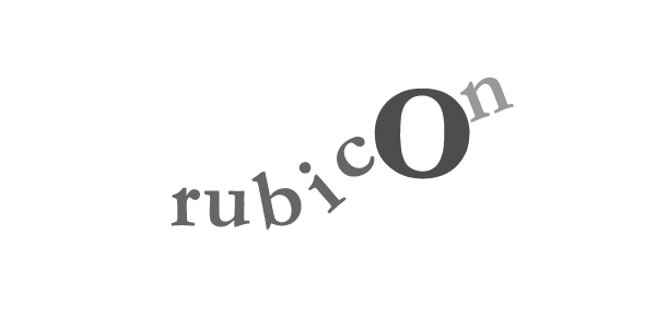
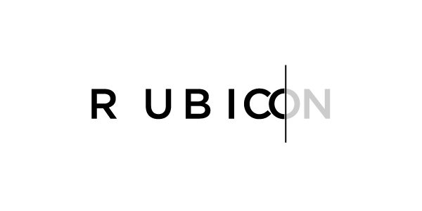
    The entry point for me was the O, which almost explicitly proclaims a point that, with a bit of re-contextualisng, can communicate a point of no return. I started by enclosing the N within an imposing, all-encompassing O. The N was made less bright so as to convey an unchangeable distance that is beyond hesitation.

    rubicon-expressive

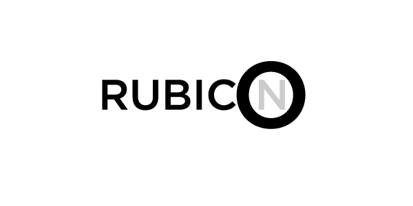
    I did feel that the message can be mixed a bit here: is the O simply highlighting the N? To get around that, I opted to take another direction in which a line splits the O in its center, so that the characters are divided into two groups: everything before the middle point of O are in a pre-commitment, static state, while the N and the second half of the O are beyond that; they are beyond the point of no return. The line also alludes to the rubicon the river, and the meaningful crossing of it by Caesar.

    rubicon-expressive-2

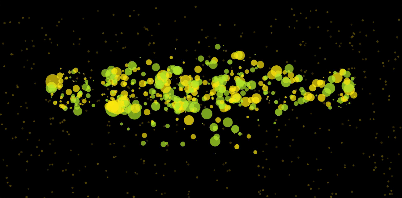
    Then I wanted to add  a sense of a river-like, marching motion towards the point of no return. I did that using a rhythmic spatial change of the position of the letters.

    rubicon-expressive-3
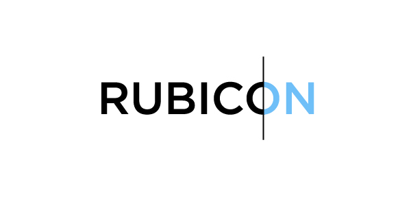
I especially like the way the C and the O almost touch and how aptly their shapes interact. I then wanted to revisit the previous design but with a bit of (watery) color.

    rubicon-expressive-4 
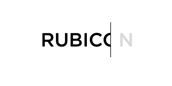
To convey the message more dramatically, I experimented with doing away with the second half of the O, to tell a story of an abrupt change of state.

    rubicon-expressive-5 
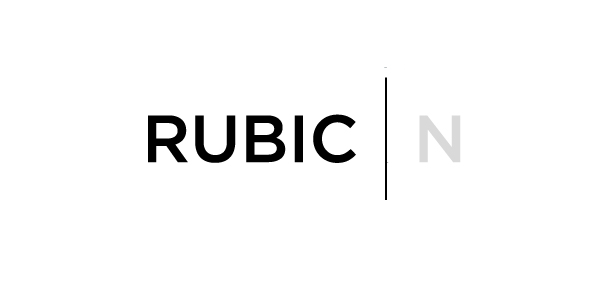
I found that the complete removal of the O is also effective, but at the expense of readability of course.

    rubicon-expressive-6

    A final experimentation I did is with a serif font (Garamond), with a sense of playful water/flow towards a static point of no return.

    rubicon-expressive-7

  • Deceiving with Color

    Deceiving with Color

    Josef Albers’ book, Interaction of Color, is a record of an experimental way to teach and study color.

    Unlike other physical phenomena (e.g. sound), the measurement and perception of color, whether optical (light-based) or reflected (pigment-based), is subject of both psychic and physical deception, Albers argues. Color, as a medium in itself, is one that continuously deceives, in spite of (and perhaps because of) the underlying physicality of pigments, colored paper, and, to a certain extent, light. The anatomical system of observation is one of both biological and psychological constraints, and linguistically, the vocabulary of color is severely limited in contrast to the almost endless supply of unique instances of color that both additive and subtractive color mixing afford.

    The significant relativity of color as a medium is perhaps more comprehensible if one opted to study color action, instead of an inadequate, myopic focus on hue, color intensity, and light intensity of detached swatches.

    Color action is a result of the interaction between an instance of a color and its context, whether spatial, temporal, or volumetric. Spatial context as in form, and placement. Temporal context is a result of the after-effect that is often the result of the retina’s self-adjusting mechanism when colors are moved, replaced, or subtracted from a scene. Volumetric context is related to quantity and recurrence. Color, in a way, is like music in that one only hears it if a note is prior or after another, and with recurring moments of silence to give it form.

    For an adequate study of color, one should treat color as a medium of interaction, away from the hierarchal and flat systems of color that works prior to Albers championed.

    To see color action, and consequently develop a practical, unmarred by static theory, eye for color, is to approach it with a sense of observation, discovery, comparison, situational thinking, and creativeness. Josef Albers’ studies of color are structured, for the lack of a more apt term, to foster that.

    A typical study of color in the Interaction of Color handbook starts with a gentle acknowledgement of an observation. “A color can appear as two,” or “two colors can appear as one,” for instance. Students are then inspired to recreate that effect through their very own exploration, using the most quintessential and uniform representation of color: found colored paper that is emancipated from the subjective curation of store-bought swatches, or the highly textured, process-dependent mixed colors.

    josef-albers-portrait

    Josef Albers acknowledges the challenge of the deception of color and gently points, at one point, to the doubt that a student is bound to feel, not only about what is being observed, but also about the thoroughly exploratory mode of instruction.

    There is only one way to experience the color studies fully: to attempt them. I was fortunate to have two copies of the book, the 50th Anniversary Edition by Yale University Press, and the recently-released iPad app that contains the full text and a digital, interactive representation of the accompanying plates. Surprisingly, I found the iPad version to be more honest to the nature of Albers’ pedagogy; each plate is fully responsive to haptic interaction, whereas the paperback’s plates are obviously static and immutable.

    Regardless of the medium of their consumption, Josef Albers’ color studies’ value, in my personal opinion, is their gentle reminding of a single, often ignored fact about the nature of one’s experience of the world: that context matters. Experiencing things in the early morning alone in a cubicle in a high-rise can be potentially completely dissimilar to experiencing the same things at night, surrounded by friends and family around a communal table.

  • Cheer an ITPer, initial concept

    For my final Physical Computing project, I decided to make a lofi-morale raising device for all the overworked cool people here in ITP, utilizing the lofi magic that is a thermal printer.

    photo 3

    Users can interact with it in two ways: physically to print an anecdote, a quote, or a rad piece of ASCII art, and virtually through submitting pieces of said anecdotes, quotes, and rad pieces of ASCII art through an email address or a public blog.

    I am in love with it already.

  • Seeing all the signs

    This week I went on a mini mission to locate the worst piece of signage I could find to critique and redesign.

    One thing I’ve noticed since I moved to NYC is the amount of scaffolding that adorns, for the lack of a better term, pretty much every pedestrian walkway I come across. Not only are they inconvenient, but they are also potentially quite dangerous. There is, therefore, an inherent need for clear wayfinding and signage systems to reduce both the inconvenience and the potential risk at play.

    I didn’t have to go far to find a suitably bad scaffolding sign.

    Somewhere in 8th Avenue/57th West Street.
    Somewhere in 8th Avenue/57th West Street.

    (I live right across from this thing.)

    Critique:

    1. The first problem I found with the above sign is its placement. If any matter to arise from the scaffolding in question, it would most probably be experienced somewhere underneath it. The sign is placed on the side and quite high; reading it anywhere close to the scaffolding is literally impossible. To see what it is all about, I had to cross to the other side of the street and then use my phone’s camera to zoom into it.

    2. The second problem is readability. The type is set in upper case, which impedes readability as the human visual system reads words based on their formal shapes, which is often obscured when using all-caps.

    3. The third is lack of a hierarchy. The method of information presentation followed is pretty much including all data points in the same manner and prominence. The order in which the lines are organized also appears to be random, with no rhyme or reason. This results in oddities such as the obscureness of the most important piece of information, what number to call when an emergency actually happens (see line 6 in the sign).

    4. The intention behind the sign appears to be confused: the sign’s header proclaims that it is a list of numbers to call for emergencies, but the sign mostly include addresses of building-related governmental departments that I would imagine are more suited to receive building-related complaints than process prompt emergency calls.

    Redesign:
    signredesign

    While the redesign is, by no means, polished, I attempted to correct the problem of readability through the introduction of a grid-based layout that divided the information into relevantly aligned and grouped divisions. I used a more readable typeface set in upper-lower to preserve the shapes of the words for maximum readability. Color and iconography also aid in both attracting the eye to the text (the visual system is known to be more attuned the color red than other colors) and to guide the viewer through the layout.

    I introduced an information hierarchy through the use of varying sizes of the typeface to ensure that what needs to be prominent is in fact visually so. Color is used again to ensure hierarchy; less important pieces of information are in a lighter shade of black. A phone icon was also used to bring attention to the phone numbers amidst the address information.

    In terms of design intention, I divided the included information into three categories: most important emergency information (um, call 911), secondary emergency information (the addresses of the closest FDNY house and police precinct), and the safety complaints information (the addresses of the departments of buildings, building safety, and transport). I emphasised the presumably main intent behind the sign by giving the first set the most prominence and space, while the third set is given a marginal yet visible space.

    A favorite piece of wayfinding design:

    dxbmetro
    There many great examples of wayfinding and signage design in the Dubai Metro project.

    The above is my favorite piece of design from that project: the in-station map of the station layout. I find it effective as it uses 3-dimensional presentation of information while avoiding the problems that often come with 3-dimensional views, mainly occlusion. The isometric view of the station layout allows the user to build an effective mental model of the station due to the clarity of the graphical elements, as enhanced by the clever use of color. As the station is presented in 3D, the viewer does not need to exert additional thinking efforts to translate the typically-abstracted 2D visual information to actual,realistic spatial information.

  • Visual Shock, A Visual Language Analysis

    Visual Shock, A Visual Language Analysis

    Chip Kidd’s design of the cover of Visual Shock: A History of Art Controversies in American Culture is, in my opinion, a striking piece of elegant, meaningful design.

    I. Visual Concept

    Chip Kidd’s work tends to employ a sense of contrast, not necessarily in color, but in the form of the juxtaposition of elements for visual impact. In this case through the use of both visually similar but contradictory in nature structural works: the towering Cleopatra’s Needle, and a bronze, medium-height sculpture from Constantin Brancusi’s Bird in Space series. Both works are alike, however, in having a history of controversy. (Bird in Space, for instance, was the source of a long, deliberate legal process to prove whether it constitutes a piece of art and therefore can evade import taxation.)

    bird in space

    II. Grid and Placement

    visual shock
    Spatially, the design is divided vertically into two equally spaced panels, connected through the placement of text in-between, and the layout within each panel. Both visual elements are prominently placed among an ample amount of surrounding negative space, that, although colorful, is of a lesser color intensity than the obelisk/sculpture.

    III. Typography and Hierarchy

    FF_DIN_and_FF_DIN_Round-Showing_by_William_Montrose-Helker
    Only a single typeface was used for the text: FF DIN, which is a humanist (i.e. calligraphic) sans serif that is highly legible yet elegant. Two weights of it were used which, along with the three typeface sizes used, establish a hierarchy of information of which the title and author name are the most prominent. Follow that are the book’s subtitle and a description of the author. Last in that hierarchy is the press quote at the bottom.

    IV. Color

    PALETTE

    The color palette used is light in color intensity (saturation), and is fairly bright, which serves as a good contrast to the black typeface. A sense of atmospheric distance is achieved through the hazy background colors behind both the obelisk and sculpture, to perhaps emphasize the structural aesthetics of both.

  • Hue-shifting

    Hue-shifting

    This is an experiment in gradually and cyclically changing the hue and saturation values of an “array of pixels,” i.e. an image. The main parameter I experimented with was the nature of the increment value to both hue and saturation: whether it is a whole number, a float, a sinusoidal value, or a simple quadratic formula.

    [one_fourth]27768.451[/one_fourth][one_fourth]129585.66[/one_fourth][one_fourth]701145.7[/one_fourth][one_fourth_last]377843.94[/one_fourth_last][one_fourth]734175.9[/one_fourth][one_fourth]224657.36[/one_fourth][one_fourth]254764.05[/one_fourth][one_fourth_last]259448.44[/one_fourth_last]To achieve a cyclic animation, the saturation value increments upwardly until it reaches 255 before starting to decrement back. The below is a video of the animation.

    The program was run with various images to compare results; the darker the image is, the lesser the change in appearance (hue and saturation).

    [one_fourth]66525.5[/one_fourth][one_fourth]907474.1[/one_fourth][one_fourth]717525.1[/one_fourth][one_fourth_last]21743.68[/one_fourth_last][one_fourth]507630.12[/one_fourth][one_fourth]396375.78[/one_fourth][one_fourth]73955.33[/one_fourth][one_fourth_last]177715.47[/one_fourth_last]