This week I went on a mini mission to locate the worst piece of signage I could find to critique and redesign.
One thing I’ve noticed since I moved to NYC is the amount of scaffolding that adorns, for the lack of a better term, pretty much every pedestrian walkway I come across. Not only are they inconvenient, but they are also potentially quite dangerous. There is, therefore, an inherent need for clear wayfinding and signage systems to reduce both the inconvenience and the potential risk at play.
I didn’t have to go far to find a suitably bad scaffolding sign.
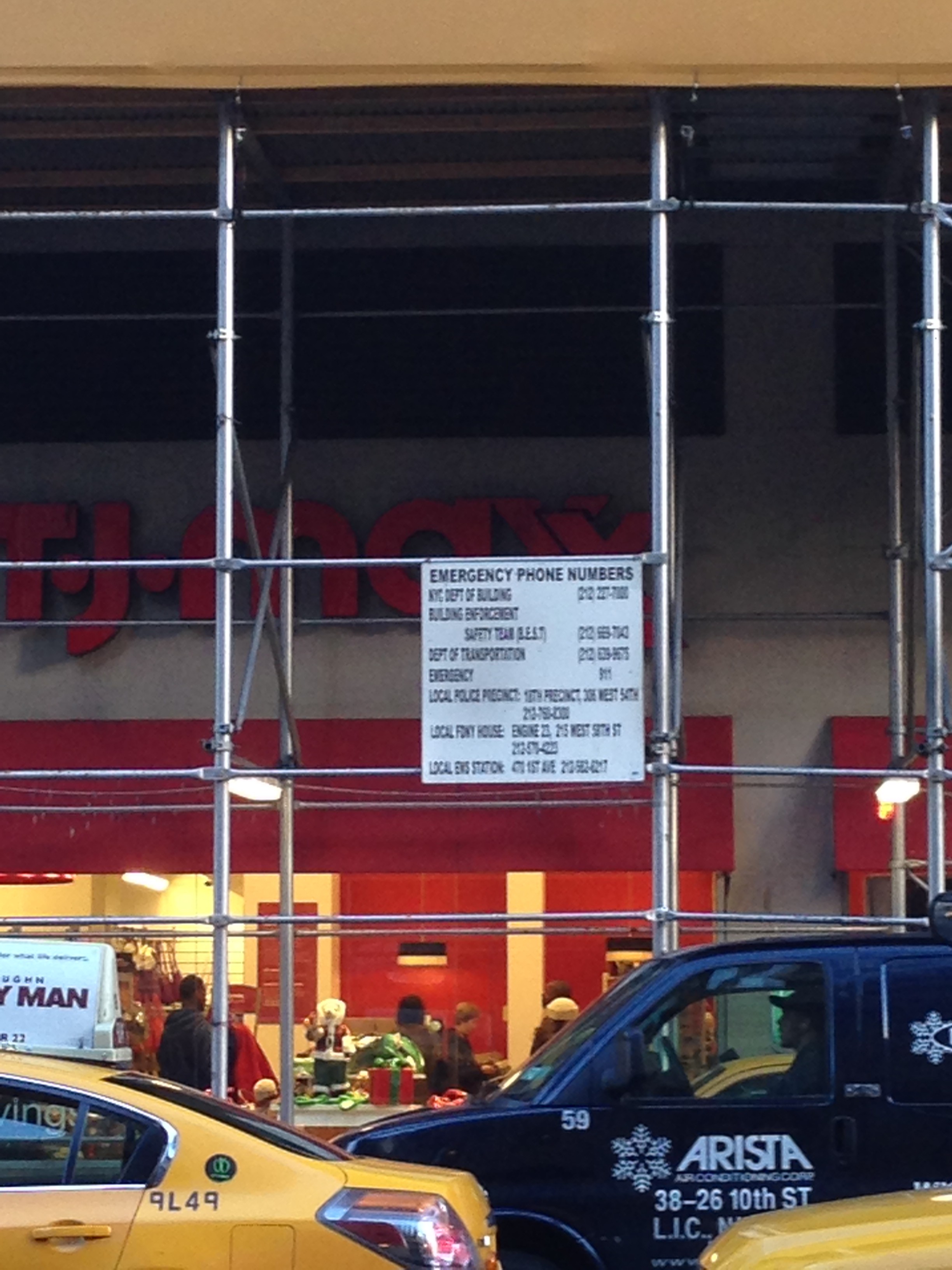
(I live right across from this thing.)
Critique:
1. The first problem I found with the above sign is its placement. If any matter to arise from the scaffolding in question, it would most probably be experienced somewhere underneath it. The sign is placed on the side and quite high; reading it anywhere close to the scaffolding is literally impossible. To see what it is all about, I had to cross to the other side of the street and then use my phone’s camera to zoom into it.
2. The second problem is readability. The type is set in upper case, which impedes readability as the human visual system reads words based on their formal shapes, which is often obscured when using all-caps.
3. The third is lack of a hierarchy. The method of information presentation followed is pretty much including all data points in the same manner and prominence. The order in which the lines are organized also appears to be random, with no rhyme or reason. This results in oddities such as the obscureness of the most important piece of information, what number to call when an emergency actually happens (see line 6 in the sign).
4. The intention behind the sign appears to be confused: the sign’s header proclaims that it is a list of numbers to call for emergencies, but the sign mostly include addresses of building-related governmental departments that I would imagine are more suited to receive building-related complaints than process prompt emergency calls.
Redesign:
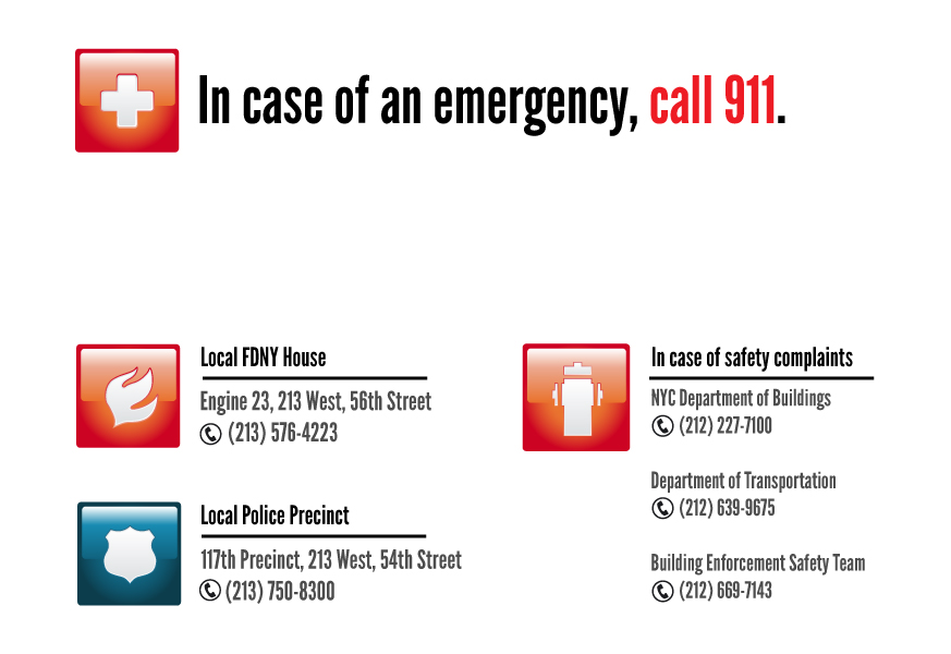
While the redesign is, by no means, polished, I attempted to correct the problem of readability through the introduction of a grid-based layout that divided the information into relevantly aligned and grouped divisions. I used a more readable typeface set in upper-lower to preserve the shapes of the words for maximum readability. Color and iconography also aid in both attracting the eye to the text (the visual system is known to be more attuned the color red than other colors) and to guide the viewer through the layout.
I introduced an information hierarchy through the use of varying sizes of the typeface to ensure that what needs to be prominent is in fact visually so. Color is used again to ensure hierarchy; less important pieces of information are in a lighter shade of black. A phone icon was also used to bring attention to the phone numbers amidst the address information.
In terms of design intention, I divided the included information into three categories: most important emergency information (um, call 911), secondary emergency information (the addresses of the closest FDNY house and police precinct), and the safety complaints information (the addresses of the departments of buildings, building safety, and transport). I emphasised the presumably main intent behind the sign by giving the first set the most prominence and space, while the third set is given a marginal yet visible space.
A favorite piece of wayfinding design:
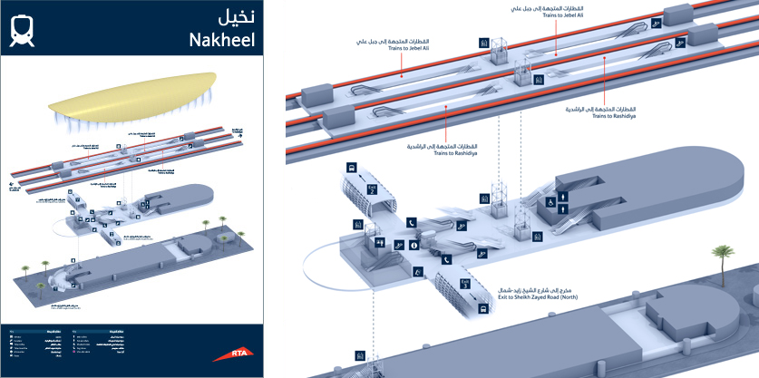
There many great examples of wayfinding and signage design in the Dubai Metro project.
The above is my favorite piece of design from that project: the in-station map of the station layout. I find it effective as it uses 3-dimensional presentation of information while avoiding the problems that often come with 3-dimensional views, mainly occlusion. The isometric view of the station layout allows the user to build an effective mental model of the station due to the clarity of the graphical elements, as enhanced by the clever use of color. As the station is presented in 3D, the viewer does not need to exert additional thinking efforts to translate the typically-abstracted 2D visual information to actual,realistic spatial information.
Leave a Reply