
Chip Kidd’s design of the cover of Visual Shock: A History of Art Controversies in American Culture is, in my opinion, a striking piece of elegant, meaningful design.
I. Visual Concept
Chip Kidd’s work tends to employ a sense of contrast, not necessarily in color, but in the form of the juxtaposition of elements for visual impact. In this case through the use of both visually similar but contradictory in nature structural works: the towering Cleopatra’s Needle, and a bronze, medium-height sculpture from Constantin Brancusi’s Bird in Space series. Both works are alike, however, in having a history of controversy. (Bird in Space, for instance, was the source of a long, deliberate legal process to prove whether it constitutes a piece of art and therefore can evade import taxation.)

II. Grid and Placement
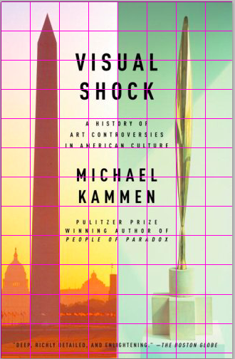
Spatially, the design is divided vertically into two equally spaced panels, connected through the placement of text in-between, and the layout within each panel. Both visual elements are prominently placed among an ample amount of surrounding negative space, that, although colorful, is of a lesser color intensity than the obelisk/sculpture.
III. Typography and Hierarchy

Only a single typeface was used for the text: FF DIN, which is a humanist (i.e. calligraphic) sans serif that is highly legible yet elegant. Two weights of it were used which, along with the three typeface sizes used, establish a hierarchy of information of which the title and author name are the most prominent. Follow that are the book’s subtitle and a description of the author. Last in that hierarchy is the press quote at the bottom.
IV. Color

The color palette used is light in color intensity (saturation), and is fairly bright, which serves as a good contrast to the black typeface. A sense of atmospheric distance is achieved through the hazy background colors behind both the obelisk and sculpture, to perhaps emphasize the structural aesthetics of both.
Leave a Reply