For the last 8 years, I have been collecting records of every song I listened to, whether it was on a (now so precious) iPod, my personal computer, or my phone.
If this sounds obsessive, it is not. In truth, I made no effort other than creating a last.fm account, downloading every “scrobbling” solution they provide, and restricting my streaming and non-streaming activity to supported platforms (hello Rdio). However, a simple list of songs to which one has listened to is not much of an insight-generating dataset. Using the echoNest APIs, I chose to supplement every song or artist I have listened to with metadata about the type of artist they are, and the kind of sound their music is.
If this sounds vain, well, it is. I can’t claim it is not. It is, however, an experiment that can be replicated universally. There are all sorts of insight we can learn about the way we go about our lives through the characteristics of the music we listen to. For instance, what kind of narrative can the tempo of the music characterising a period of our lives tell? Can change in musical taste be quantified, and more importantly, be used to document periods of our lives?
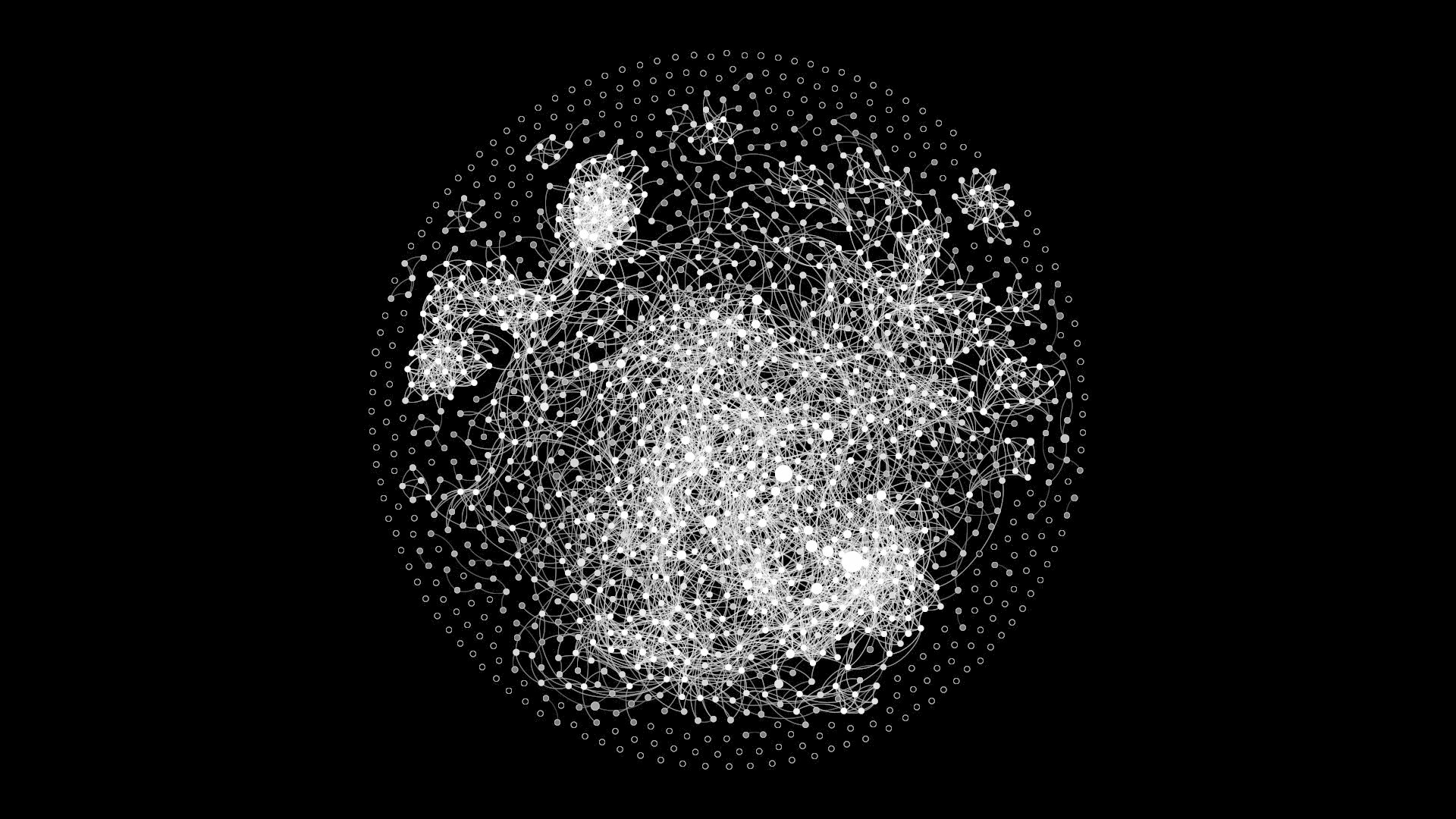
The first thing I wanted to investigate is whether there exists a clustering, or in other words, a community structure to the artists I listened to. Using the similarity parameters provided by the echoNest APIs, I came up with the below graph.
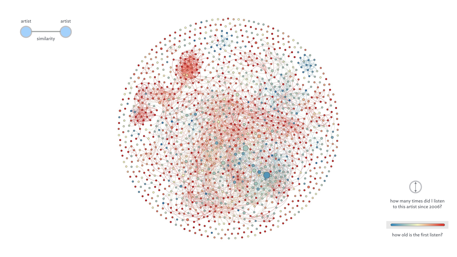
Each node is an artist, and the size of it is the number of times I listened to that artist in the period in question. The redder the color of the node is, the more recently I started to listen to them.
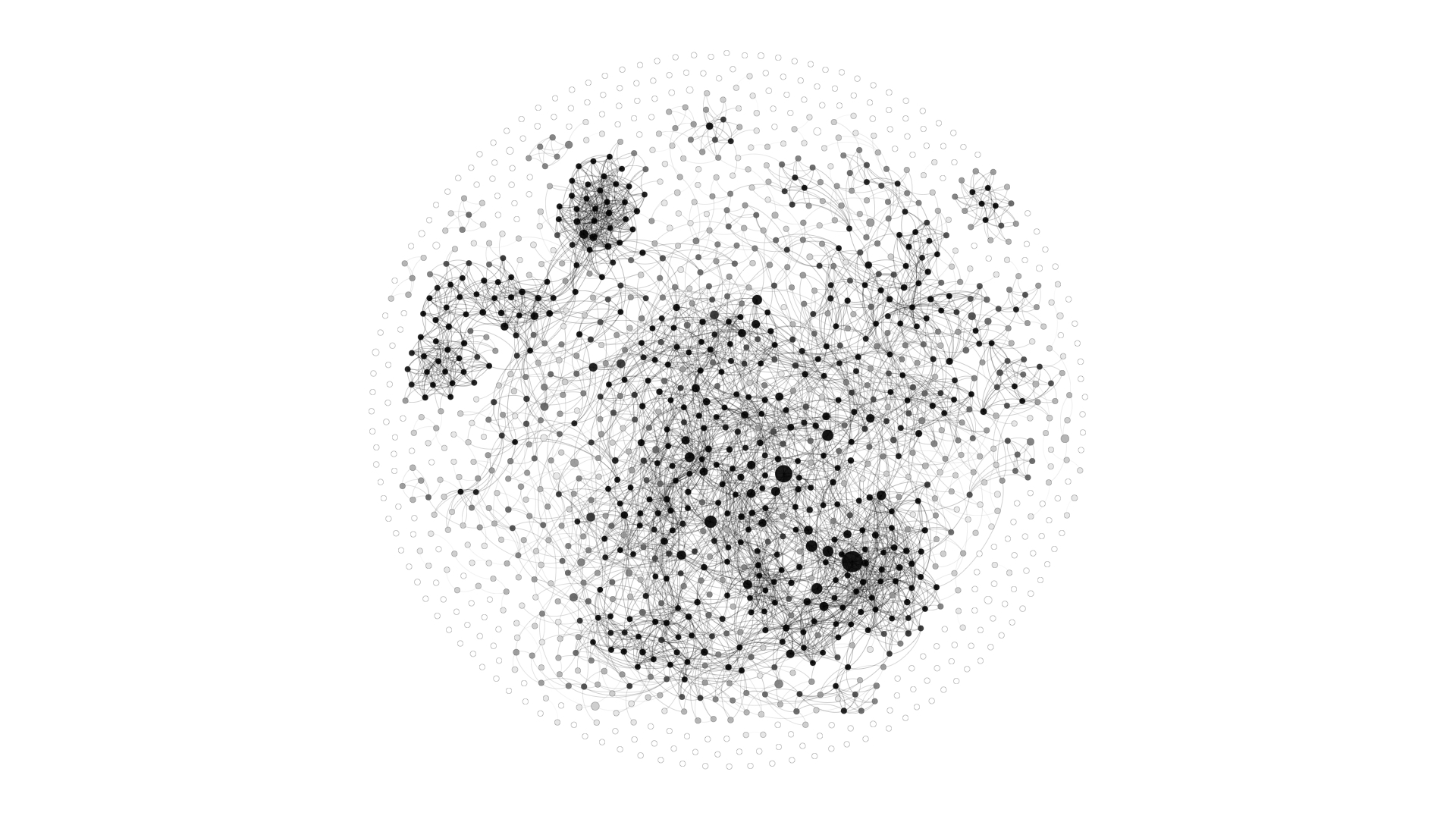
It is visually obvious that there are a number of clusters of artists in the graph. A black-and-white variation of the graph makes that more apparent.
After examining the actual nodes to comprehend what type of artists each cluster comprises, I annotated the graph as is shown below
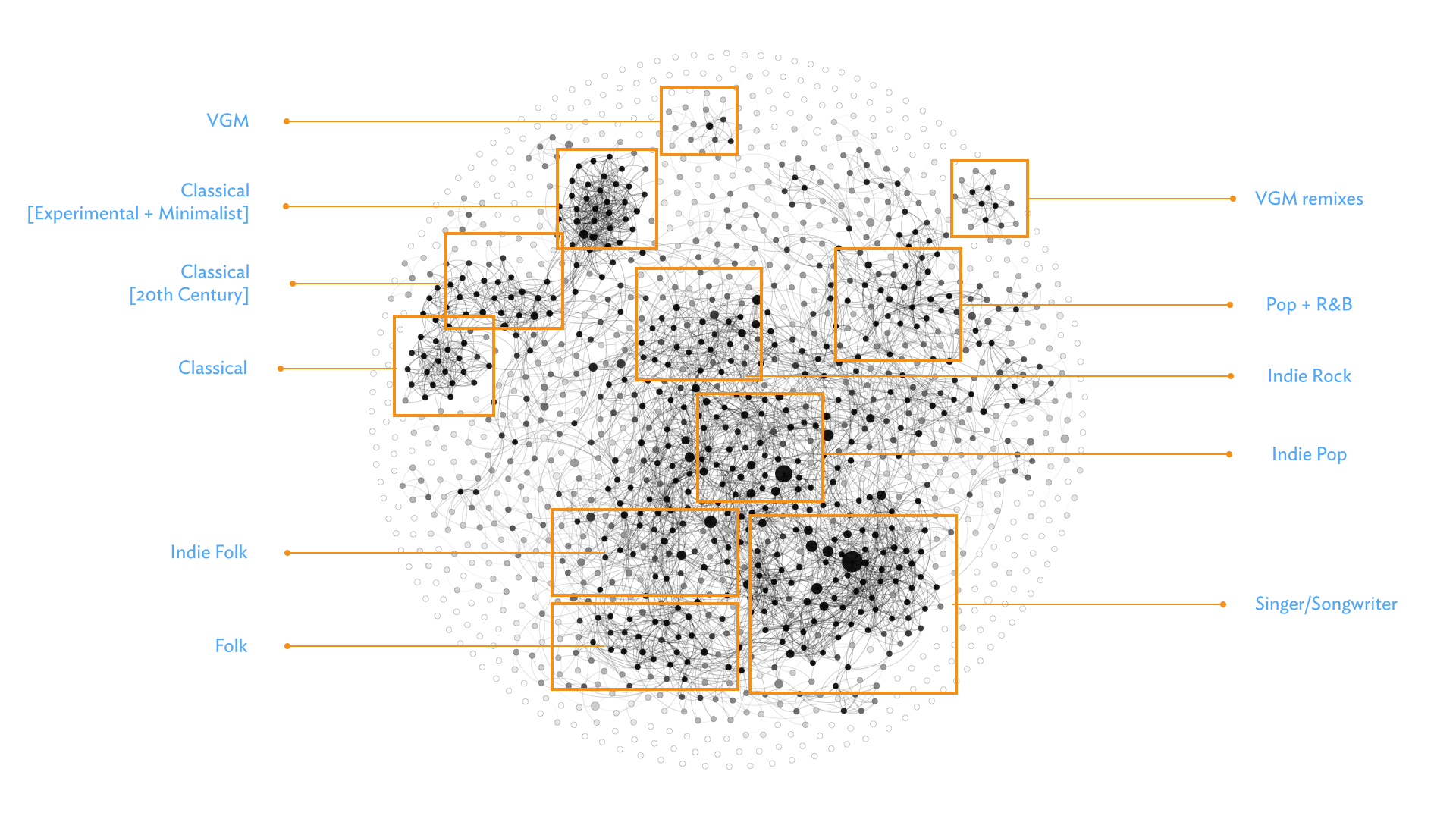
The most interesting aspect to the above is that there is a comprehensible, rational gradation between the genre-clusters. For example, both Folk and Indie Pop stem from the Singer/Songwriter cluster. Video game music (VGM) is closer in nature to the more experimental works of Classical music (e.g. Hauschka and Max Richter).

Next, I wanted to see whether there exists a pattern in the music I listen to in terms of the artist origins.
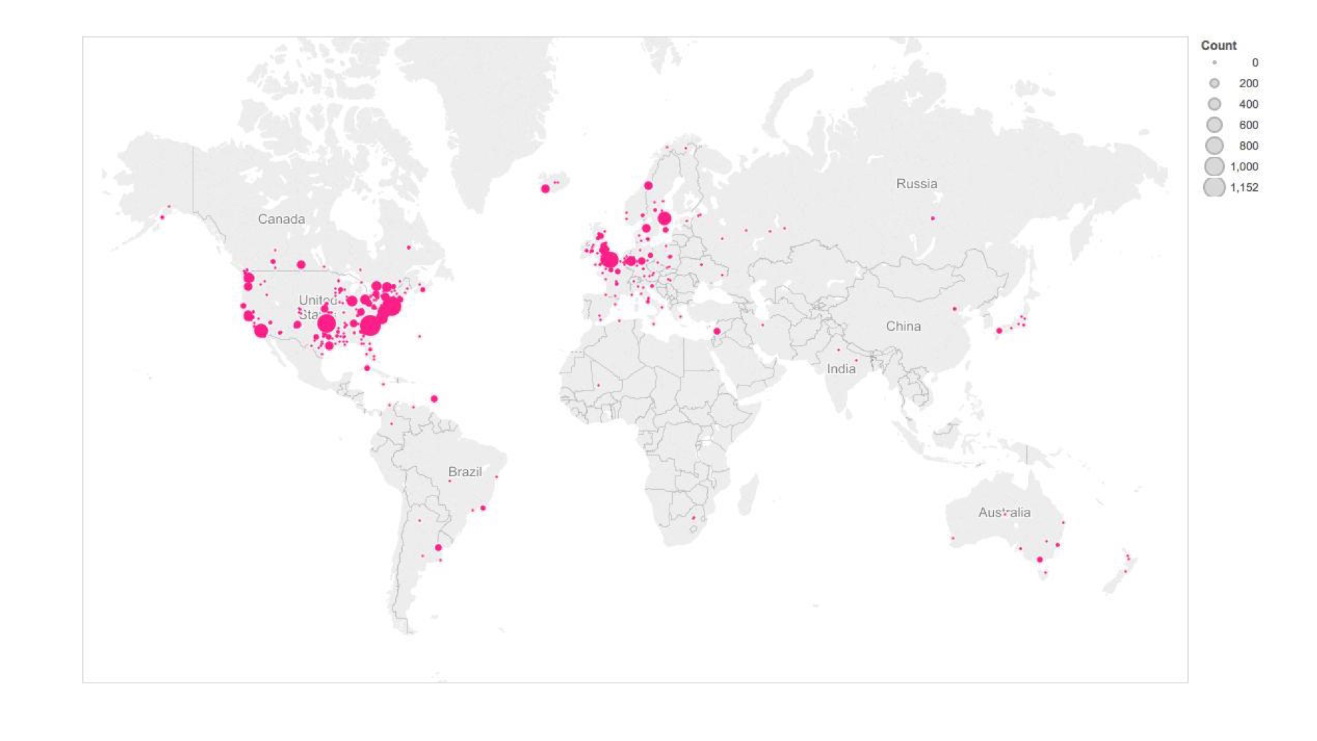
Unsurprisingly, most of the music I listen to is “western” in nature, i.e. from Europe and Northern America.
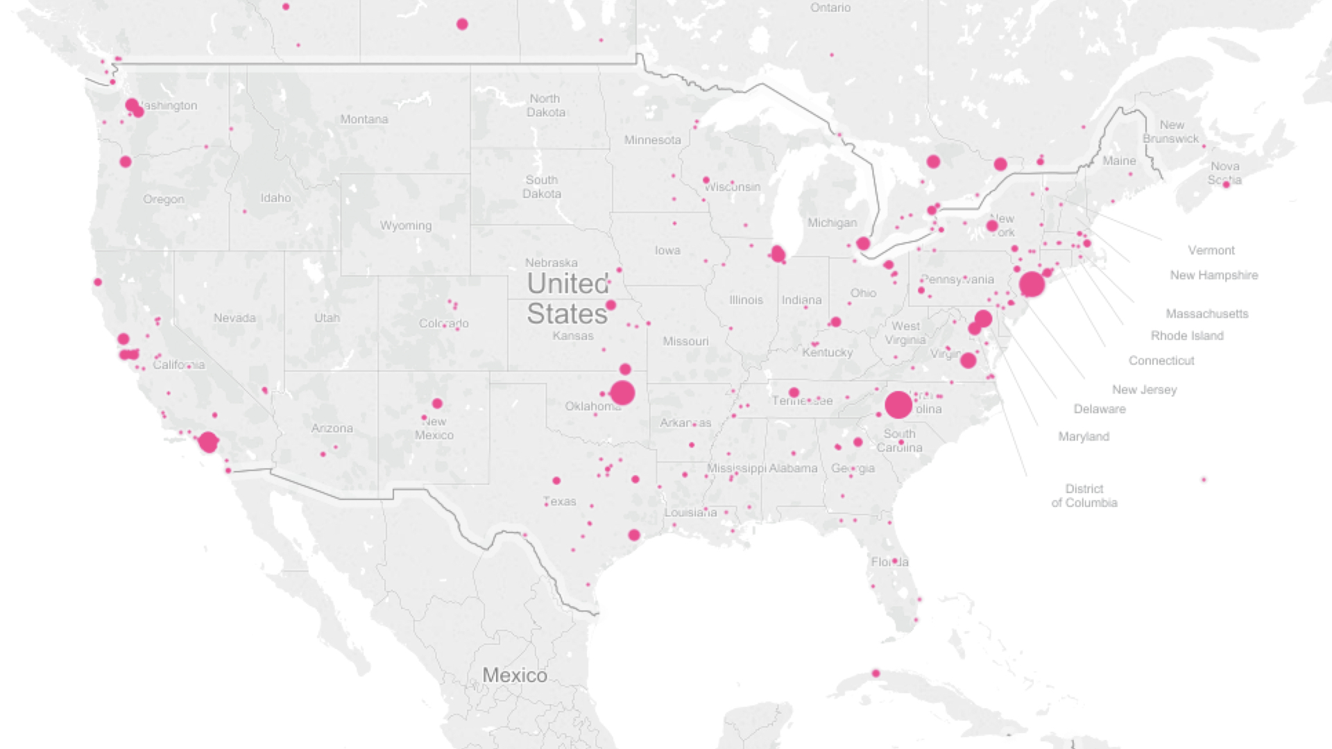
Specifically, the artists I listen to tend to come from coastal USA. For instance, Tori Amos, my most listened to artist in the period of question, is the large dot on North Carolina.
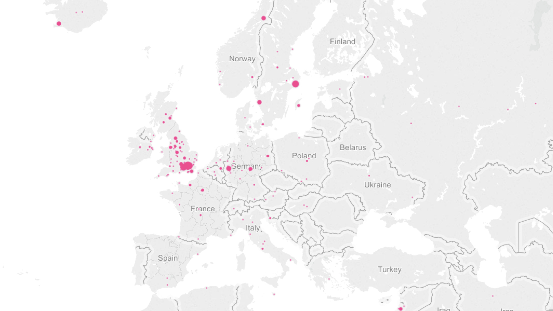
I listen to too many obscure Swedish artists (e.g. Nina Kinert, Anna Ternheim, Tomas Barfod, and Ane Brun), and it shows. Non-Scandinavian, non-Britain Europe is mostly where the classical composers I listen to come from. Also, please note the large dot on Iceland up north. This is Bjork, of course.

To get a kind of micro-view of my tastes, the below is the distribution of the musical acts I listen to. The size of the rectangles are proportional to the numbers of listens, whereas the darkness of the green color indicates how familiar the act is. “Familiar” as in how well known they are to the mainstream.
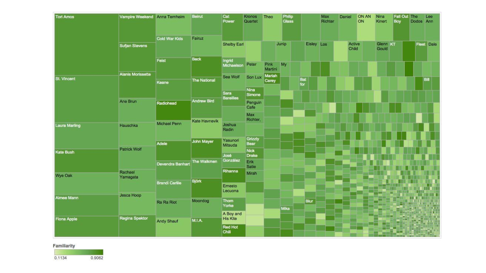
The most apparent pattern is that I am heavily into female vocalist, mostly singer-songwriters, as well as indie pop/rock acts. The other observation is the huge number of artists that I listened to that have an abysmally low listens count.
The below histograms represent the distribution of the music I listen to in terms of energy, tempo, valence (as in the likelihood of the song to evoke a positive feeling), and “hotttnesss” (spelled like that, I kid you not). The latter is echoNest’s term for how hot the artist is commercially.
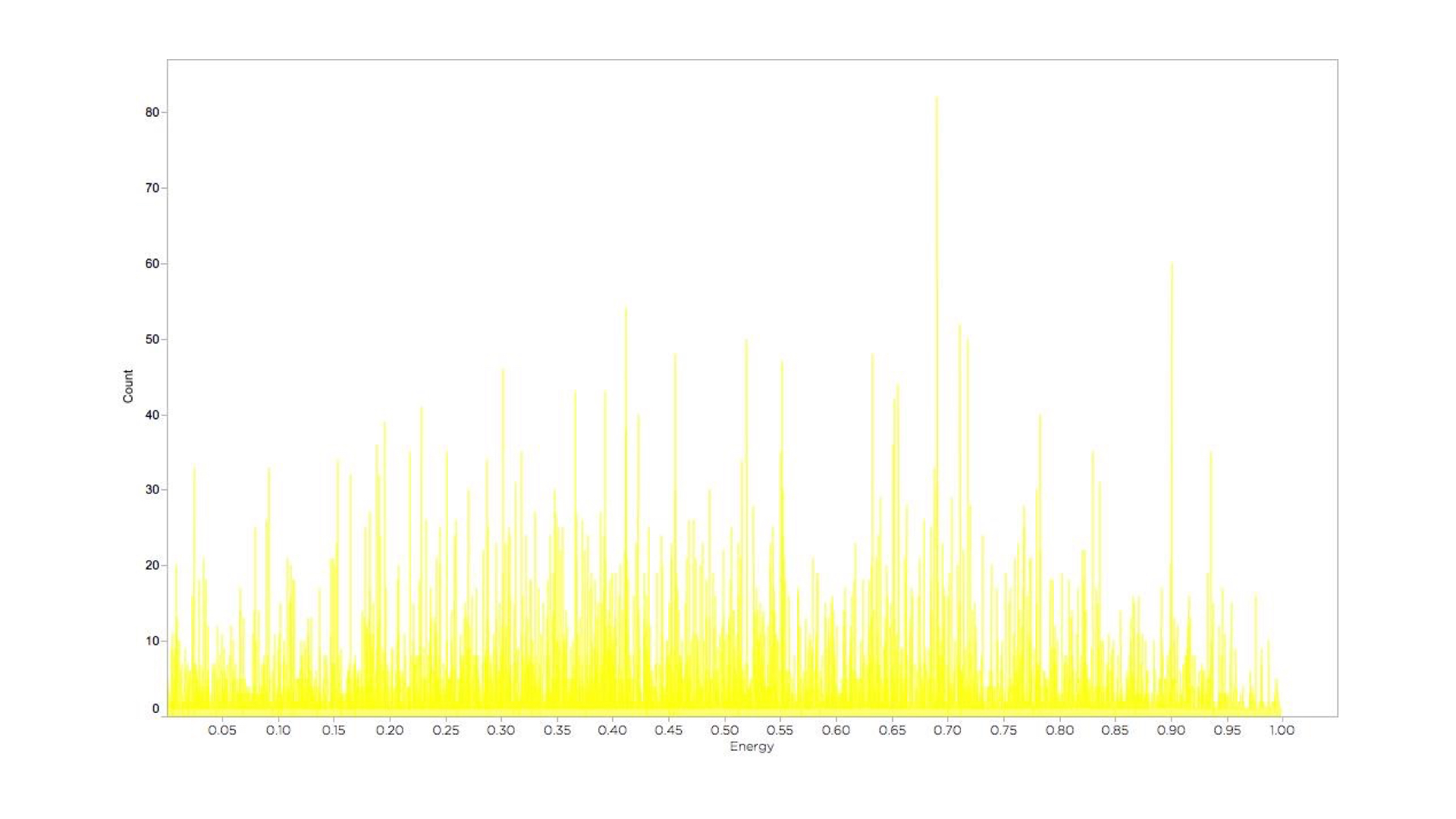
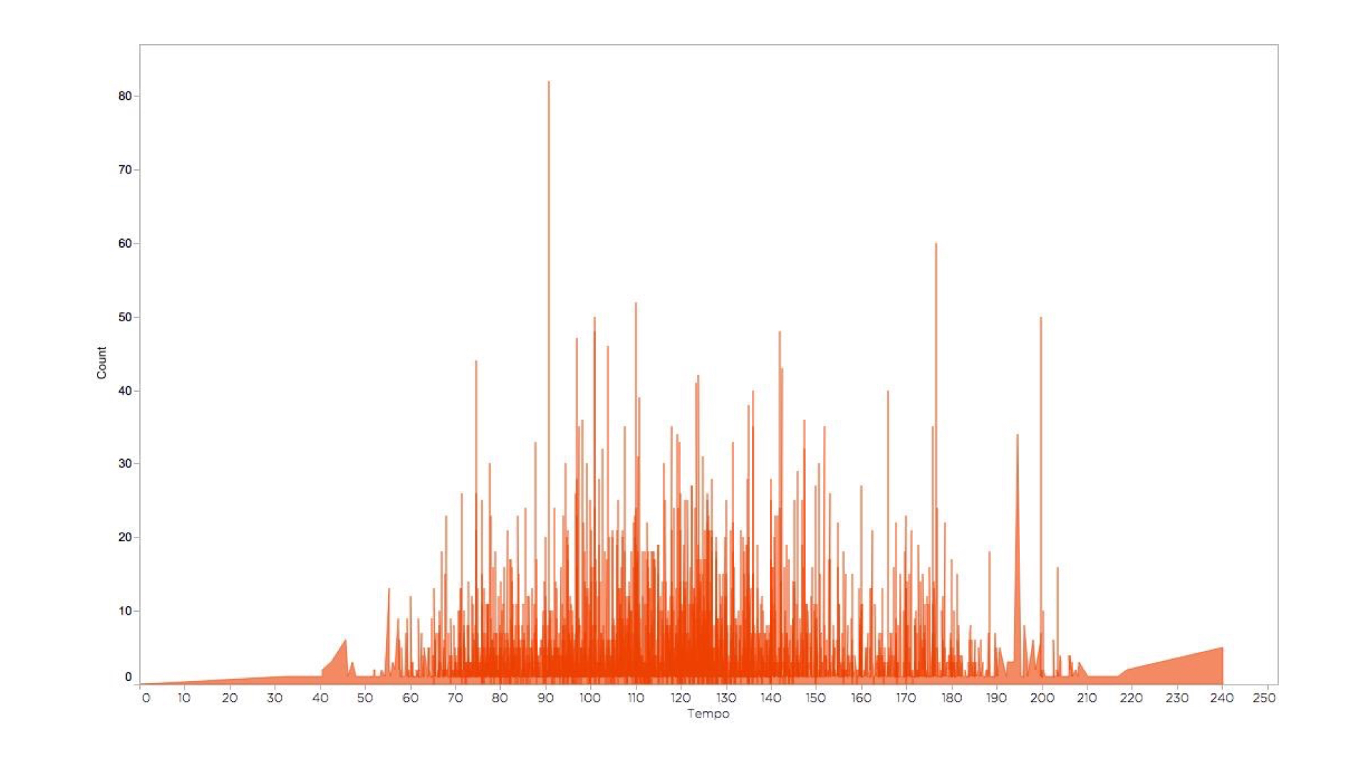
While there is no clear pattern to the energy of the music I listen to, most of my music is in the middle of the tempo spectrum. However, the API seem to exaggerate the tempo of some of the songs, as it is really hard to find songs that are 240 bpms.
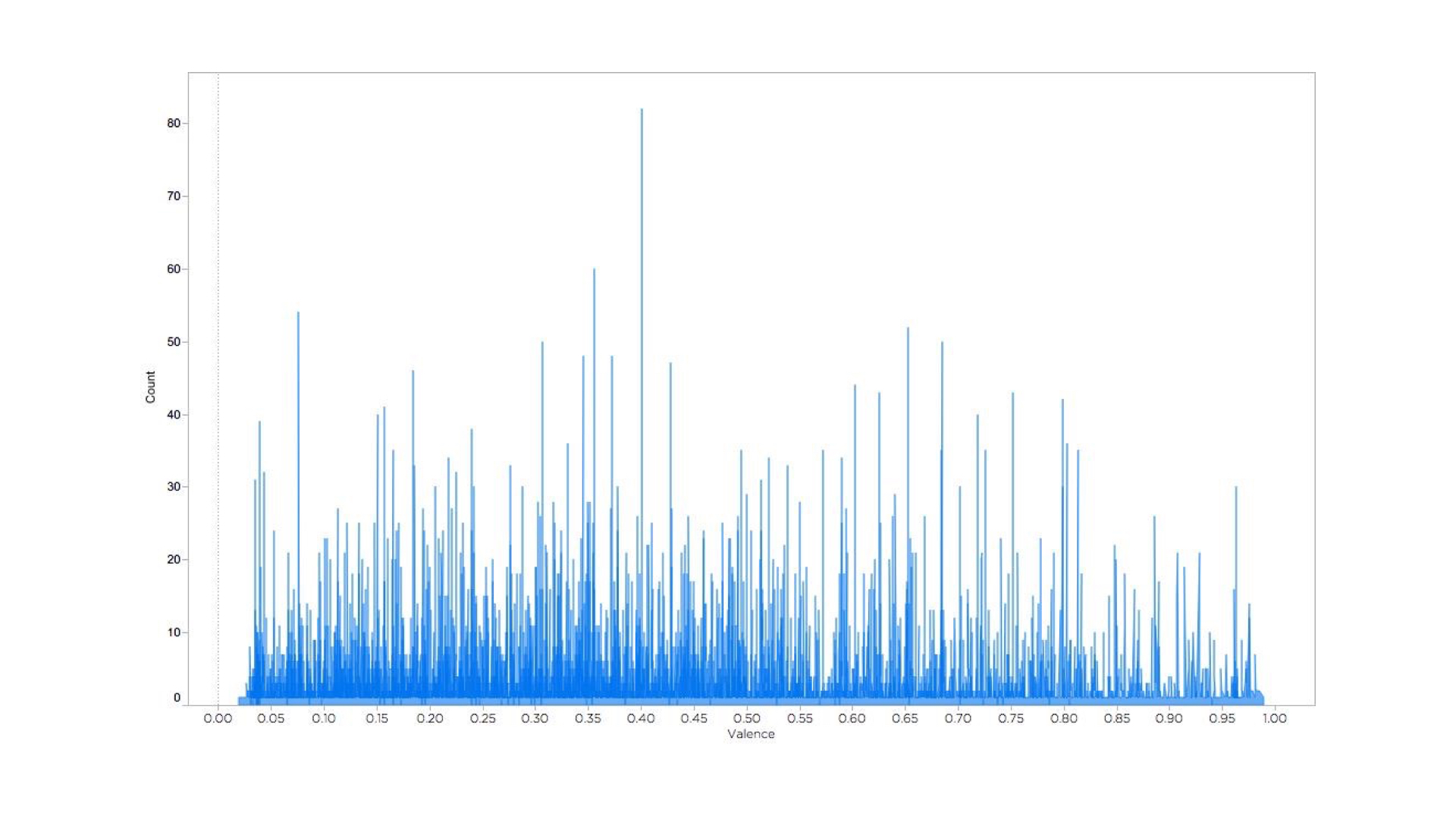

Thankfully, most of the music acts I listen to are below the average in terms of commercial hotness. The majority of my valence values are below 0.50, i.e. they are prone to evoke a sad feeling.
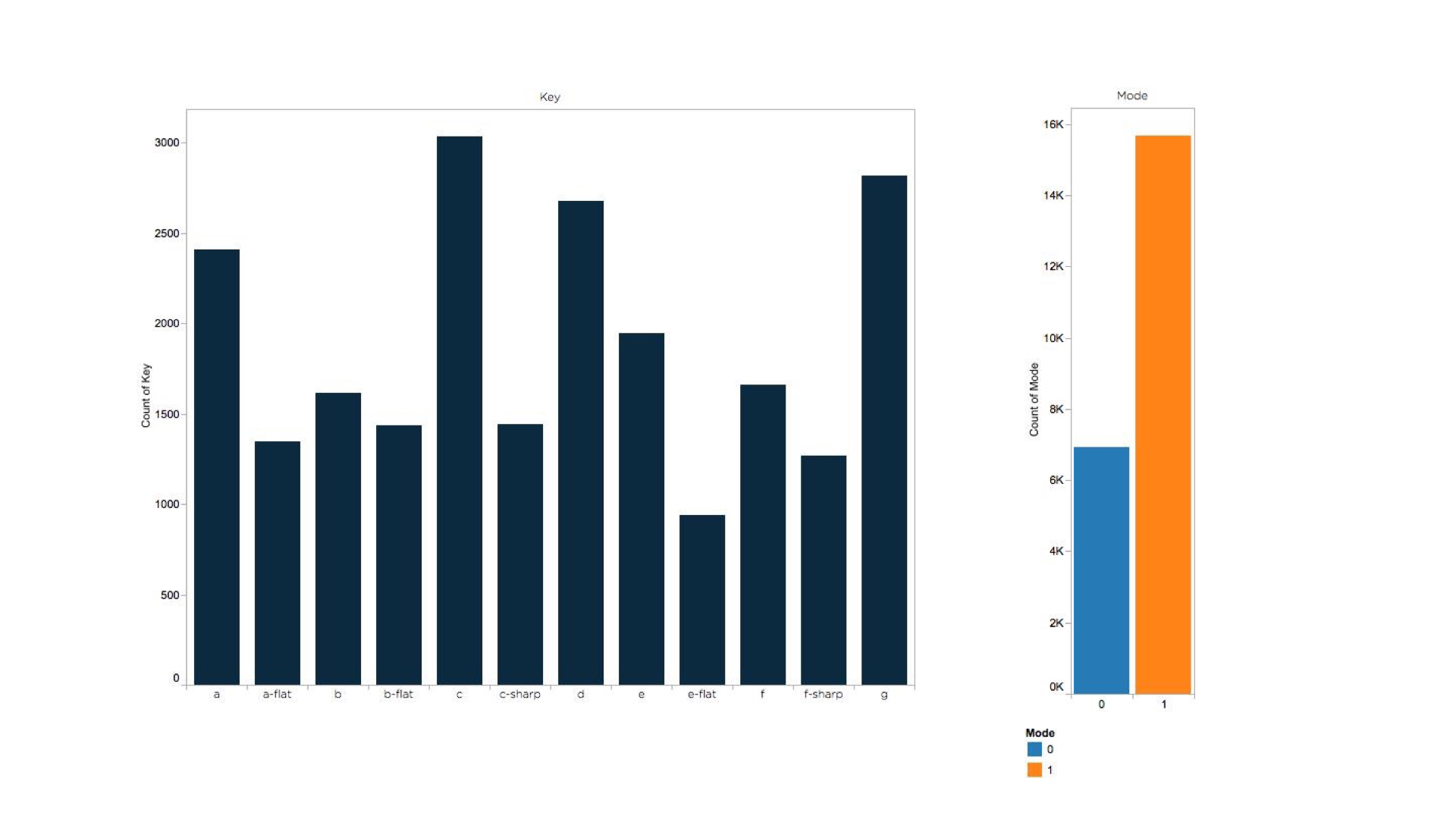
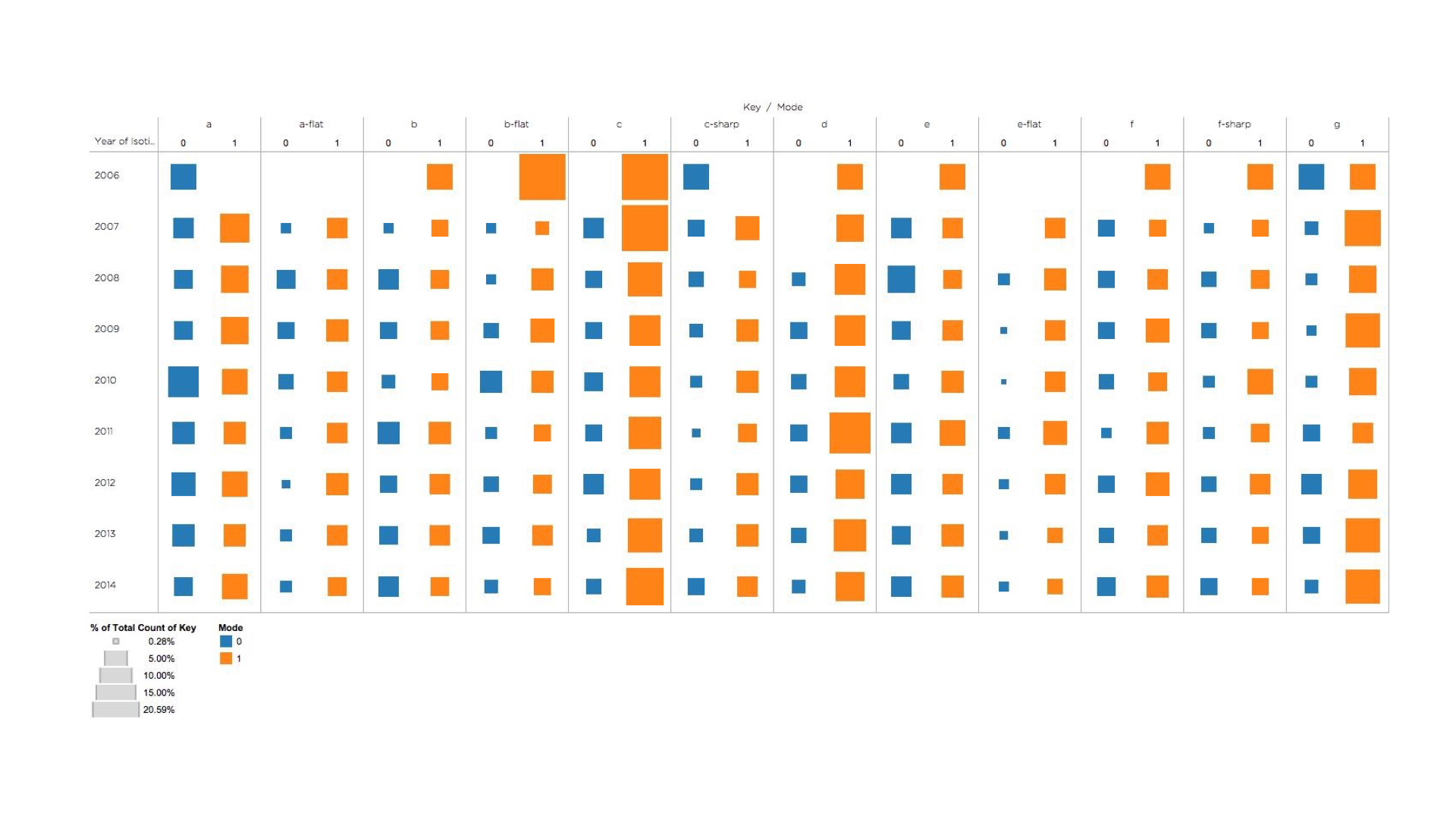
In terms of musical key, the majority of the music was in the a, c, d, and g keys. I listen to more music in the major key (more than 2/3 of all the music I listen to) than the minor one, which is an indication, according to the musicians I asked, of higher upbeatness.
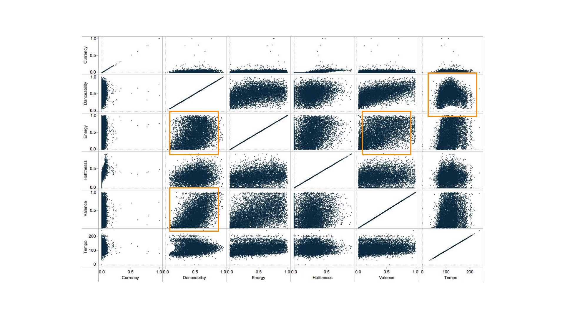
Using a matrix display of the above musical parameters, the most apparent correlation is the bell-curve-like graph of danceability versus valence. There also seems to be a positive correlation between danceability and energy, as well as valence and energy.

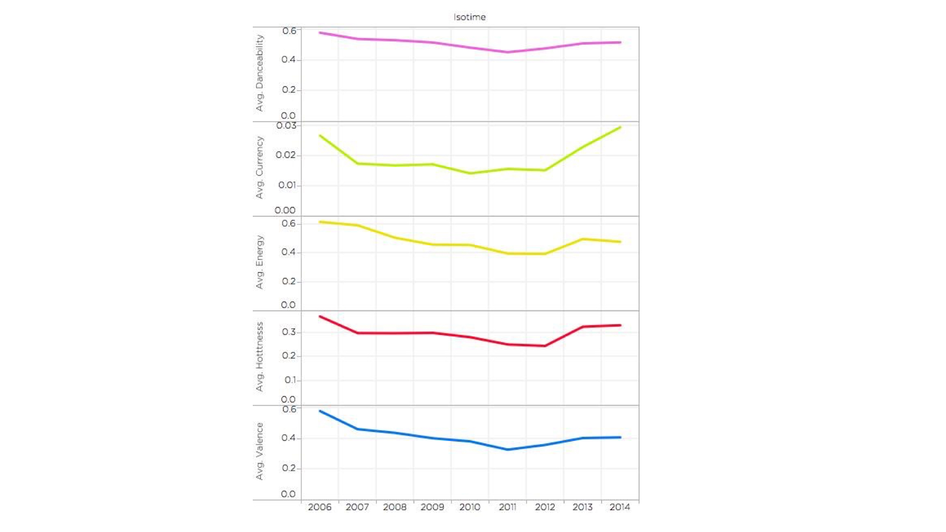
The beauty of a dataset that is inherently a time series is that you can uncover patterns of change over periods of time.
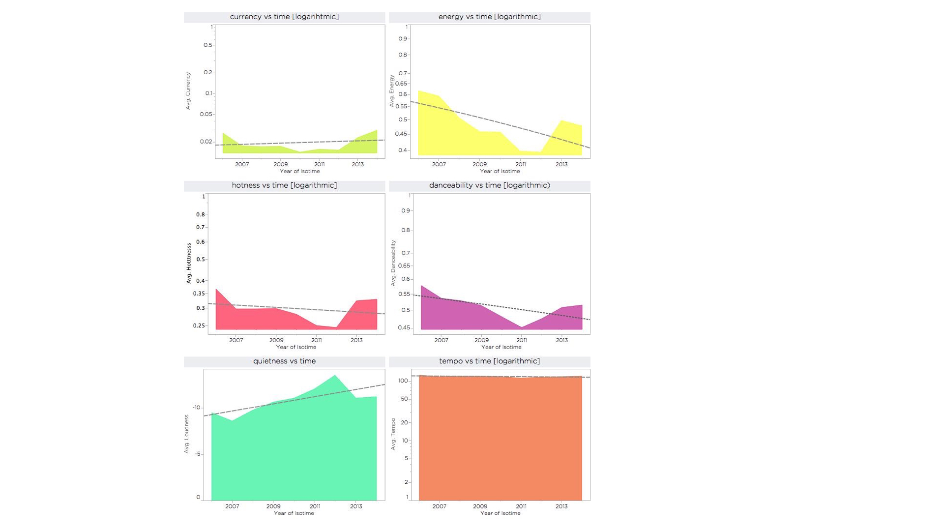
The general pattern of change in my music tastes is towards less danceable, less energetic music as I grow older. (All values calculated in the below graphs are calculated as averages to make up for the uneven volume of listens.)
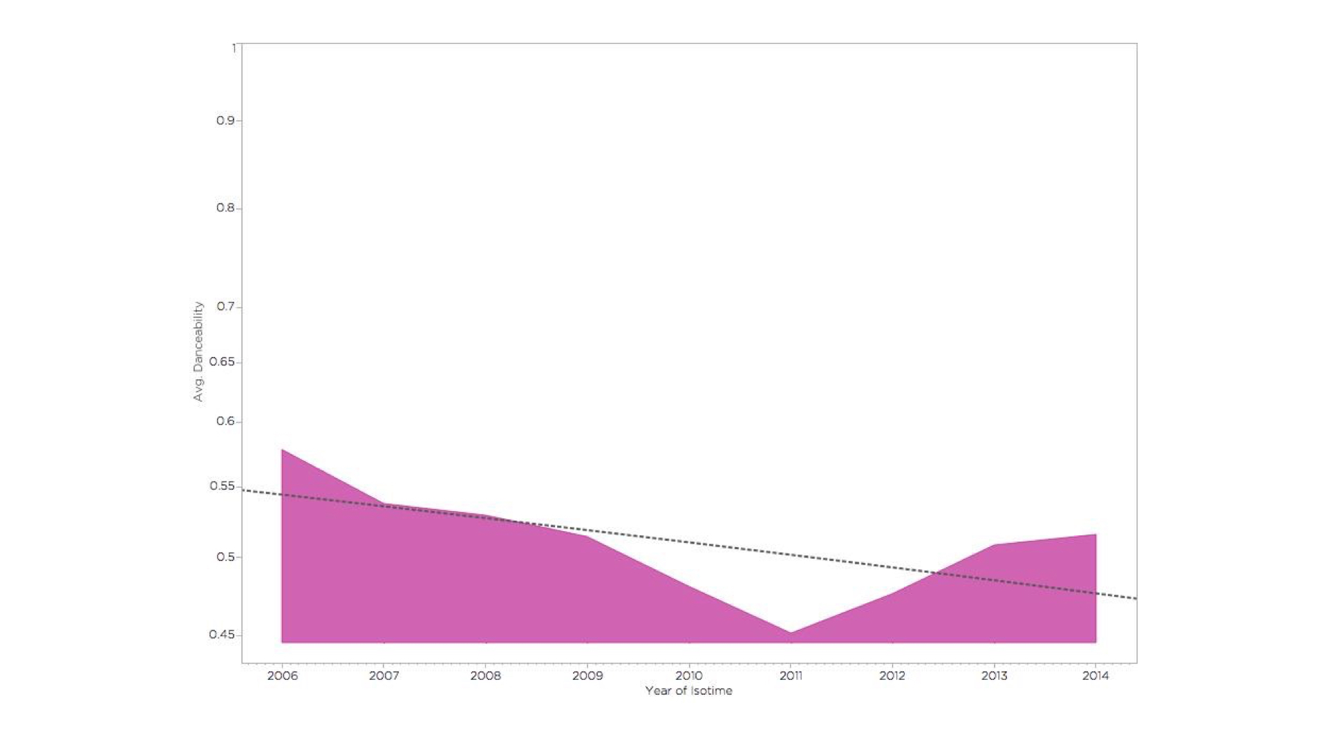
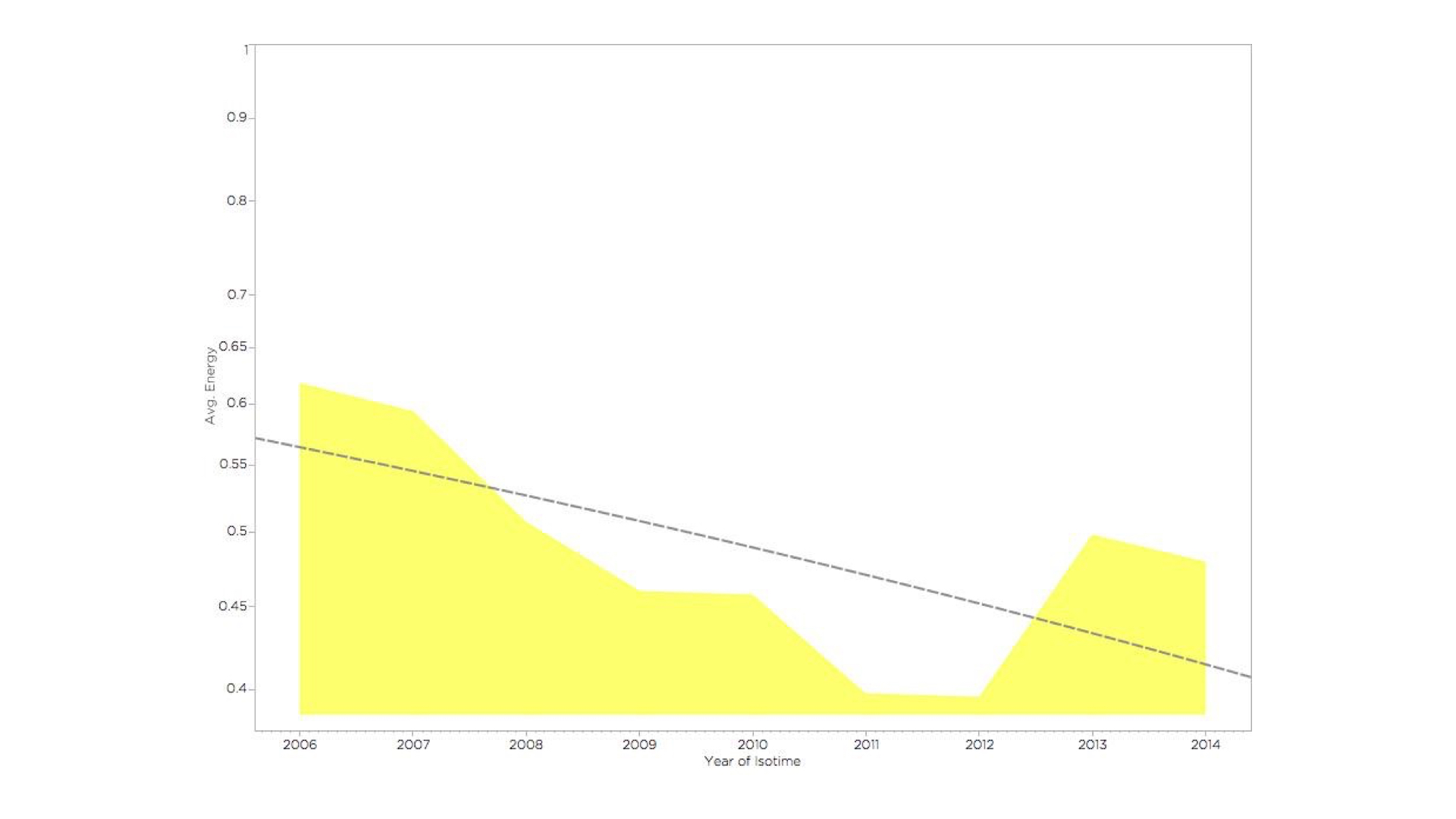
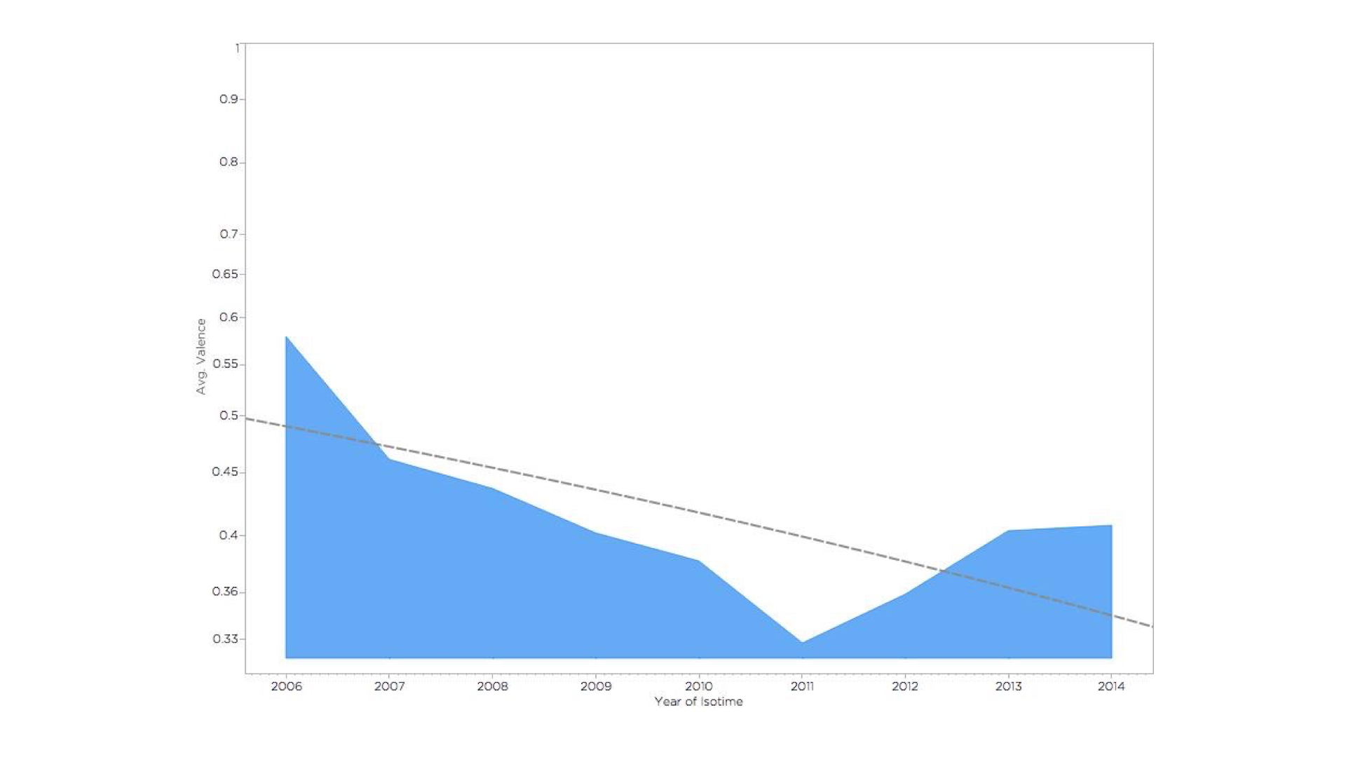
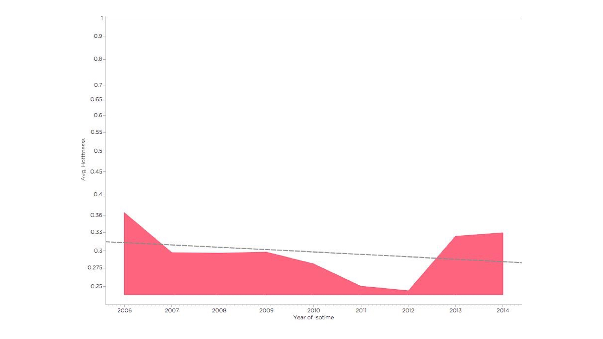
However, there seems to be a consistent dip in most of the upbeatness-related music parameters in 2011-2012. I can only attribute that to a period of depression I was going through back then.
Leave a Reply to Rahab Cancel reply