Category: project development studio

  • Online Wayfinding System [Version 1.0]

    Online Wayfinding System [Version 1.0]

    (This post is a place for my concluding remarks for the online wayfinding system project that I started this semester. It is also the starting point for my work on it in the next semester.)

    In this project, I ventured to explore, design, and implement the concept of an online wayfinding system.

    pds-final-presentation.002

    pds-final-presentation.003


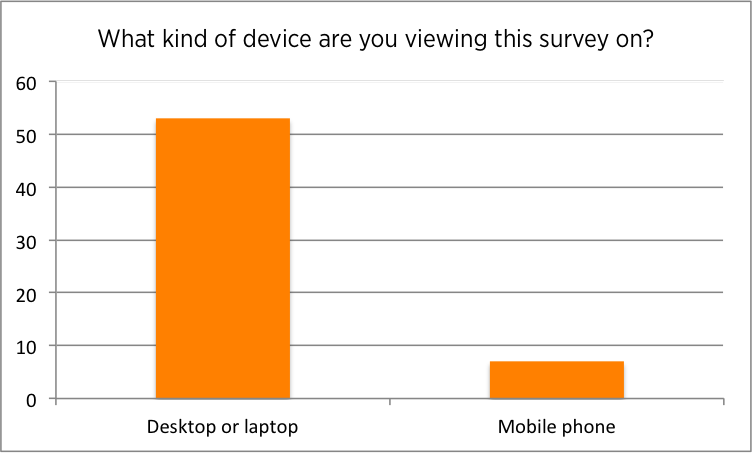
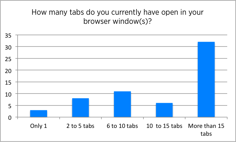
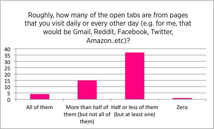
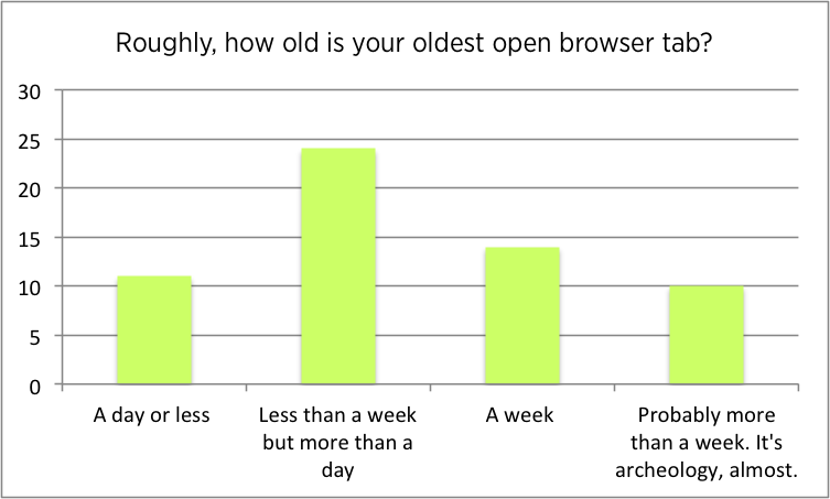
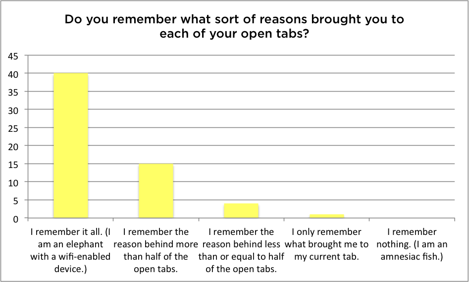
    I started the process by trying to understand the problem further, including circulating a questionnaire about the tabs that the respondents had open in their browser window.

    pds-final-presentation.004

    The problem, I found out, has three main challenging facets.

    pds-final-presentation.005

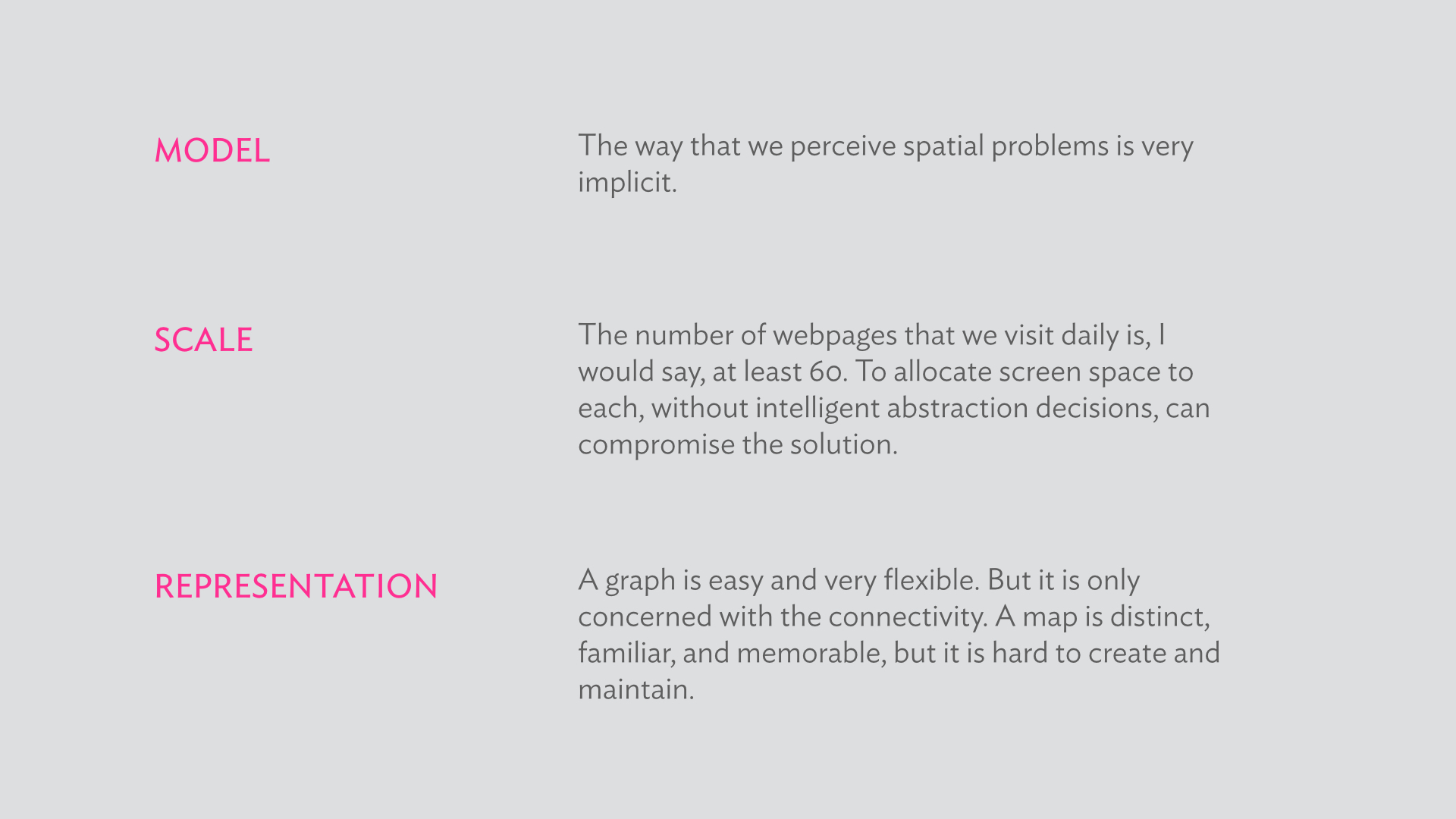
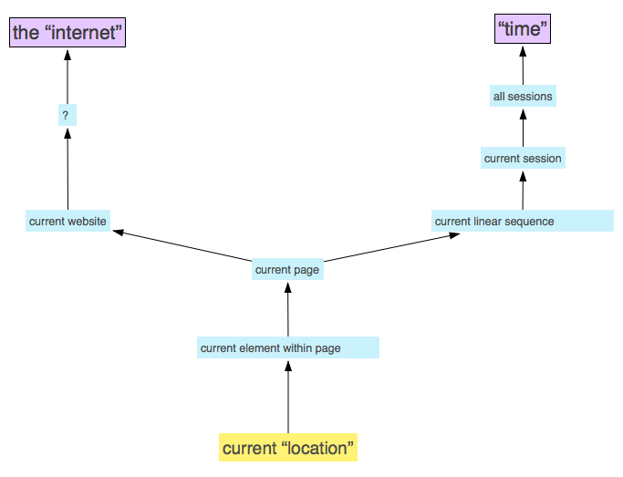
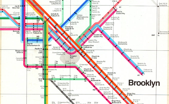
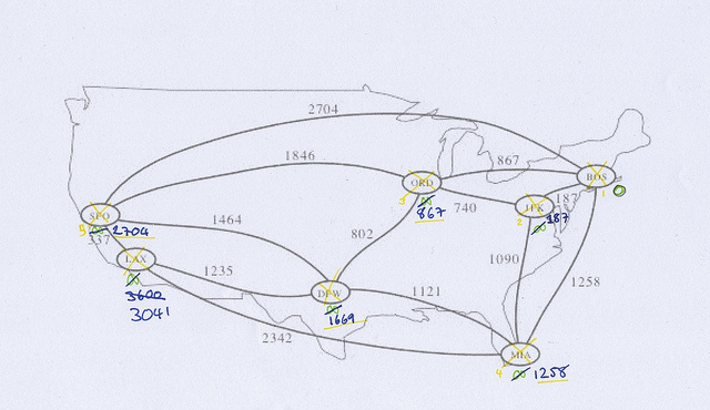
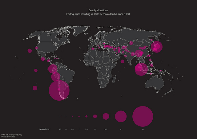
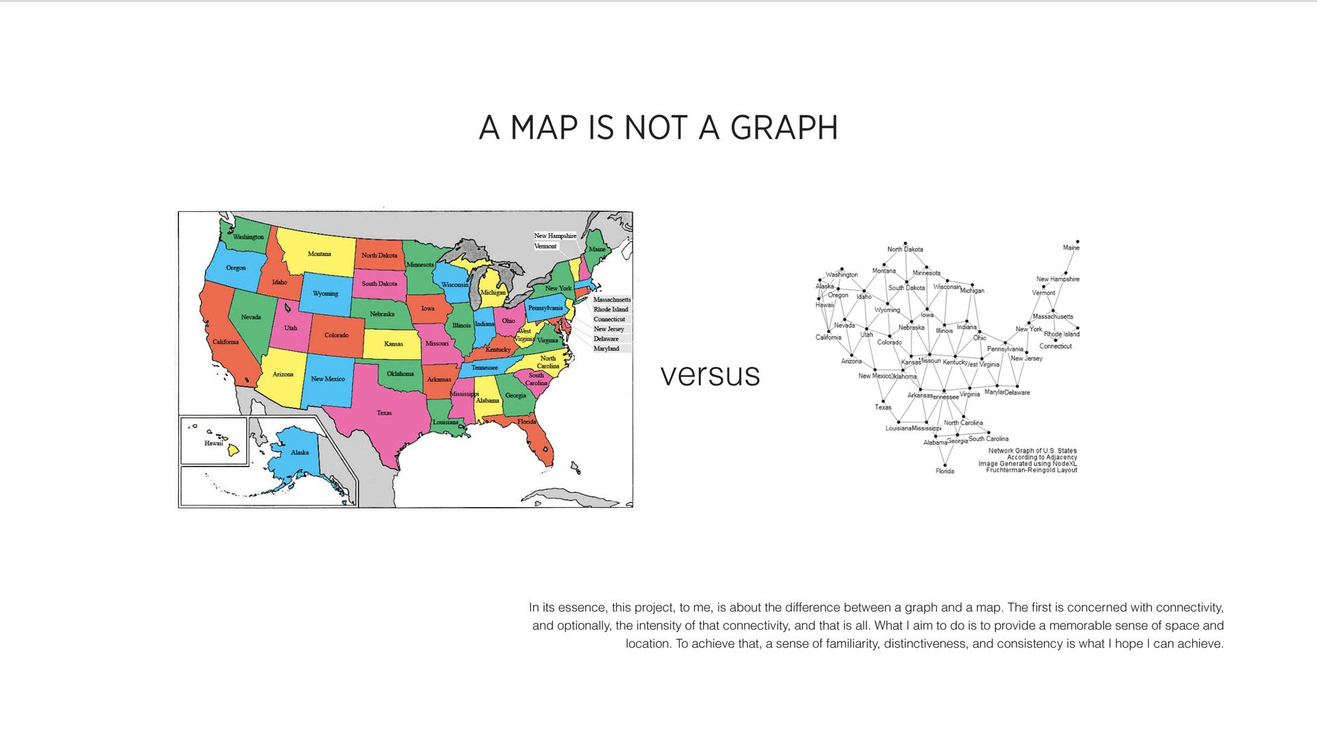
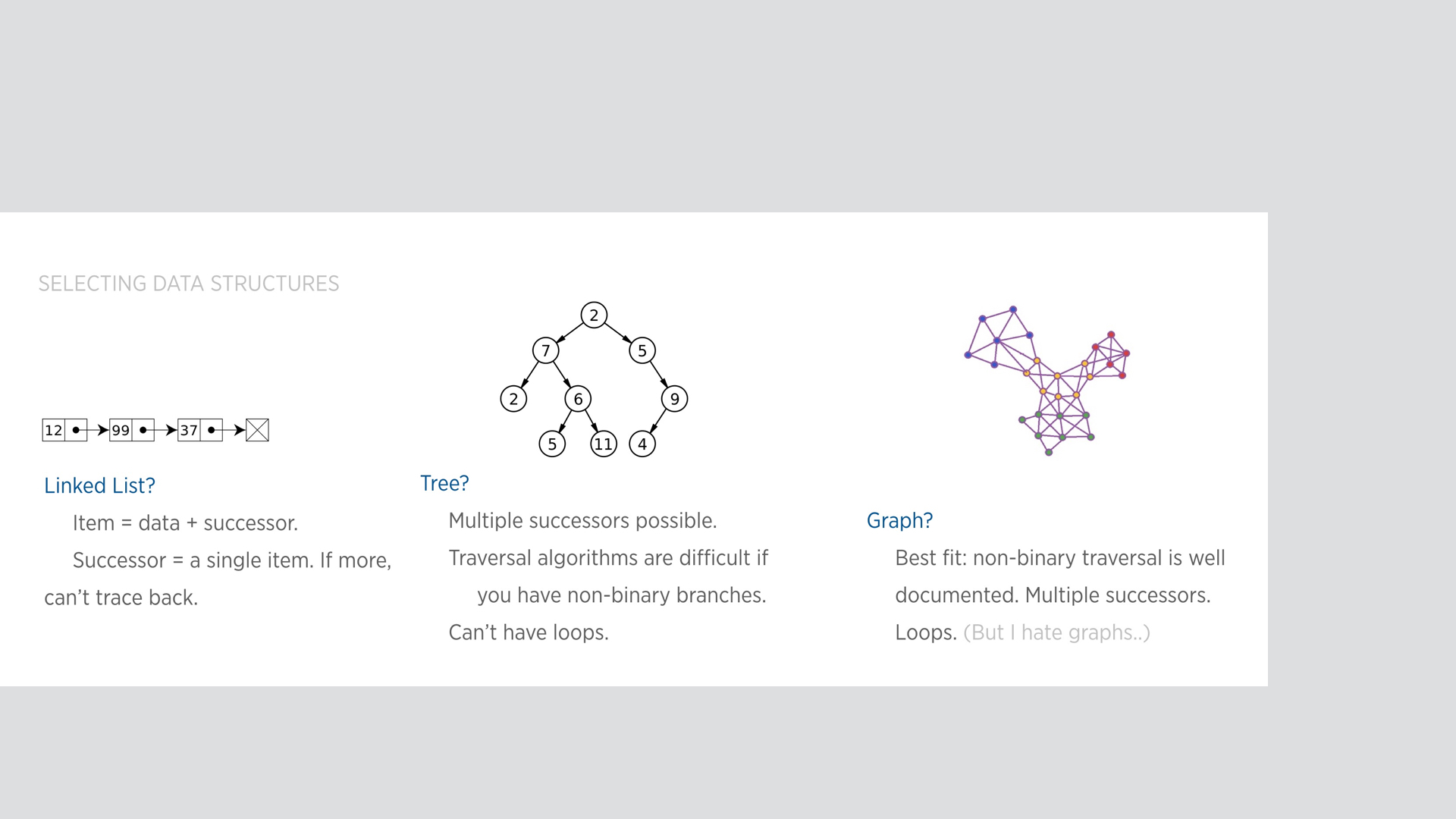
    In particular, the representational aspect of the problem can be distilled by considering maps and graphs as two views of the same underlying data constructs. Each view has its own benefits, as shown below. Which of them is best for the problem at hand?

    pds-final-presentation.010

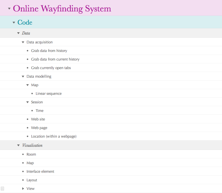
    To explore the problem further, I followed a process that is abbreviated below throughout this semester.

    pds-final-presentation.007 pds-final-presentation.008 pds-final-presentation.009

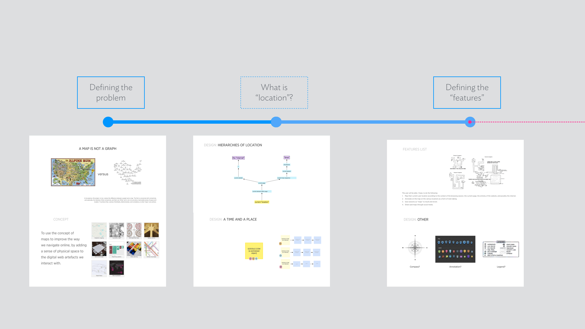
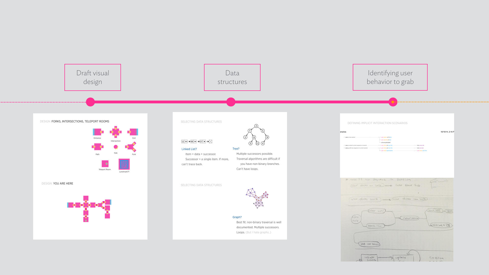
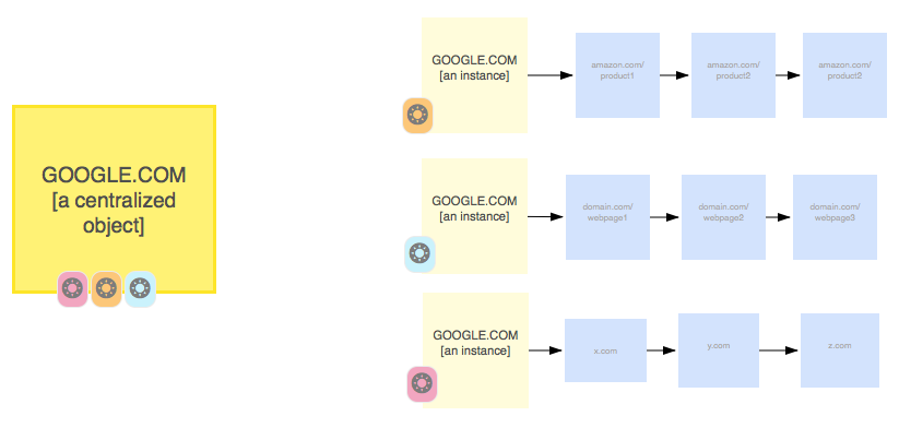
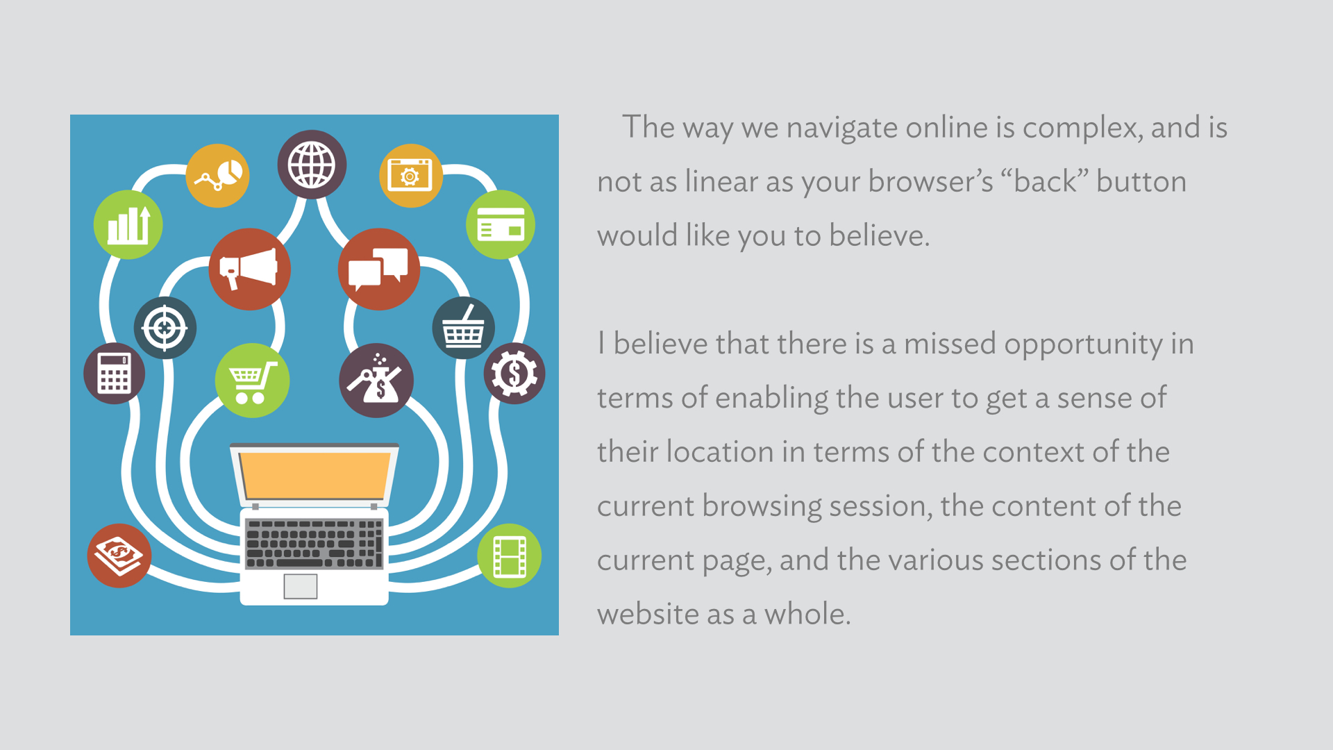
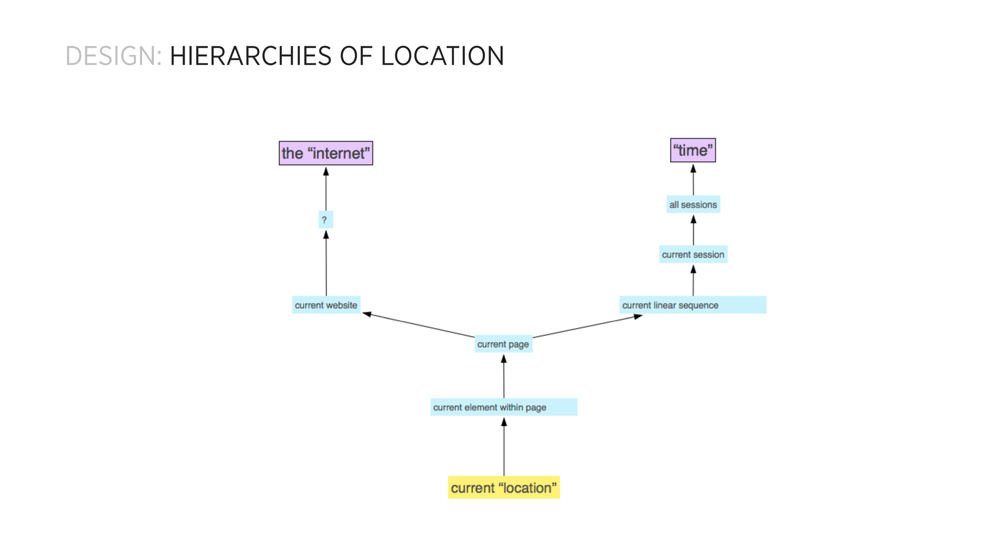
    Additionally, I found out that it is important to understand what a location is when we speak about an online session. There is the obvious, topographical definition of the term, where a web page is part of a domain hosted in a server. More pragmatic, however, is the view of a location as a point of time in a browsing session, as a particular page-visit.

    pds-final-presentation.012

    From there, I started the process of designing the dynamic “map” I wanted to implement.

    pds-final-presentation.013

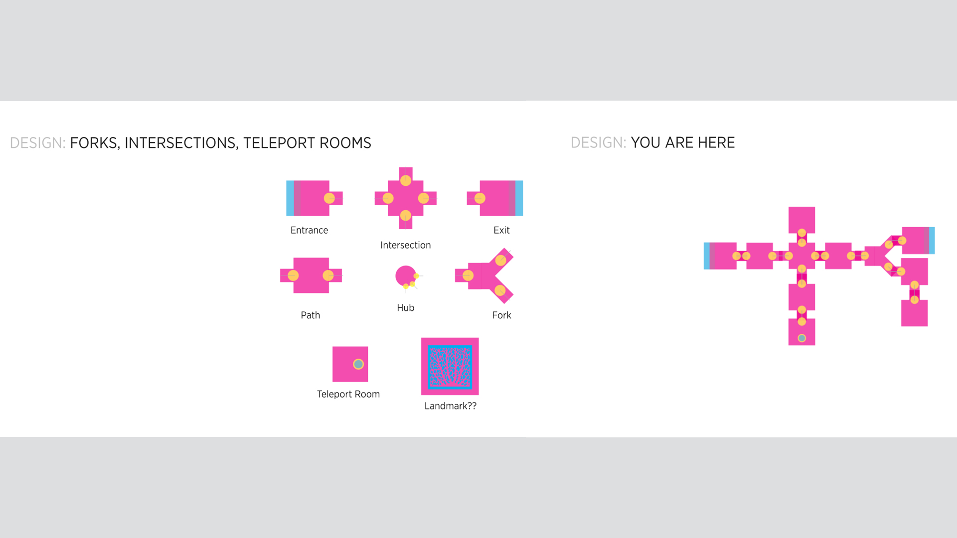
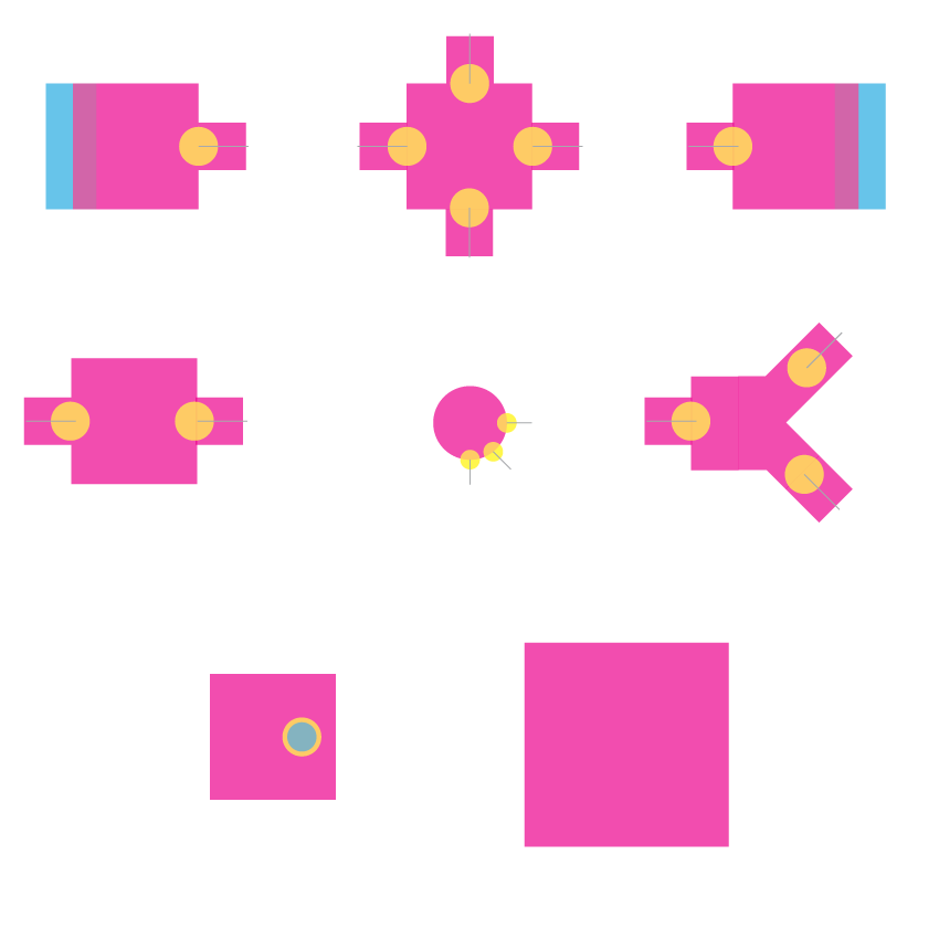
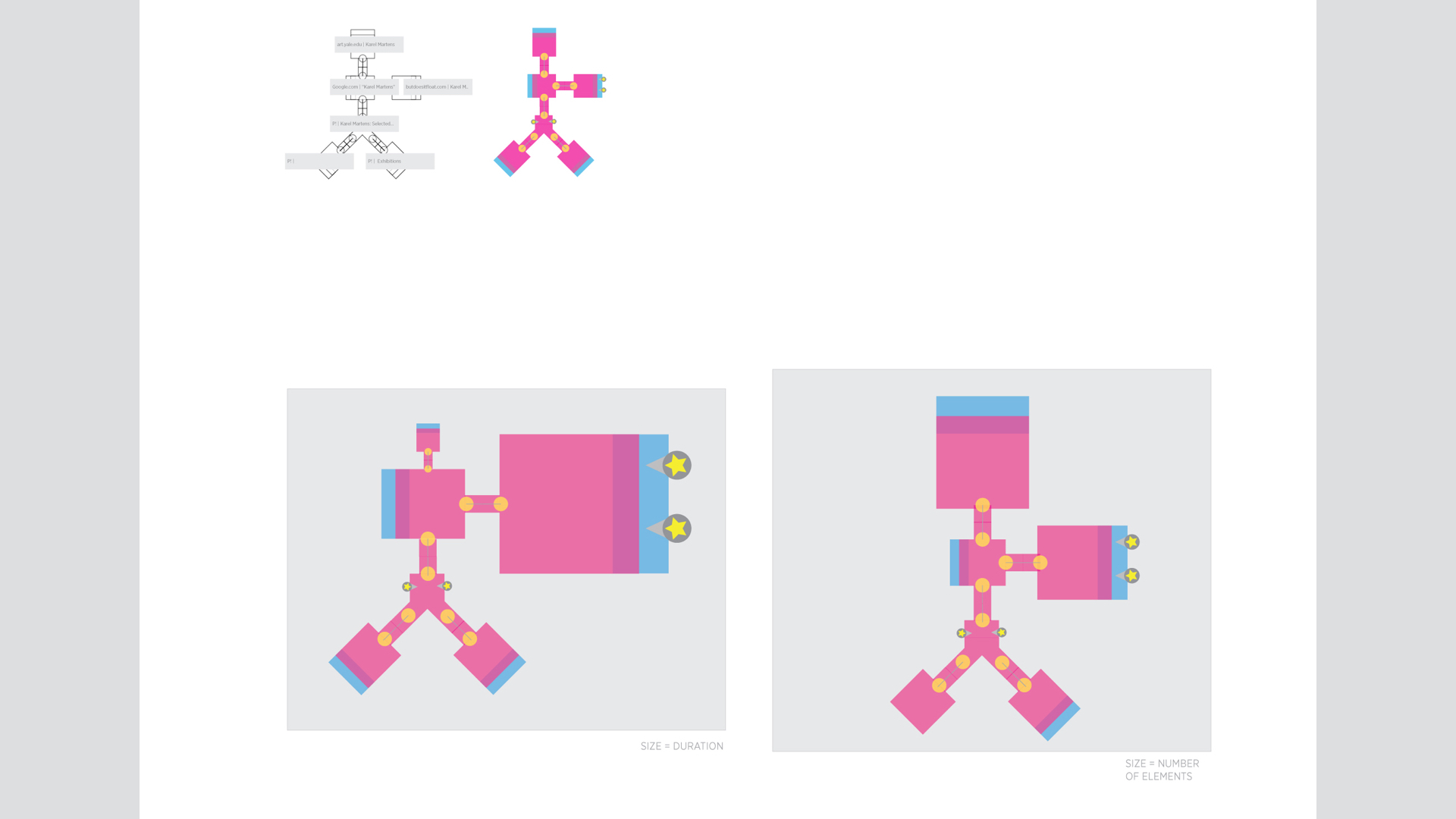
    I worked on defining a modular visual language that allows for showing each visit according to its connectivity to other visits.

    In terms of data structures, I experimented with a few. A graph, at least as a data structure, is the best fit for the job.

    pds-final-presentation.014

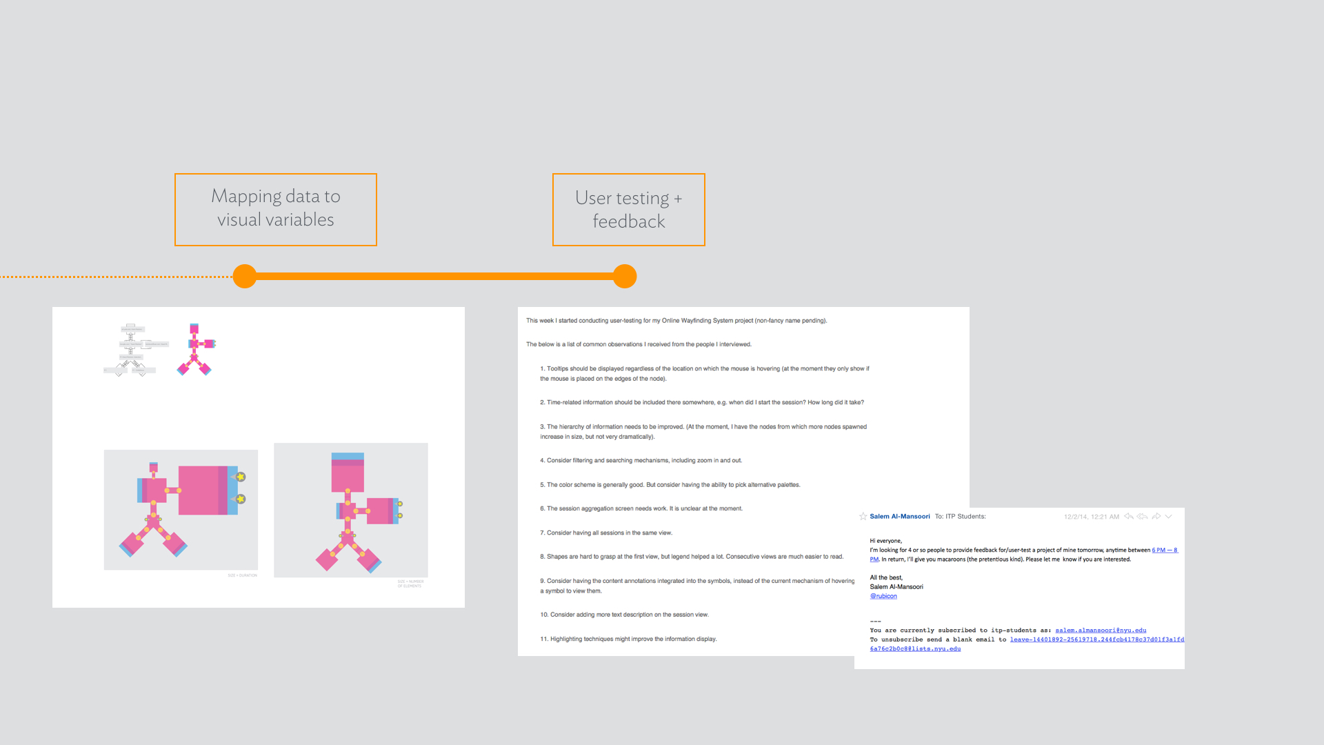
    Next was mapping the parameters of visits to their visual representations. I experimented with a few combinations.

    pds-final-presentation.016

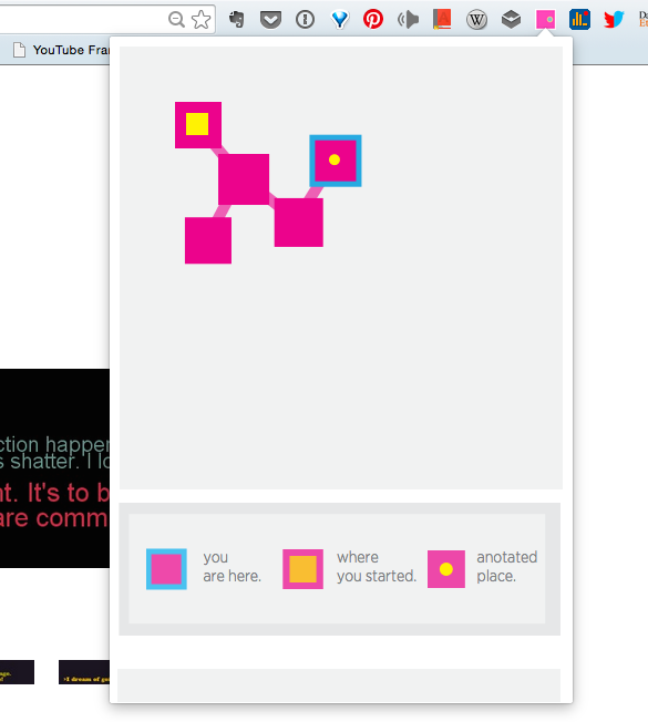
    The final product, at least in its current iteration, is a Chrome extension I created using JavaScript, jsnetworkx, d3js, jQuery, among other framework.Screen Shot 2014-12-14 at 9.21.34 PM


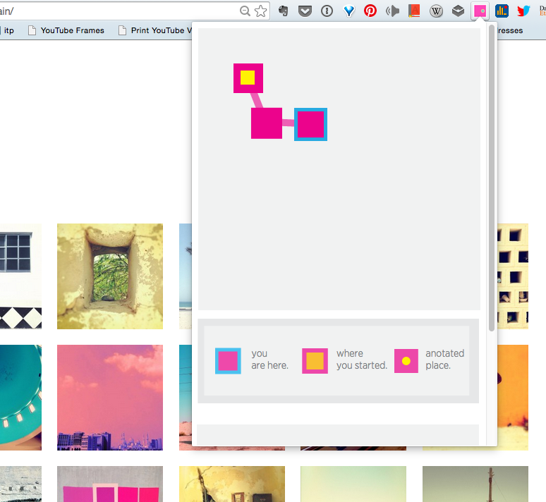
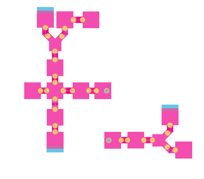
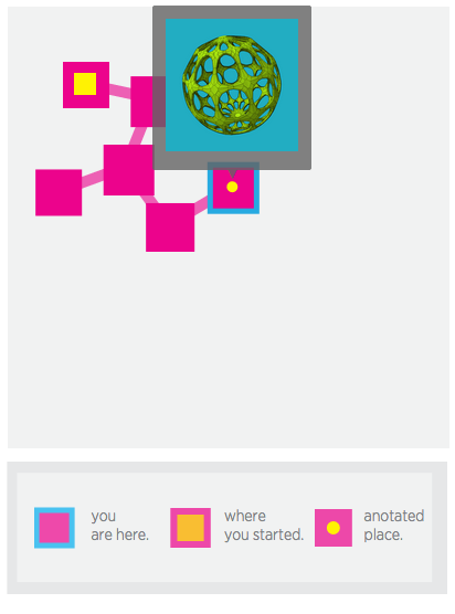
    The main map view is supplemented with a legend. The extension listens passively to the user’s activities, and accordingly categorises each action into a location in the current session, or in a new one.

    As you progress into a browsing session, forks and intersections are introduced to the map view. The size of each node is proportional to the number of paths it led to.

    Screen Shot 2014-12-14 at 9.24.19 PM

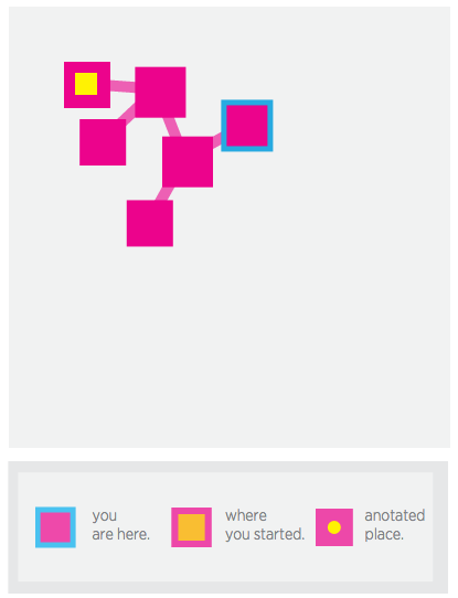
    The user also has the ability to “annotate” each node by selecting an element from the page, whether an image or a text, to be added to the node as a form of note-taking and highlighting for future reference.

    Screen Shot 2014-12-14 at 9.26.56 PM

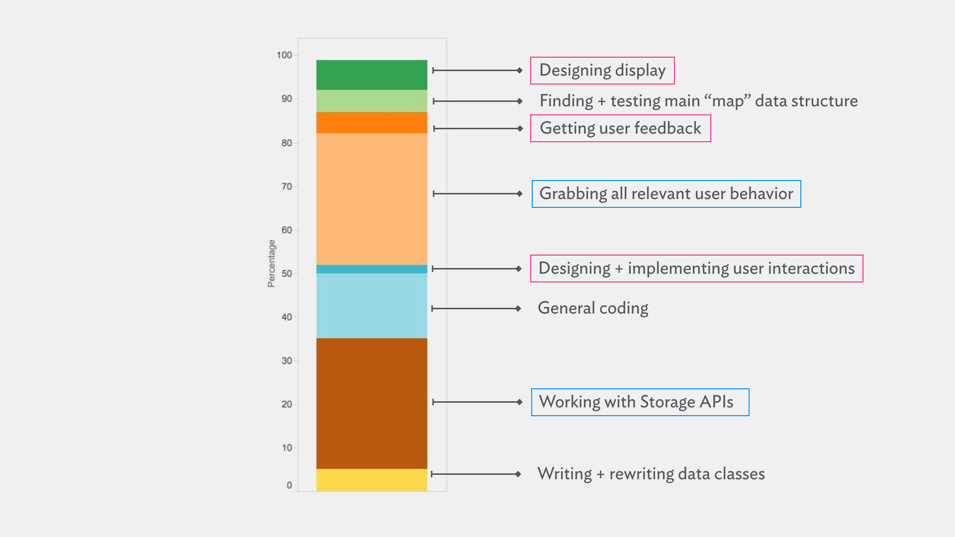
    The below is a rough estimation of how I’ve spent my time in this project. How I wish it was is more of the pink stuff and less of blue ones.

    pds-final-presentation.017


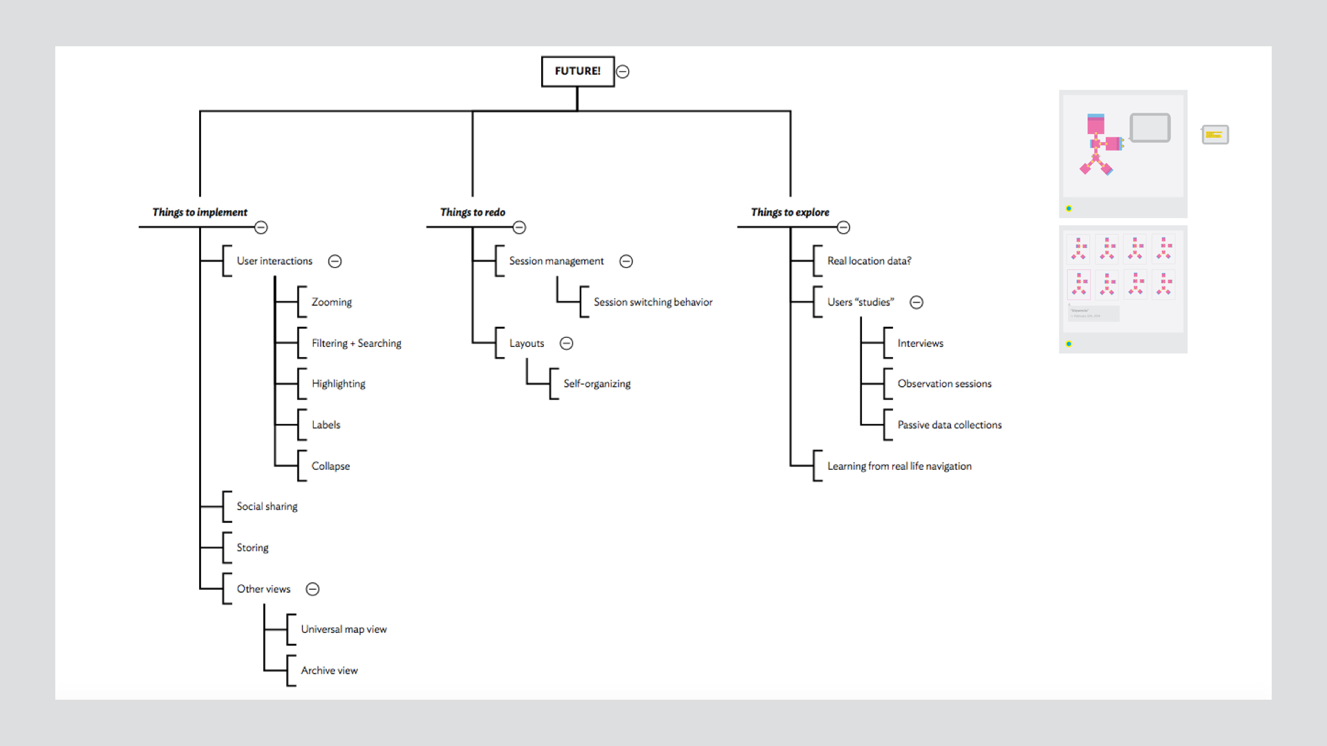
    What about the future, you ask? The future sounds exciting.

    pds-final-presentation.018


  • Notes on User Testing

    Screen Shot 2014-12-04 at 1.11.31 PM

    This week I started conducting user-testing for my Online Wayfinding System project (non-fancy name pending).

    The below is a list of common observations I received from the people I interviewed.

    1. Tooltips should be displayed regardless of the location on which the mouse is hovering (at the moment they only show if the mouse is placed on the edges of the node).

    2. Time-related information should be included there somewhere, e.g. when did I start the session? How long did it take?

    3. The hierarchy of information needs to be improved. (At the moment, I have the nodes from which more nodes spawned increase in size, but not very dramatically).

    4. Consider filtering and searching mechanisms, including zoom in and out.

    5. The color scheme is generally good. But consider having the ability to pick alternative palettes.

    6. The session aggregation screen needs work. It is unclear at the moment.

    7. Consider having all sessions in the same view.

    8. Shapes are hard to grasp at the first view, but legend helped a lot. Consecutive views are much easier to read.

    9. Consider having the content annotations integrated into the symbols, instead of the current mechanism of hovering over a symbol to view them.

    10. Consider adding more text description on the session view.

    11. Highlighting techniques might improve the information display.


  • Online Wayfinding System, presentations

    Online Wayfinding System, presentations

    (This is in relation to my ongoing Online Wayfinding System project.)

    This is just a housekeeping post to post both presentations I’ve done so far for this project to the blog.

    I. Proposal

    II. Progress


  • Listening to the user

    (This is in relation to my ongoing Online Wayfinding System project.)

    Listening to the user

    This week I conducted a survey. The main thing I wanted to learn about is whether users feel overwhelmed about their open tabs. Specifically, how many open tabs they often have open, what is the rough age of the oldest tab, and whether they do remember what brought them to each tab.

    survery-1 survey-2 survey-3 survey-4

    While most people had (unsurprisingly) more than 15 tabs, most of their tabs fell in the range 2 to 7 days old. I was expecting them to be older, but it is understandable as the respondents were ITP people, and we all go through our one-week cycles of homework.

    Another important thing to note is that, typically, more than half of the tabs open are for regularly visited websites (e.g. email and social media). To me, this means that those belong to another category than “sessions.” They are static points that are always there and always open.

    survey-5

    The above is a surprising finding to me, as most people indicated that they do remember the “reason” behind their open tabs. I think I was asking the wrong question, as yes, the reason (or more like the context, as in “my ICM assignment”) is easy to recall. But what about the process of navigation, the detours, and the progression of research?

      Listening to the user’s interaction

    I’ve been also working on “listening” to the user’s interaction with: 1) his tabs,  and 2) the links he clicks. I use the term “listening” in its most technical sense, as in writing the code that listens to events and register them. I am, at the moment, able to detect when a new tab is opened, or when a tab’s url has changed. This data is used to instantiate nodes in the underlying graph data structure.

      Listening to the data

    Another thing I’ve been also experimenting with is the idea of grabbing more “meta” information about the content category of each visited website. I found an API that provides such information, but I am yet to try it out in action. (There is also the matter of the rate limitation, as there is a paid fee that incurs above a certain threshold.)

    An interesting aside is a book I’ve been reading (more like randomly picking up and looking through). The book is called Elements of Spacemaking. It is about the elements that make up manmade spaces, and what it all means. For example, windows are not only a way to ventilate and let light in, they are also a medium of communication. Walls are there to guide movement; they are not only vertical surfaces.

    Processed with VSCOcam with f2 preset

  • Code Planning

    (This is in relation to my ongoing Online Wayfinding System project.)

    Screen Shot 2014-10-02 at 3.11.21 PM

    I think it is time to get my proverbial feet wet. I’ve recently started coding my way through the project, and it is exciting. The above is an outline I’ve put through to help guide my process.

  • Forks, Intersections, and Teleport Rooms [Design Considerations]

    Forks, Intersections, and Teleport Rooms [Design Considerations]

    (This is in relation to my ongoing Online Wayfinding System project.)

    To simplify my work, I have to internally agree on a taxonomy of discrete elements that constitute the system I have in mind. For a wayfinding system, the first set of concepts that needs to be made concrete is the features of the geography. As I am basically making up a geographical representation for a space that does not really exist, I chose to think about and borrow from the basic elements of traversal that we come across every day.

    I also chose to translate them into a tileable, iconographic system (static at the moment, I made its elements in Illustrator).

    entrances+exits+forks+intersections+hubs

    Obviously, a system of space needs two terminal points: an entrance and an exit. They are visually represented as the top left tile and the top right tile, respectively. A path between the entrance is typically a mixture between spaces that serve nothing but progress to a destination, as well as tiles that serve as controllers of directional flow: forks, and intersections.

    An intersection, as I see it, is a tile that allows change into 3 or more possible alternative spatial sequences. I present them visually as the top middle tile. However, they generally occur less frequently than forks. A fork is a binary choice of one of two possible sequences. They are represented as the rightmost icon in the second row in the illustration above.

    Taking the idea of an intersection into the extreme, we get the concept of hubs. A hub is a space that serves nothing except control the flow to one of many possibilities. As a concrete example in relation to my online wayfinding system, a search results page (e.g. what you get after entering “fruits” to Google’s search field), has no inherent value except for its aggregation of links. Such a page is simply a hub: you only go there to go to one of many places. In the diagram above. The hub is presented as the circular icon in the middle of the second row.

    Another control flow element, as I presented in my previous design considerations post, is a teleport room. In their simplest term, they allow the user to travel from one collection of contiguous locations to another instantaneously, allowing the linkage between regions and sessions. They are, in effect, a tool to manage the increasing complexity of a growing map. They are represented above as the square on the left at bottom row in the illustration above. Note the circular blue/yellow element within that represents the teleporting point.

    samplemap copy

    Connecting the tiles together allows for orderly, rational spatial paths to appear, as in the example above. However, to me, they are useful for tracking sequences, but are they as memorable as, say, a map a specific street? This is what I would like to think about more in the next few days.

    (Also, behold, my very first Chrome extension.)

    Screen Shot 2014-09-16 at 7.08.08 PM

  • A Time and A Place [Design Considerations]

    (This is in relation to my ongoing Online Wayfinding System project.)

    centralisedobjectsOne important aspect that I have to keep in mind is two useful, but different notations of a webpage in the context of our daily online use. A website, obviously, exists whether we visit it or not. When we think of it, we think of its feature as it exists timelessly, we do not think of a single particular visit of it.

    The other notation, as can be inferred from the description of the first, is the visited webpage, or less esoterically, our visit to a page in an instance of time. This latter distinction is useful in mapping modular, self-contained sessions.

    However, I feel that it is important for a “webpage-visit” to refer to a singular, centralized version of the webpage, according to the first notation I described above. This serves in solving the problem of “what sequence of webpages did I view in this research session?” as well as the problem of “if I start at this webpage, what alternative paths of sequences can I revisit?

    Algorithmically speaking, the singular version of the webpage is a centralized object, whereas each visit to it is an instance of an object.

    A design metaphor that I can use is the act of “teleportation.” The mapped instance should have a “teleportation portal,” so to speak, that takes the user to the original, singular room with the references to all contained sessions. From there, the user can, if he so wishes, revisit all relevant sessions that this webpage participated in.

    The motivation behind this thread of thinking is that, as a map grows expansive and complex, having a single representation of an online location from which all relevant sessions flow, is visually an overwhelming view. Instead, we can opt for two complementary views that allow the user to see his current traversal, as well as a view that maps his historical explorations into the web, in a singular map.

    Alternatively, the singular map can be the start, as an abstracted overview that can be expanded into a focused detailed single map of traversals.


  • Hierarchies of Location [Design Considerations]

    (This is in relation to my ongoing Online Wayfinding System project.)

    An online “location” falls within more than a single hierarchy.

    hierarchy


    The importance of having this in mind is because mapping a time-based browsing session or history has different outcome as opposed to mapping the hierarchy of web resources in terms of URL, server, etc. The first is more about the subjective user experience, while the second is a matter of indexing pieces of information that can be used, at best, as reference.

    However, I feel that a hybrid consideration of both hierarchies is conductive: there is a benefit for the user in knowing the “physical” location (as in the HTML element) in the current page, as well as the the relation between this page to either the already visited pages in the domain (e.g. how far am I from the first page I visited in this domain in this session?), or the simplified blueprint of the website (e.g. where does this page stand in relationship to the main page in the website, the one to which I can return to take alternative paths of browsing?).

  • Online Wayfinding System, a beginning

    Online Wayfinding System, a beginning

    The Problem

    The way we navigate online is complex, and is not as linear as your browser’s “back” button would like you to believe.

    I believe that there is a missed opportunity in terms of enabling the user to get a sense of their location in terms of the context of the current browsing session, the content of the current page, and the various sections of the website as a whole.

    A typical use case is to search for a term, take a mental note of the relevant search results, choose one to visit at first, follow even more links in there, then go back to the original search results and repeat. Such a messy navigation situation can be improved using the same solution for its real-life counterpart: through the use of a well-designed map.

    The Proposed Solution

    The management of a browsing session can be greatly simplified through a map that the user can visually access at all times, representing the current website trail as rooms, grouping of rooms, and so on. The locations and sizes of the rooms can be used to signify further information: the time spent there, the relation of this location to the other contexts of the website/session, etc. Within each room, information about specific sections in the page can be added as peripheral visual elements.

    The utility of such map is two fold: as a navigational aid, as well as a visualization tool for the user’s internet browsing habits.

    The User

    The user, to me, is one who uses the internet as a tool for information, whether in its academic form or for his or her entertainment.

    What I would like the user to feel using this product is clarity, organization, control, and whatever the opposite emotion of overwhelm is called.

    The user will be able, I hope, to do the following:

    1. Map their current user location according to the context of the browsing session, the current page, the entirety of the website, and possibly the internet.
    2. Annotate on the map on the various locations as a form of note-taking.
    3. Save sessions as “maps” to recall and revisit.
    4. Share said maps through social media.

    The Challenges

    In its essence, this project, to me, is about the difference between a graph and a map. The first is concerned with connectivity, and optionally, the intensity of that connectivity, and that is all. What I aim to do is to provide a memorable sense of space and location. To achieve that, a sense of familiarity, distinctiveness, and consistency is what I hope I can achieve.

    Another challenge is scale. The number of webpages that we visit daily is, I would say, at least 60. To allocate screen space to each, without intelligent abstraction decisions, can compromise the solution.

    “Timeline”

    The schedule that I have in mind is as follows:

    Week 1: Planning: defining the problem, start to think about the design considerations as well as the obvious implementations details.

    Weeks 2 — 3: Develop a proof of concept Chrome extension that reads user history in the simplest form. This is just to feel assured that it is doable.

    Weeks 3 — 4: Mockup, prototypes, paper interaction models.  Concept user testing.

    Weeks 5 — 6: Add a simple visualization ability to the extension.

    Weeks 7 — 8: Finalize visual design.

    Weeks 9 — 11: Finish implementation. + User testing.

    Weeks 12 — 14: User testing. + Finish implementation.

    Goals

    My goals for this project in the context of the Project Development Studio class are as follows:

    1. Develop a working prototype Chrome extension of the features outlined in the previous section as much as possible.
    2. Follow a sound design process that includes considerations for the user experience design.
    3. Learn more about and intelligently apply the sound principles of cartography and wayfinding.

    Relevant Research Keywords


    Subjective mapping
    Subjective mapping
    Generative, topographical maps
    Generative maps
    Self-organizing maps (growing)
    Self-organizing maps
    Spatial memory
    Spatial memory
    Game level design
    Game level design
    Wayfinding systems
    Wayfinding systems
    Urban planning
    Urban planning
    Subway map design
    Subway map design
    Graph theory
    Graph theory
    Data visualisation
    Data visualisation