The Problem
The way we navigate online is complex, and is not as linear as your browser’s “back” button would like you to believe.
I believe that there is a missed opportunity in terms of enabling the user to get a sense of their location in terms of the context of the current browsing session, the content of the current page, and the various sections of the website as a whole.
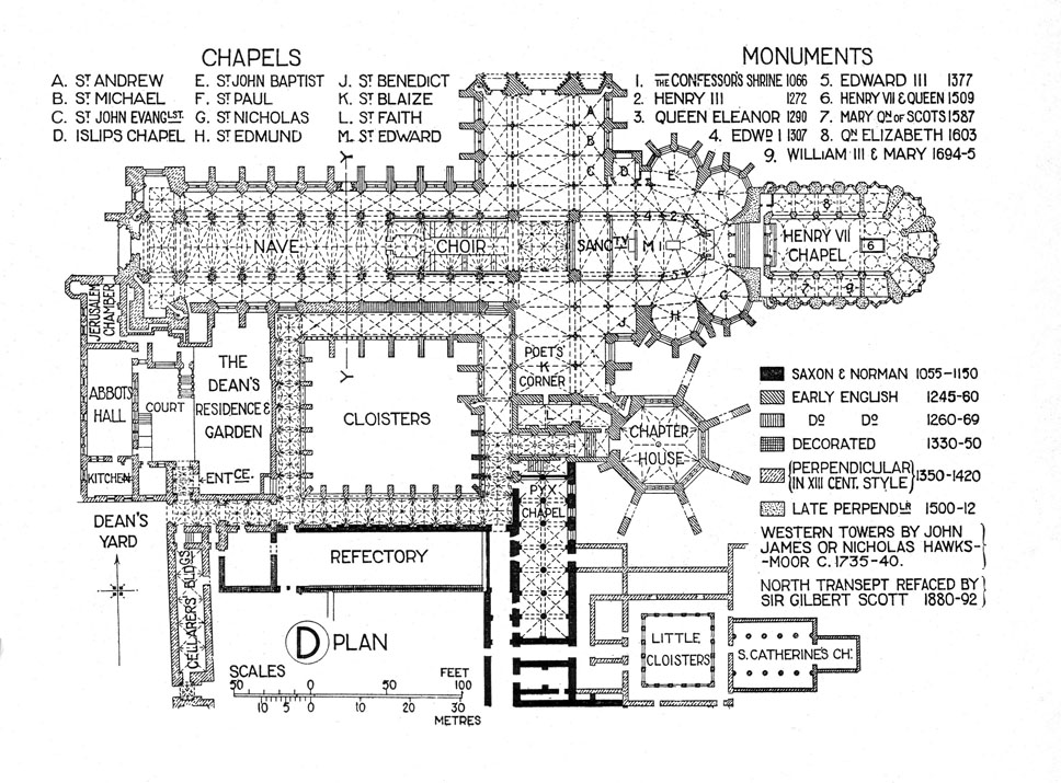
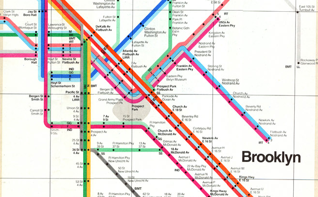
A typical use case is to search for a term, take a mental note of the relevant search results, choose one to visit at first, follow even more links in there, then go back to the original search results and repeat. Such a messy navigation situation can be improved using the same solution for its real-life counterpart: through the use of a well-designed map.
The Proposed Solution
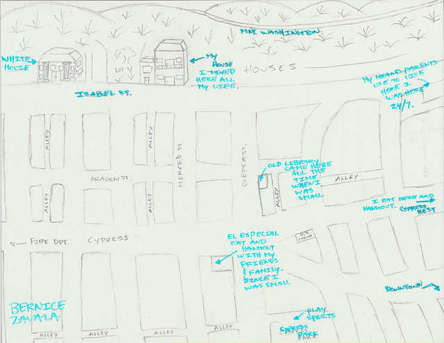
The management of a browsing session can be greatly simplified through a map that the user can visually access at all times, representing the current website trail as rooms, grouping of rooms, and so on. The locations and sizes of the rooms can be used to signify further information: the time spent there, the relation of this location to the other contexts of the website/session, etc. Within each room, information about specific sections in the page can be added as peripheral visual elements.
The utility of such map is two fold: as a navigational aid, as well as a visualization tool for the user’s internet browsing habits.
The User
The user, to me, is one who uses the internet as a tool for information, whether in its academic form or for his or her entertainment.
What I would like the user to feel using this product is clarity, organization, control, and whatever the opposite emotion of overwhelm is called.
The user will be able, I hope, to do the following:
- Map their current user location according to the context of the browsing session, the current page, the entirety of the website, and possibly the internet.
- Annotate on the map on the various locations as a form of note-taking.
- Save sessions as “maps” to recall and revisit.
- Share said maps through social media.
The Challenges
In its essence, this project, to me, is about the difference between a graph and a map. The first is concerned with connectivity, and optionally, the intensity of that connectivity, and that is all. What I aim to do is to provide a memorable sense of space and location. To achieve that, a sense of familiarity, distinctiveness, and consistency is what I hope I can achieve.
Another challenge is scale. The number of webpages that we visit daily is, I would say, at least 60. To allocate screen space to each, without intelligent abstraction decisions, can compromise the solution.
“Timeline”
The schedule that I have in mind is as follows:
Week 1: Planning: defining the problem, start to think about the design considerations as well as the obvious implementations details.
Weeks 2 — 3: Develop a proof of concept Chrome extension that reads user history in the simplest form. This is just to feel assured that it is doable.
Weeks 3 — 4: Mockup, prototypes, paper interaction models. Concept user testing.
Weeks 5 — 6: Add a simple visualization ability to the extension.
Weeks 7 — 8: Finalize visual design.
Weeks 9 — 11: Finish implementation. + User testing.
Weeks 12 — 14: User testing. + Finish implementation.
Goals
My goals for this project in the context of the Project Development Studio class are as follows:
- Develop a working prototype Chrome extension of the features outlined in the previous section as much as possible.
- Follow a sound design process that includes considerations for the user experience design.
- Learn more about and intelligently apply the sound principles of cartography and wayfinding.
Relevant Research Keywords
Leave a Reply