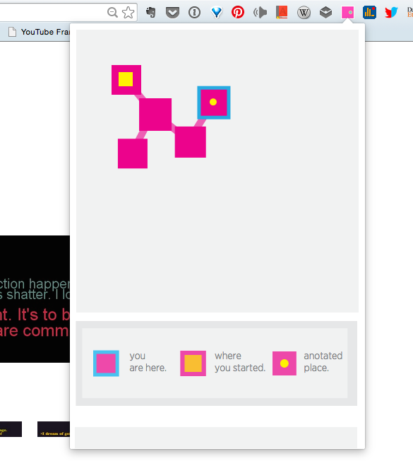
This week I started conducting user-testing for my Online Wayfinding System project (non-fancy name pending).
The below is a list of common observations I received from the people I interviewed.
1. Tooltips should be displayed regardless of the location on which the mouse is hovering (at the moment they only show if the mouse is placed on the edges of the node).
2. Time-related information should be included there somewhere, e.g. when did I start the session? How long did it take?
3. The hierarchy of information needs to be improved. (At the moment, I have the nodes from which more nodes spawned increase in size, but not very dramatically).
4. Consider filtering and searching mechanisms, including zoom in and out.
5. The color scheme is generally good. But consider having the ability to pick alternative palettes.
6. The session aggregation screen needs work. It is unclear at the moment.
7. Consider having all sessions in the same view.
8. Shapes are hard to grasp at the first view, but legend helped a lot. Consecutive views are much easier to read.
9. Consider having the content annotations integrated into the symbols, instead of the current mechanism of hovering over a symbol to view them.
10. Consider adding more text description on the session view.
11. Highlighting techniques might improve the information display.

Leave a Reply