This is a summary of my final Temporary Expert research project on maps, propaganda, and cartographic art.
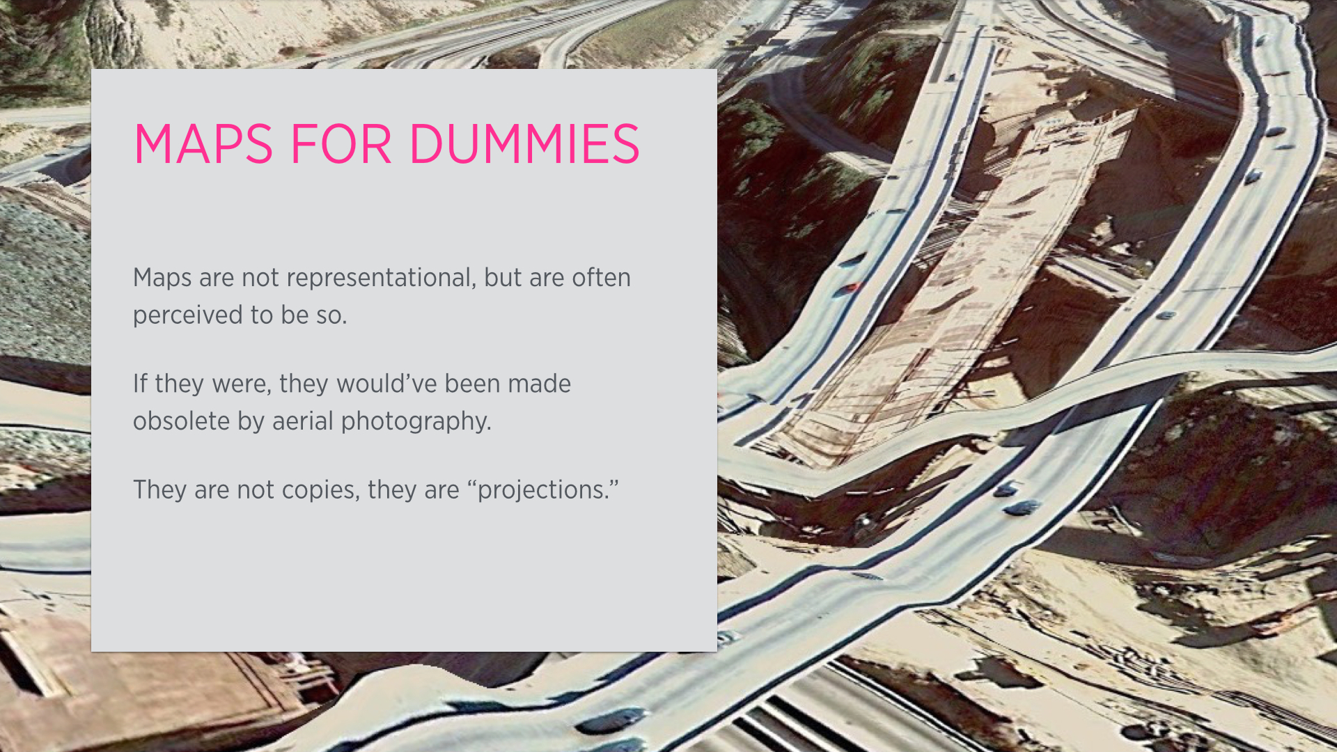
Not really, but rather, our perception of maps is. Maps are not completely representational, and were never meant to be. They are, by design, incapable to be that: immersion is not part of their design goals. They don’t represent reality but are used to communicate usable aspects of it.
One of the main things about maps is that they are essentially projections, in both senses of the words. A perfect projection does not exist, and the choice of a particular projection depends on what sort of information the map maker feels is most important for the context.
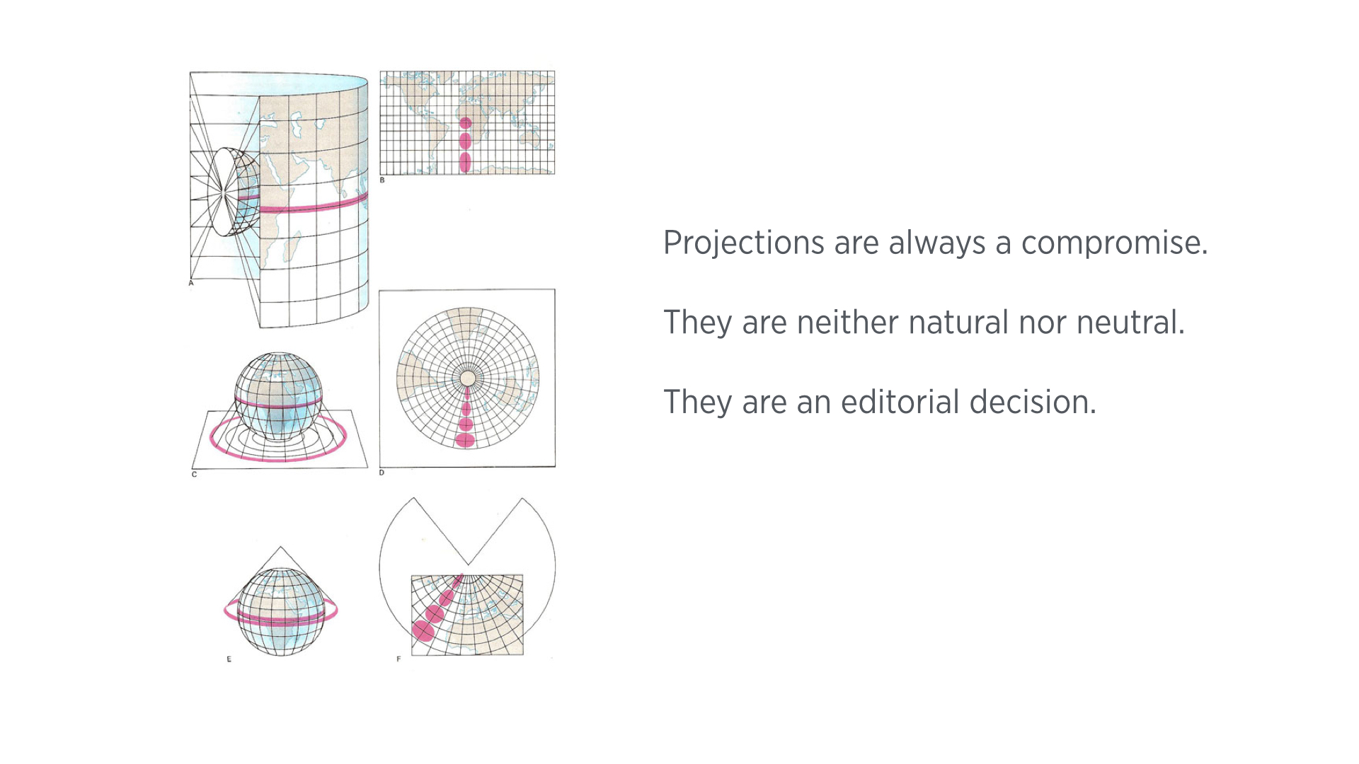
For instance, the Mercator projection (uppermost diagram in the slide above), which is an equatorial, cylindrical projection, is accurate at the equator and gets distorted as you move towards the poles. Other projections can solve that at the expense of other information: Transverse Mercator is more accurate at the poles but completely removes a geographical point at the equator. There are also azimuthal and conic projections, like the ones illustrated in the middle and bottom of the slide above. While they are accurate at the polar areas, they distort all other areas, and/or introduce discontinuities to the topography. 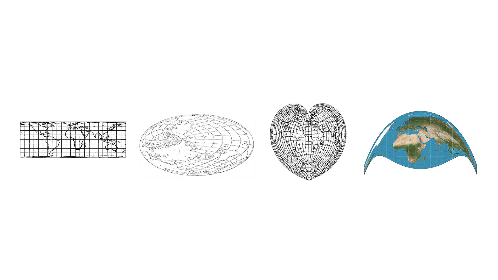
(As an aside, projections are such a powerful device both visually and as a filter for spatial information. To begin with, not every projection is made for a standard rectangular-plane. The leftmost projection above is designed to be used with mobius-like surfaces. Both of the middle projections conserve the distance or area from the center of the map, and distort distances/areas that do not include the center of the map. The rightmost projection, called the Craig Retroazimuthal Projection, is used to center a map around a geographical point, and distorting all else, in this case the center is Mecca. I personally feel it is a strong way to make a political point.)
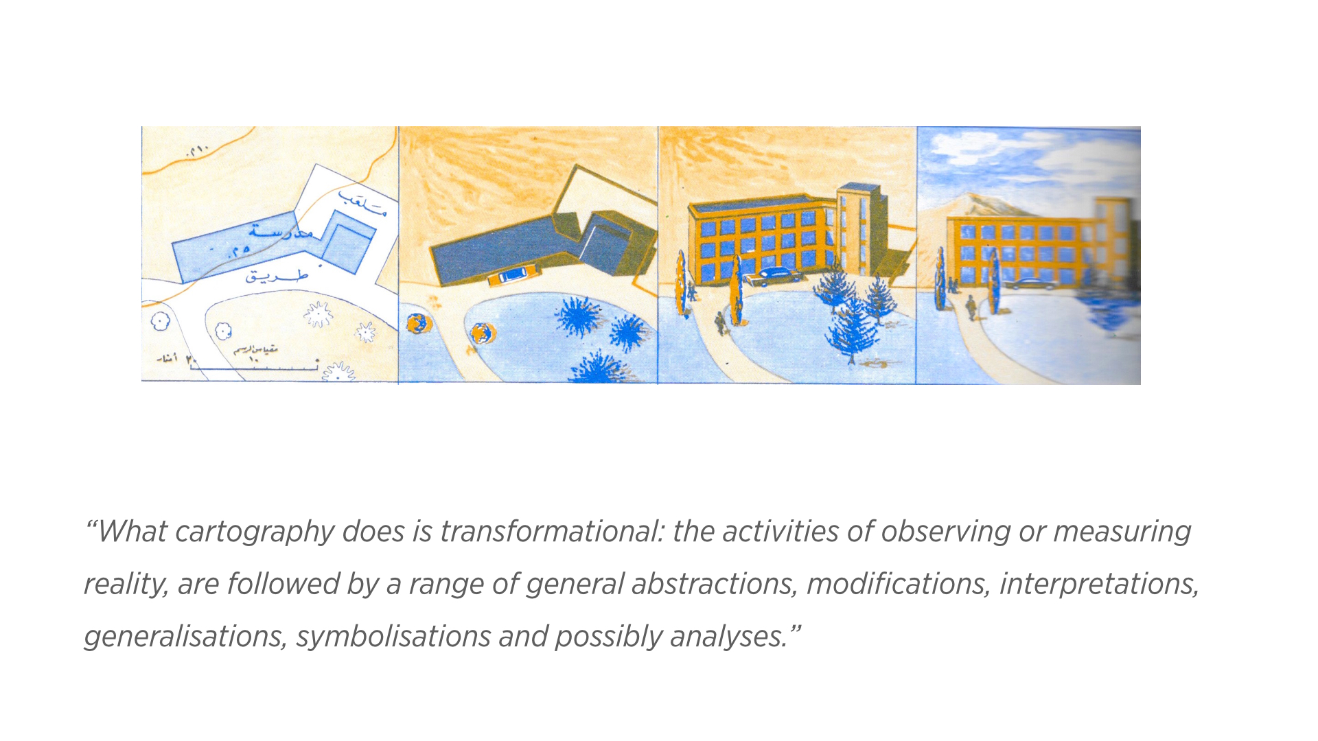
It is not only the choice of projection method, there is also an extensive process of “symbolisation,” i.e. mapping visual symbols to spatial (and non-spatial) data inherent in mapmaking. This is the essence of the cartography process; the seminal work of French cartographer and theorist, Jacques Bertin, as seen below, has set the principles of this process extensively and articulately. 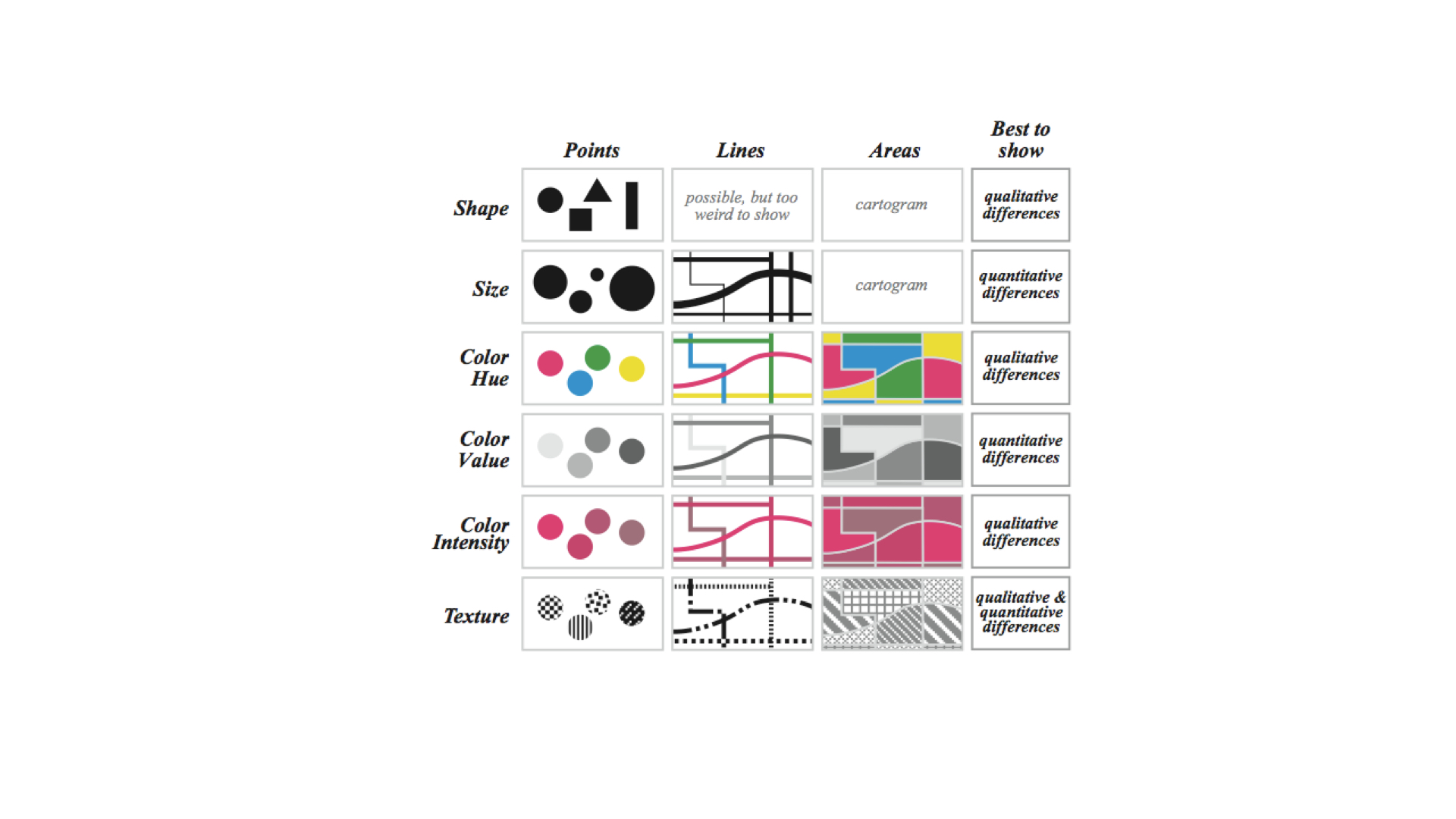
Maps are a tremendously powerful thing. In a way, a map is a blueprint for wars, and a war is effectively a man-made change of geography.
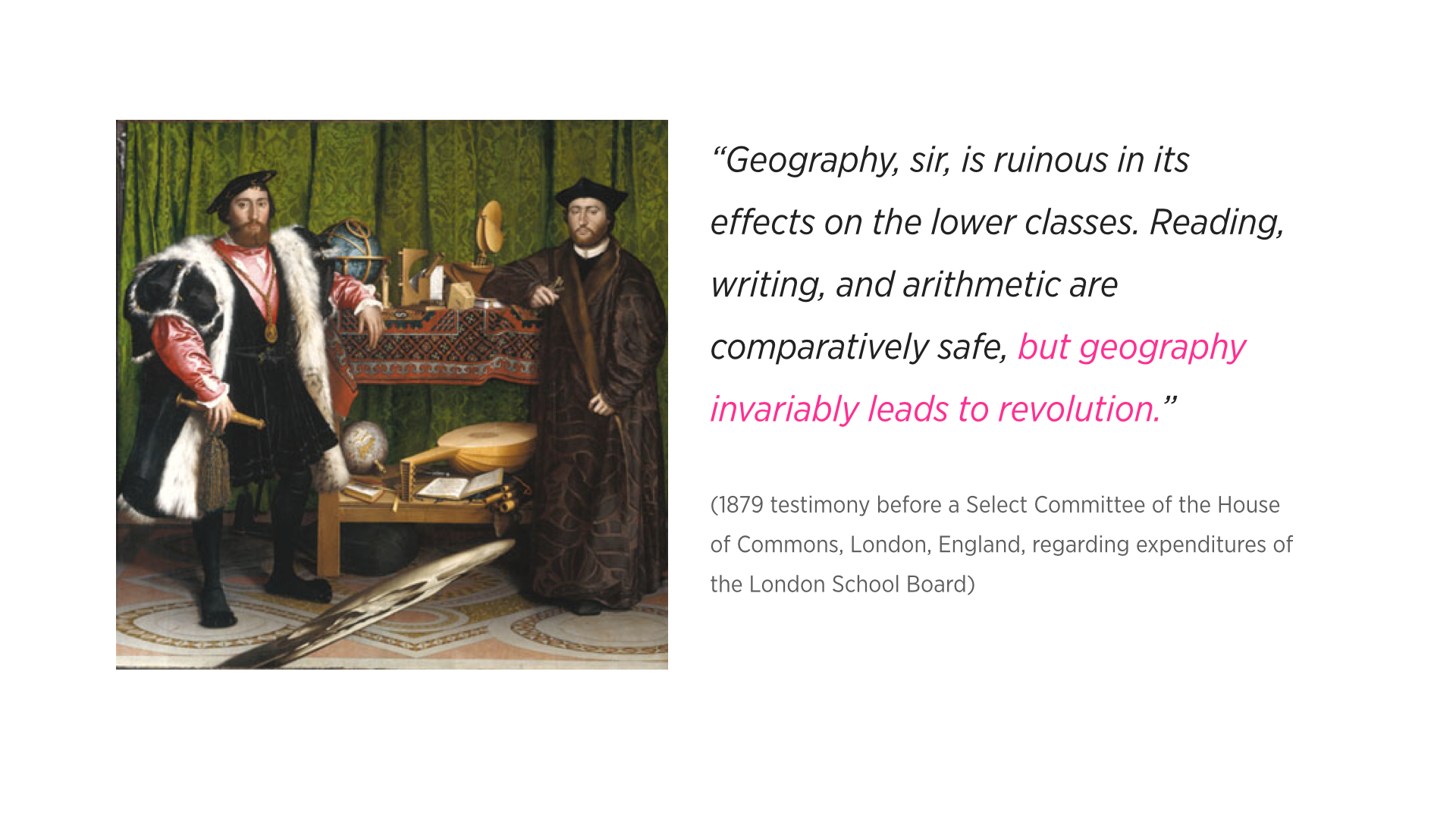
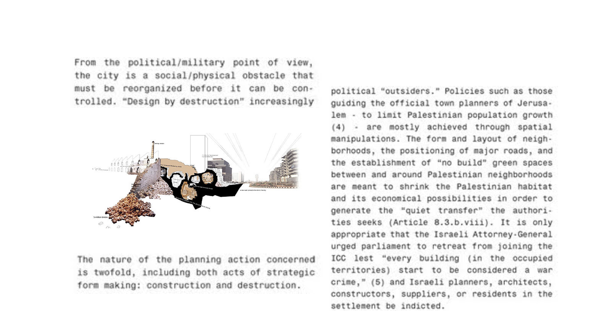
Eyal Weizeman, notable Israeli architect and intellectual, goes as far as to argue that architects, and by extension, urban planners and cartographers, should be held equally accountable for some acts of war that involve “design by destruction.” The danger of their work is not only in the process of planning war efforts, but also in the way urban colonization is made concrete in the layouts of captive cities, in the spatial control of how materials flow to captured places. 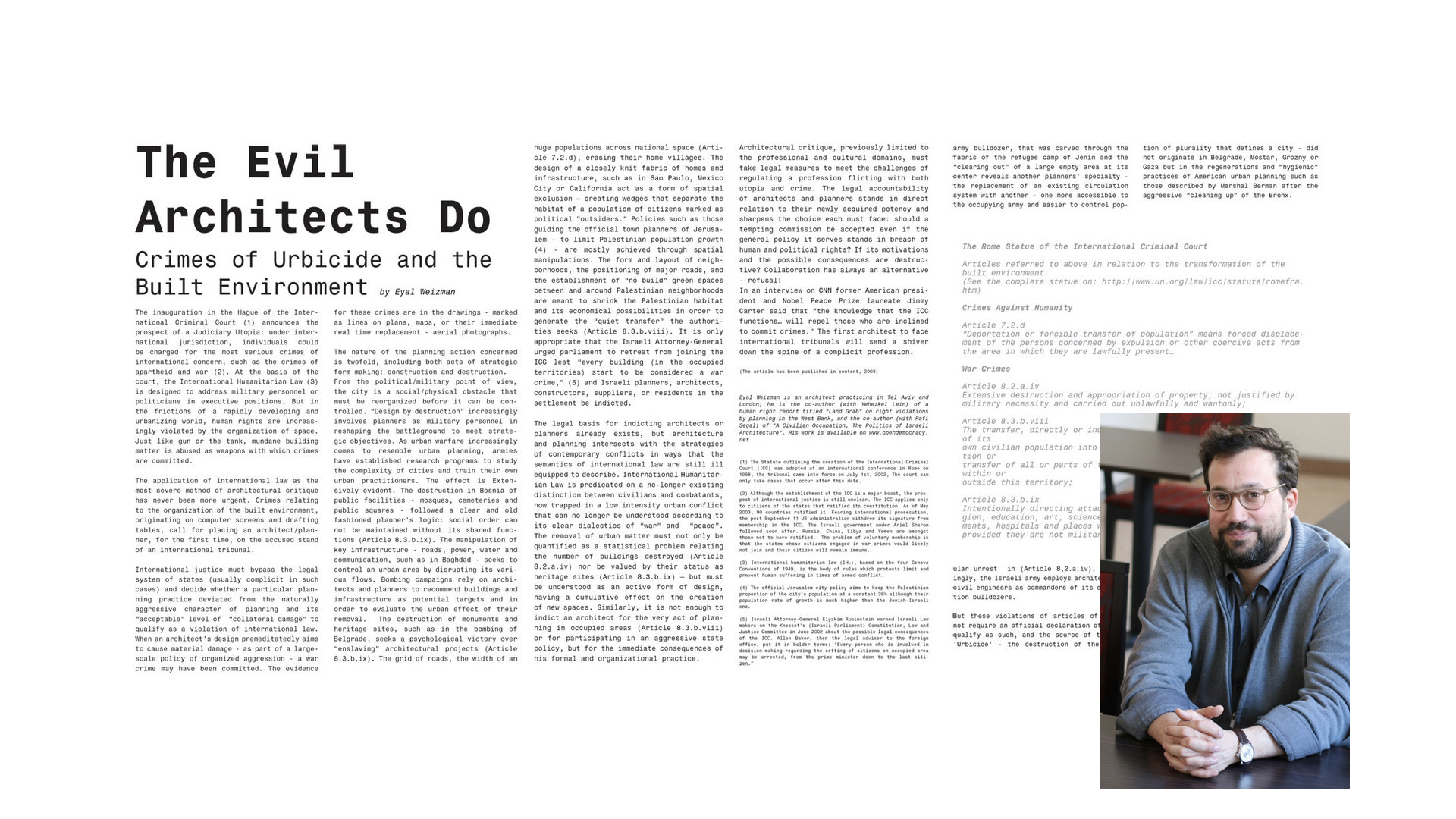
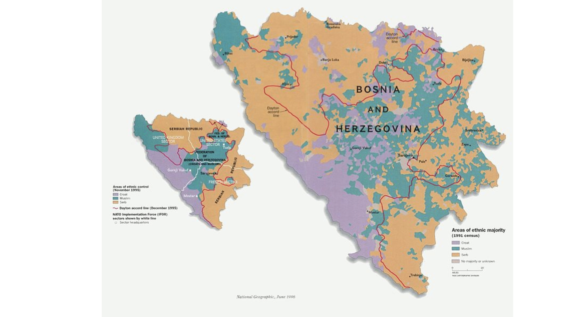
A clear example of the way wars are a change of maps, is the reshaping of Bosnia and Herzegovina after the 1991 civil war. Before it, the ethnical markup was nebulous, and after it, the region fell into a neatly organized set of ethnically segregated areas.
Maps are also as much of a tool of resistance as they are for occupation. 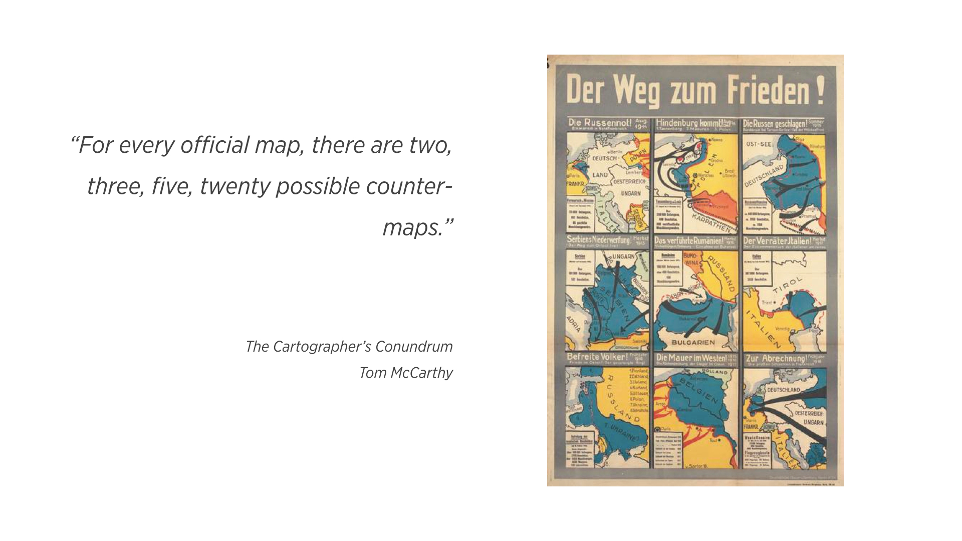
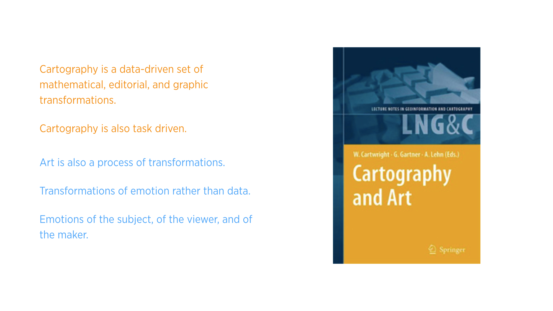
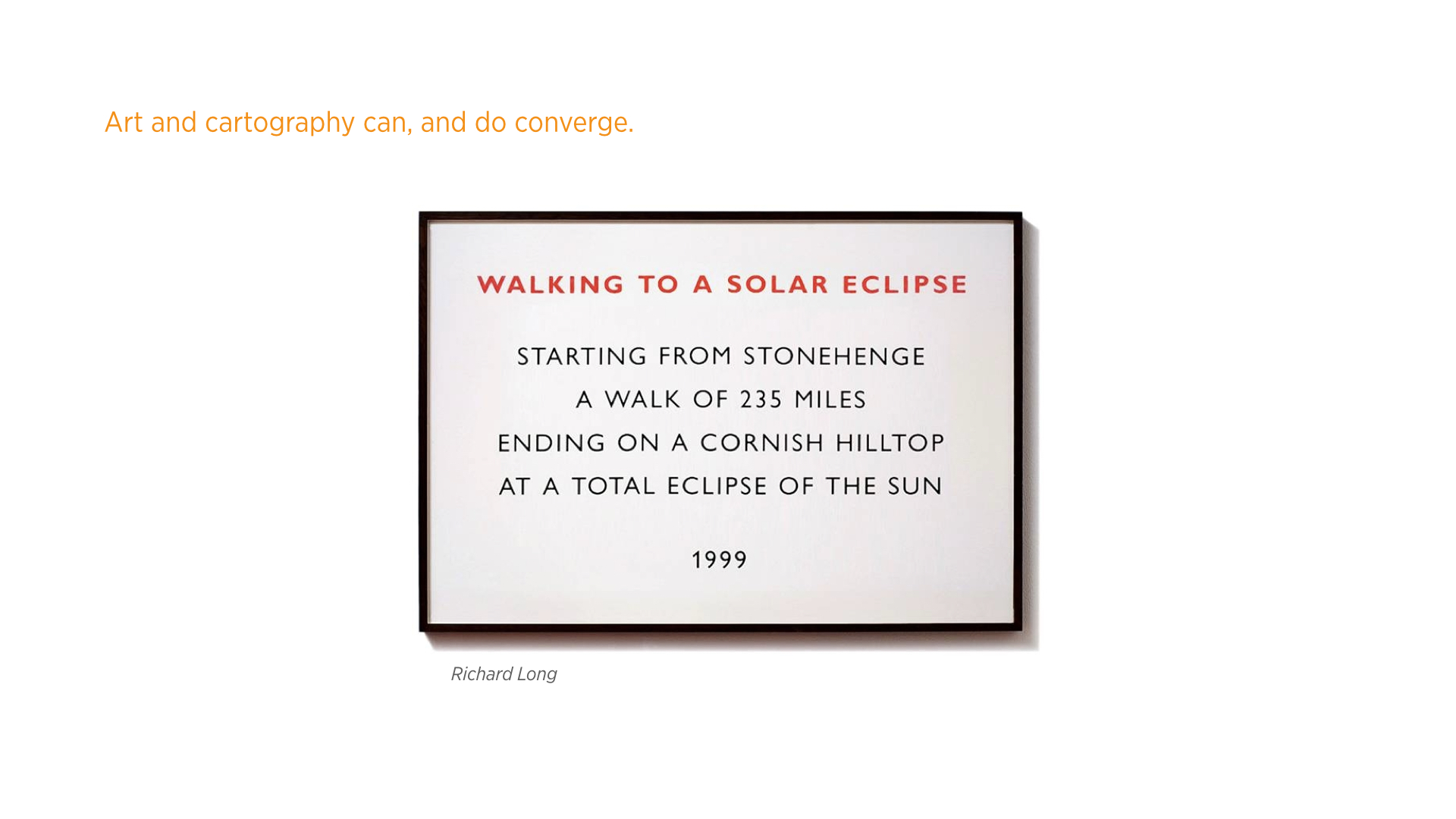
One prevailing theory of the progression of art is that, after the Renaissance, works of art were made, generally speaking, to map the emotion of the subject matter to the art’s medium, and in a way, to elicit an emotional response in the audience. Ernst Gombrich argues that, by the end of the eighteenth century, artists were expected to map their state of emotions rather than that of the subject matter or the viewer. 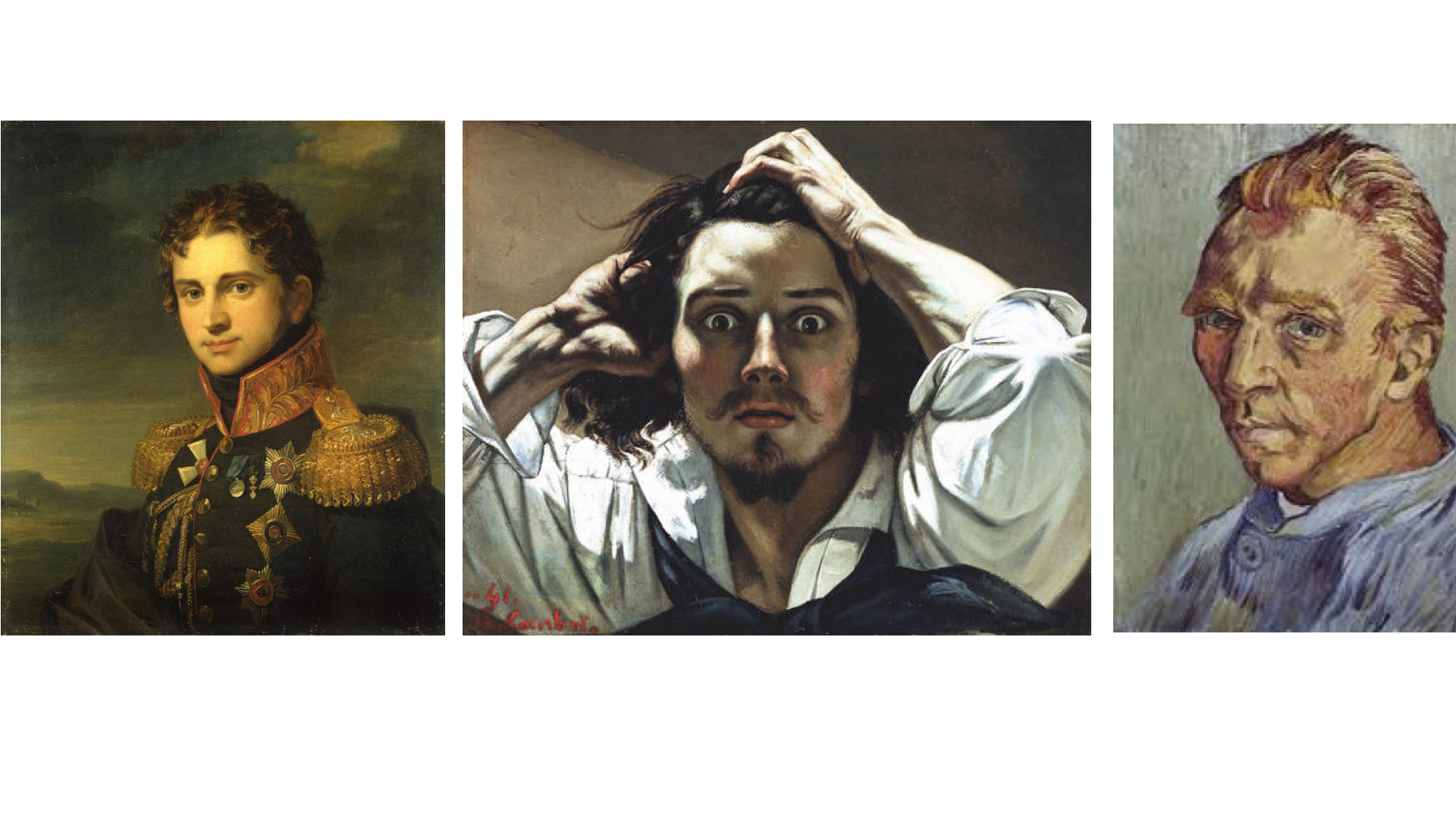 Cartography moved, and still does, in the opposite direction. Due to the limitation of technological means in primitive times, maps started as a subjective visual works that convey an impression more than information. Modern maps are more about information, but not completely about that.
 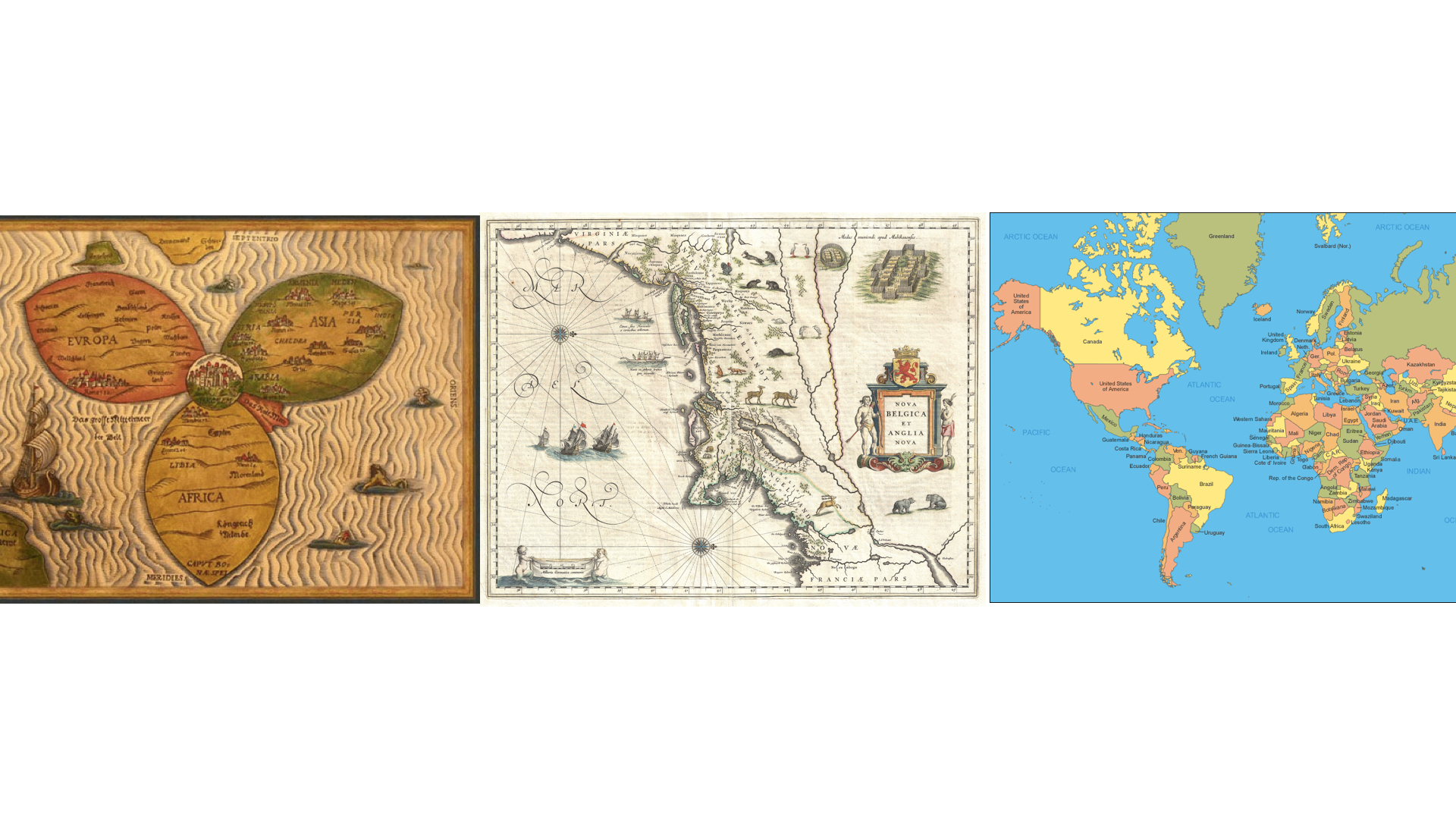 The point of the above is that cartography and art should not be necessarily considered too far removed from one another. Cartographic art, whether in the sense of “cartography-assisted performance art” as with the work of Richard Long, or maps that impress more than enlighten, is, in my personal opinion, as aesthetically and conceptually powerful as a painting.
The final thing of note in this line of thinking is the idea of space itself. Space has been defined and redefined in all philosophical manners throughout time, from the idea of space being relational, to the scientific idea of the convergence of time and space in the concept of spacetime. What is space anyway, and why should maps be about a single institutional idea of it?
 LIST OF SOURCES, IMAGES, AND MORE:
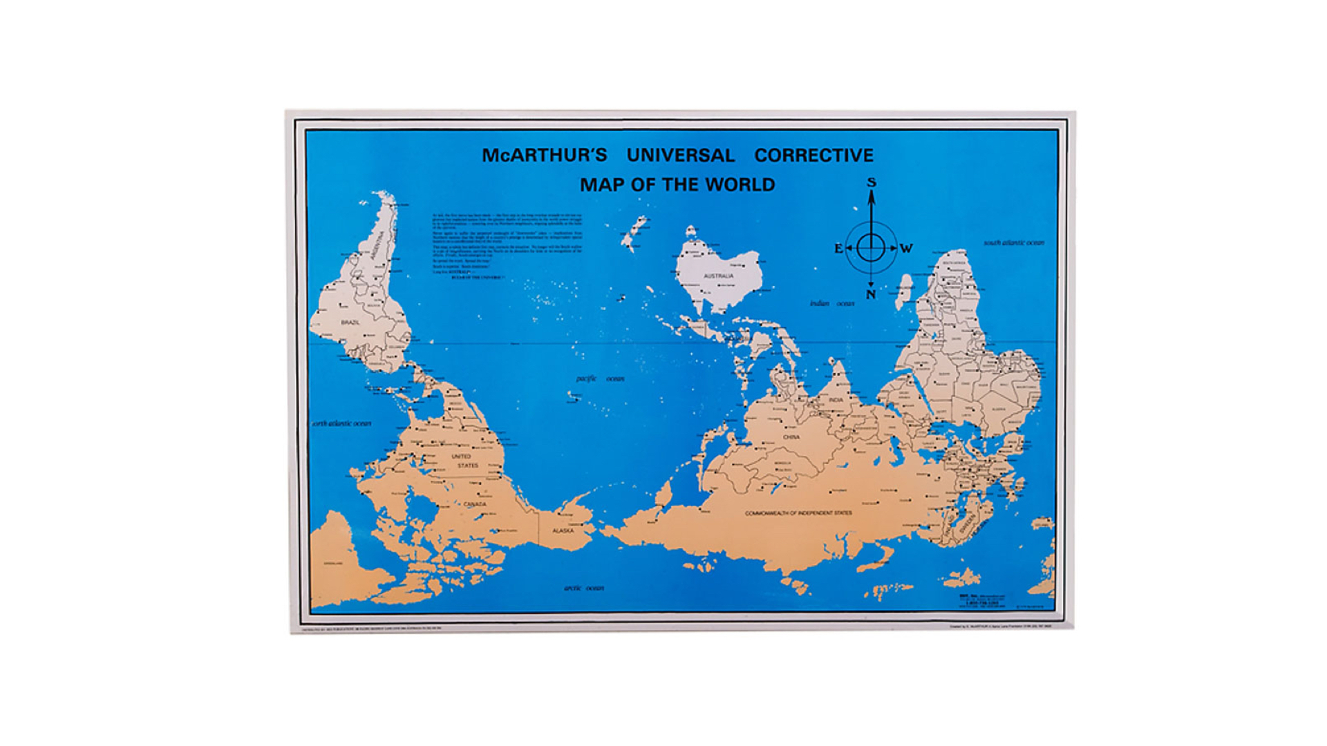
Image: McArthur’s Universal Corrective Map of the World
“Maps are broken..”:
Ideas: The Mapmaker’s Conumdrum, Tom McCarthy, The New Yorker
Ideas: Mapping It Out: An Alternative Atlas of Contemporary Cartographies, Hans Ulrich Obrist
Image: Postcards from Google Earth , Clement Valla (color corrected by me to suit the color theme of the slideshow)
Ideas: Cartography: Thematic Map Design, Borden Dent , Jeff Torguson , Thomas Hodler
Image: The World’s of David Darling, David Darling
Ideas + Images: Unusual Map Projections, Waldo Tobler
Image: الأطلس العربي World Atlas (Arabic)
Ideas + Image: Semiology of Graphics: Diagrams, Networks, Maps, Jacques Bertin
“Maps are violent..”
Ideas: The Mapmaker’s Conumdrum, Tom McCarthy, The New Yorker
Quote: Cartography: Thematic Map Design, Borden Dent , Jeff Torguson , Thomas Hodler
Image: Hans Holbein’s The Ambassadors
Ideas: The Evil Architects Do, Eyal Weizman
Image: Faustian Urbanism, Manuel Herz, Eyal Weizman
Image: Bosnian Census, Wikipedia
Image: The Way to Peace! Nine maps of German campaigns from August 1914 to spring 1918.
“A Map is not a painting..”
Ideas: Rejecting Illusionism: Transforming Space into Maps and into Art, David Fairbairn, from Cartography and Art , edited by Cartwright, William, Gartner, Georg, Lehn, Antje
Image: A Portrait by George Dawe
Image: Gustave Courbet self-portrait, “The Desperate Man”
Image: Vincent van Gogh, Self-Portrait
Image: Richard Long’s Walks
Image: Night Shift/The Wrong Map 2004 by Adam Chodzko
Image: Oceanchart (from Lewis Carroll’s The Hunting of the Snark)
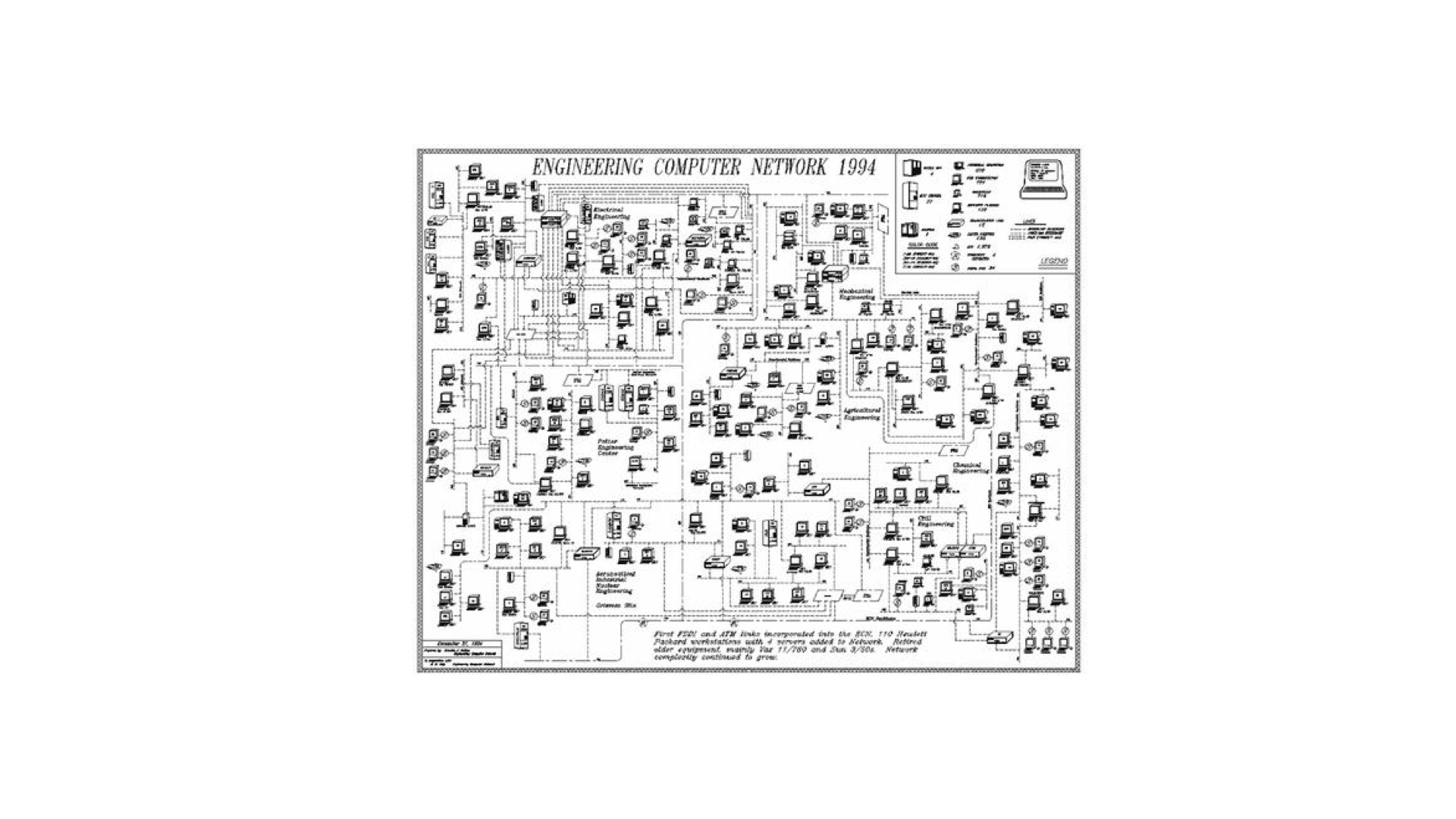
Image: 1994 ECN Network Map
Leave a Reply