(The above is a gallery. Click on the arrows on left and right to navigate.)
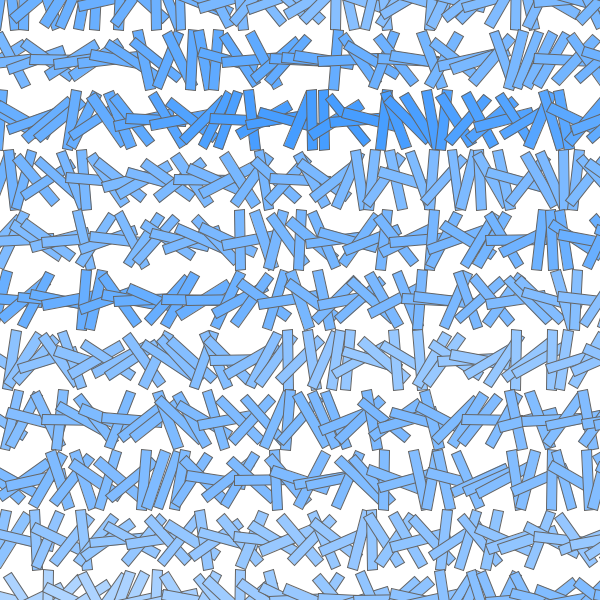
To observe the effect of breaking a color down into its components of hue (the instance of color in the color wheel), saturation (the color intensity), and brightness (the light intensity), I created a Processing sketch that displays a randomized arrangement of stripes where a color component is incrementally increased as we traverse from left to right and from top to bottom.
The saturation value was first manipulated, producing the results displayed in the first image above. The saturation value, and therefore the amount of color within the color swatch, decreased as we move to the bottom of the screen, before resetting back into a increasing pattern. The less saturated the color is, the more airy and gray-like it is.
Then I proceeded to vary the brightness value of the colored stripes, changing in the process the amount of light a color contains. The less brighter the color, the closer it is to black. (View the results by navigating the gallery on the top of the page.)
And finally, when the hue value is changed, the results are of a more haphazard appearance as it is difficult to create an aesthetically meaningful composition with so many competing colors on display.
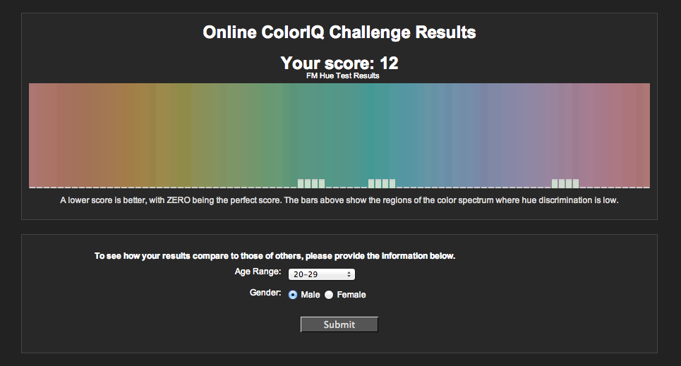
(Also, Hue test results. How sad.)
Leave a Reply